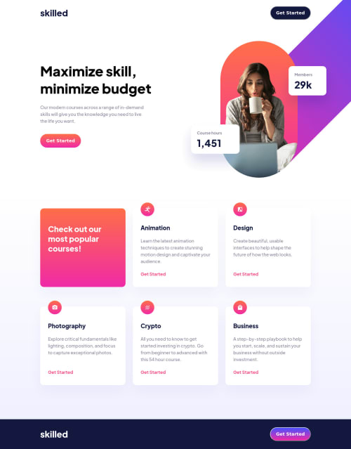
Submitted almost 3 years agoA solution to the Skilled e-learning landing page challenge
Skilled eLearning Landing Page - responsive using HTML and CSS
accessibility
P
@jguleserian

Solution retrospective
Greeting, Friends!
If any of you have a minute to take a look at my solution to this challenge, I would be most grateful. If you notice anything that you could suggest an improvement, I would be so grateful. I could also use suggestions on:
- How to keep from getting lost in the code (see README.md in the repository). Even though I think I keep things pretty organized, I have cost myself a great deal of time editing the wrong media query because I was at the tablet section when I should have been in the mobile section. Yikes!!!
- Suggestions on making decisions on what kind of structures I should use to contain other structures. Eg., my <main> was used as a two-column grid (to contain the intro section). Then inside the grid structure, I used flexbox. It seemed to work, but I didn't know if you could suggest a better way to do it.
- Anything else you can see: you can be brutal - I just want to get better. :)
Thank you fellow-frontenders!
Jeff
Code
Loading...
Please log in to post a comment
Log in with GitHubCommunity feedback
No feedback yet. Be the first to give feedback on Jeff Guleserian's solution.
Join our Discord community
Join thousands of Frontend Mentor community members taking the challenges, sharing resources, helping each other, and chatting about all things front-end!
Join our Discord