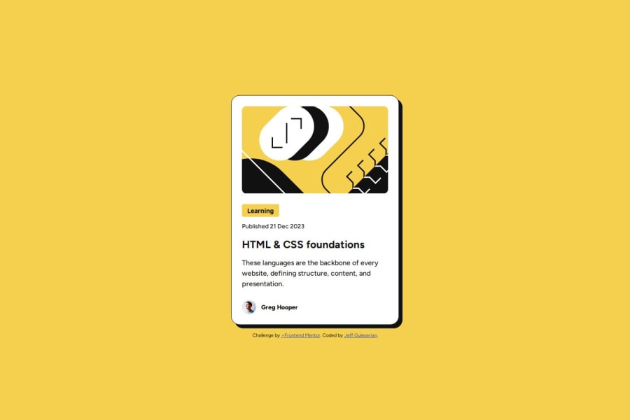


Design comparison

Solution retrospective
While the challenge, for the most part, was rather straight forward, it did present some challenges. I was happy about the fact that I was able to overcome these challenges (see below) and incorporate what I learned into my coding tool bag.
I was also pleased with the way the project came out to be so responsive, from the image to the font sizes and the container itself.
What challenges did you encounter, and how did you overcome them?The primary challenge encountered here was that put forth by Frontend Mentor: "The font sizes in this project are slightly smaller in the mobile layout. Find a way to reduce font size for smaller screens without using media queries." At first, I tried to use percentages and/or view width, but this soon collapsed since there were not proportional (at any number) to work at all sized. What I needed were minimum and maximum numbers to limit the two extremes in size. While I researched a couple of different techniques (using min() and max() together, for example), I landed on the clamp() parameter. I found that this solved my issue quite nicely and opened up a whole new world of making sites responsive.
The other challenge was dealing with that pesky with the coder's name. Putting in the same container as everything else and setting its position to "relative" allows me to move it beneath (with a negative "top" number), but then the space it occupies still remains in the original container and interferes with the bottom padding, especially at smaller sizes. The other possibility was to set its position to "absolute" and then try to place it beneath the container manually. This is what I opted for, although it took a bit of calculating to place it correctly at all sizes. nevertheless, it looks like it works for now. If anyone has a different method that I haven't thought of, I would welcome the insight.
In terms of areas of help, I think I was able to do everything fairly smoothly and economically. however, if you have the time to take a look at my code, I would more than appreciate any feedback on how to improve or new angles I should consider.
Thank you for taking time to take a look at my project.
Happy coding, Everyone!
Jeff
Please log in to post a comment
Log in with GitHubCommunity feedback
- @JEWebDev
Hello Jeff!
Very well done, your HTML is semantic and structured i liked that a lot.
I see that you opted to use margins on every element to give them spacing. This works and looks great but in the long run and on bigger projects it may be difficult to make changes afterwards. For example let's say you want to change the spacing between the card's content. You'll have to change the margins one by one. To help with this you can use
flexboxlike this:#content{ display:flex; flex-direction: column; gap: 0.75rem; }This will give the content child elements a spacing of 0.75rem or 12px.
Now this will give all of them this spacing and some have more between them. In that case you can wrap them in a
divwith a class ofwrapperorcontainerthis are common naming examples, you can use what you like.This way when you would like to change the spacing between them you only change it in the parent elements instead of each element one by one.
This is only a suggestion and one way of achieving it. Give it a try an see if you like it.
-
You can also wrap your
pictureelement in aheadertag. -
You can use the
articletag to wrap your card. this way you can have multiple of them inside themain
If you want to see the above tips in action you can look my solution of this challenge.
Happy Coding!
Marked as helpful -

Join our Discord community
Join thousands of Frontend Mentor community members taking the challenges, sharing resources, helping each other, and chatting about all things front-end!
Join our Discord