
@AliSherTR

P
Jeff Guleserian
@jguleserianAll comments
- P@jguleserian
Greetings, Ali
Thank you for letting me take a look at your solution for the Product Preview Card Component. I like your use of grid to switch the orientation of the two columns and your CSS to switch the hero image.
Another method, which you probably thought of for the former, would be to use a flex box for the switching of the columns. Likewise, another element to be aware of is the
<picture>elements that dynamically changes the image based on media queries as delineated in the HTML. You can take a look here in case you don't already know about this latter technique. Regardless of what you choose, your solutions worked very well.I might also point out a couple of things I noticed that would be an easy fix. First, I noticed that in your
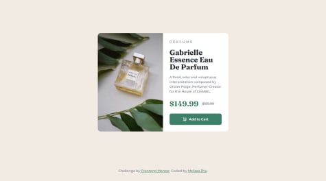
<img>elements, you have therelproperty listed, but without a description of the image. This could lead to issues for screen readers or for other users if the link should happen to break. Something likerel = "A bottle of Gabrielle Essence Eau De Parfum"would be enough to suffice.I also noticed that the scaling was off on the entire component. I'm thinking that you did not have access to the Figma file which would have made getting the dimensions of your
<div class="product">easier (it was 60rem, not the 50rem that you have). In fact, you might take a look at the max/min-width settings and whether you need them if you are not making the container responsive and actually take care of the sizing in the media query. Since you are starting with the larger size, in your case 50rem, you could just put that as the width and let the media query do the rest.Anyway, the container sizing threw off the other sizes and proportions as well. I encourage you to compare you project with the model they give you in the starting files.
Other things you might consider:
- Filling out the README-template.md, and then renaming it so it is the README.md file. This will help reviews understand your processes and struggles. It will also help you process the work better in your own mind.
- Try more semantic HTML, i.e., naming your containers that will have a better logical order. If a screen reader is trying to make sense of your site, I will have structures such as
<header> <footer> <section> <article>etc. to help it navigate. It's also easier to others to get a handle on your structure a little more.
In the end, your solution looks great, and your project ended up being an attractive solution. I just encourage you to make more comparisons to the original, since the exercise is to copy it exactly.
Thank you again for letting me take a look at your work. If I can be of any help in any way, please let me know.
Happy coding!
Marked as helpful - @Joshua65676What are you most proud of, and what would you do differently next time?
Myself for improving in styling
What challenges did you encounter, and how did you overcome them?Mobile screen, I am still working on it.
What specific areas of your project would you like help with?Media query (mobile screen).
P@jguleserianGreetings, Joshua!
Thank you for letting me take a look at your solution for the Recipe Card Challenge. It looks like you are still in process in completing it, but so far, it's looking great.
I would be happy to help in any way possible with the media query for the mobile screen if you fill me in on what you are struggling with specifically. Just respond to my comment and we can converse over what is going on. Again, I'm happy to help however I can. Here is my solution in case you want to take a look.
I also noticed a couple of other issues that may be of help.
- It looks like your recipe is not centering properly on the page. Here is the code that is the culprit:
body {
    background-color: hsl(30, 54%, 90%);
    overflow-x: hidden;
}
.main-body {
    background-color: hsl(0, 0%, 100%);
    margin-top: 50px;
    width: 800px;
    margin-left: 310px;
    height: 1655px;
    border-radius: 15px;
}
What this does is places your
<main>container at an exact distance from the left and top margin and creates a height and width that are static. I recommend that you center it more dynamically by using a flex container. Something like this...* { padding: 0; margin: 0; box-sizing: border-box; } body { display: flex; flex-direction: column; justify-content: center; align-items: center; background-color: hsl(30, 54%, 90%); } .main-body { background-color: hsl(0, 0%, 100%); margin: 128px auto auto; max-width: 736px; border-radius: 24px; }The first part of these styles with the * addresses all the elements on the page. It removes any default borders and margins and set the box size to include any padding inside it. It's an easier way to think about the formatting and how big the content is.
The second part turns your body into a flex box. What this means is that it will dynamically place anything in it according to the parameters you choose. In this case, we told it to align everything in a column and justify and align it to the center.
The third part sets the margins of the of the
<main>to the top of 128px (because that is exactly what Frontend Mentor has in its example) and "auto" for the sides and bottom. By setting it to "auto", the parent container, i.e., the<body>, is allowed then to move it to always be in the center. Additionally, we set the maximum width to 736px (which includes all content and padding, thanks to our earlier box-sizing), but allows it to shrink as necessary. And finally, setting the border radius at 24px is done because that is actually what the design specifies (have you opened the Figma file to see all the details?).Anyway, that is enough for now. Please let me know how I can be of more help with media queries, really anything. I'd love to see how your final project turns out. You are certainly on track to make it great!
Happy coding, My Friend!
Jeff
Marked as helpful - @Siyam1888What are you most proud of, and what would you do differently next time?
I really feel amazed to see that I could successfully design it myself.
I would like to use more reusable CSS in the upcoming projects.
What challenges did you encounter, and how did you overcome them?For this one I did not encounter any mentionable challenge.
What specific areas of your project would you like help with?I am a beginner, and your feedback on any topic regarding semantic HTML and efficient CSS will be highly appreciated.
Thank you.
P@jguleserianGreetings, Siyam!
Thank you for sharing your solution to the Social Links Profile. You should be proud of yourself for completing this project with such a similitud to the original, especially if you are a beginner.
I did notice a couple of irregularities that you may, or may not, have already noticed. The overall length of the project is not the same as the model. This is due to incorrect margins between the heading elements and link elements. While it looks great the way you have it, the goal is to get it like the original. Moreover, concerning the size, the submission is not responsive, that is, it does not change as the screen size changes according to the provided models. You should also have an adaptation for screen sizes of 767px and 375px. This generally handled through "media queries." Take a look at W3Schools' for more information. This will be a good primer on the subject. I hope you find it helpful.
I also noticed that you used a
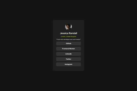
<div>element to encapsulate your links. In the future you may try to use something less generic, for instance,<section>or<article>. While a lot of this is certainly personal choice, it can be helpful to mark out sections using semantically specific nomenclature. Here is a link to W3Schools' Layout elements and Techniques to see more of what I'm talking about. What I might suggest is something like:<body> <main class="card"> <header class="user-profile"> <img src="./assets/images/avatar-jessica.jpeg" alt="Profile Picture" class="profile-picture"> <h1 class="name">Jessica Randall</h1> <p class="location">London, United Kingdom</p> <p class="description">"Front-end developer and avid reader."</p> </header> <section class="links"> <a href="#" class="social-link">GitHub</a> <a href="#" class="social-link">Frontend Mentor</a> <a href="#" class="social-link">LinkedIn</a> <a href="#" class="social-link">Twitter</a> <a href="#" class="social-link">Instagram</a> </section> </main> </body>Dividing it up into sections like this would also make spacing easier. You could turn the
<section class="links">into a flex container and handle all the spacing by just defining the flex'sgap. The same goes for the<header>section (though you would have to put the "name" and "location" in their own<div>first. If you are curious, you are welcome to look at my personal solution of the project and how I solved it.I noticed that you did a really great job in making the links,
<a>, look like those in the model. I might just throw this out there that you may want to consider creating buttons instead, and then turning the buttons into links. The reason for this is that, in the future, you may be using JavaScript to do something with those links, in which case, the button would make more sense.Finally, I noticed that your cursor changed, as it should, when it hovers over the links. This happens automatically with the
<a>element. However, I noticed that the background and text of the link do not change like they should. The reason is that you used:.social-link:active{ background-color: var(--Green); color: var(--Grey-700); }which means that it will only turn while it is being clicked on. The fix is easy (just a difference in the pseudo-class used):
.social-link:hover{
    background-color: var(--Green);
    color: var(--Grey-700);
}
Anyway, kudos again for doing such a fine job. You have reason to be proud of yourself. Keep up the good work and keep marching forward. I hope my comments are helpful. I certainly appreciate you allowing me to take a look at your work!
Happy coding!
Jeff
Marked as helpful - P@hectorlil48What are you most proud of, and what would you do differently next time?
I'm proud that I was able to make it responsive. And finally getting to use the calc() function, makes me understand it better.
What challenges did you encounter, and how did you overcome them?I don't have much experience making a website responsive. I got to work with media queries and use the CSS calc() function to make my fonts responsive.
What specific areas of your project would you like help with?All feedback is welcomed!
P@jguleserianGreetings, Hector!
Congratulations on a job well done! I enjoyed seeing how you solved some of the same issues I had when doing this project. I enjoyed going through your solution and seeing your strategy.
I did have a couple of questions, however. These have to do with your use of
calc(). You wrote, for example:.content h1 { font-size: calc(20px + (24 - 20) * ((100vw - 320px) / (1280 - 320))); font-weight: 800; }First, I wondered why you didn't go ahead and put the number
4instead of(24 - 20)since these would always come out to be the same and parentheses have precedence over operands. The same goes for(1280 - 320). The second question was where you got the number1280. I can see the relevance of the other numbers, but that one lost me.##Observations##
One observation I had was that your box shadow seemed larger than the model's. As I looked into your code, I saw this:
  -webkit-box-shadow: 12px 12px 0px 0px rgba(0, 0, 0, 1);
  -moz-box-shadow: 12px 12px 0px 0px rgba(0, 0, 0, 1);
  box-shadow: 12px 12px 0px 0px rgba(0, 0, 0, 1);
I think all you needed was the
box-shadow, and not the additional "webkit" and "moz" versions. Did you have a specific purpose in using those? If not, the redundancy may have thrown things off.Another thing I noticed was that the height of the mobile version (at 375px) was not the same as the model. As I looked closer, I could see that it was the size of the image that was the problem. The picture dimensions should be smaller, but the image should crop a little on the right and bottom. This has thrown off what would otherwise be a perfect alignment.
Finally, I noticed that to center your blog card, you made the
<body>a flex container. While this works, and solves the issue with how to center the peskyattributionelement at the end, it made your design just slightly on the Frontend Mentor comparison "solution vs. design." This is, of course, non-consequential and means nothing except that at superficial glance it looks like the proportions are off, which they are not. It's just that your design set a tad higher in the preview.Anyway, cudos to you, for creating such awesome proportions and spacing and the use of
calc(). I started to usecalc(), but was too lazy to think through all the math like you did. I usedclamp()instead. nevertheless, you really thought through this one and it looks great.I hope my comments are helpful. Take them or leave them. I am learning just like you.
Best regards and happy coding!
Jeff
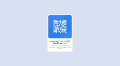
Marked as helpful - @ItchaboidavidP@jguleserian
Greetings, Itchaboidavid!
Thank you for letting me take a look at your solution for the QR Code Component Challenge. You code is easy to read and shows you know how to center the component (which can sometimes be tricky). Everything seems to be proportioned well and the presentation is effective and functional.
In terms of offering constructive criticism, I noticed a couple of things that might be helpful. In comparing your solution to the original, yours is smaller. As I look through the code, I believe that this was the result of you setting the width of the
div.containerat 225px rather than the called for 320px. This would also explain why the text starting with "Soon the qr code..." does not mirror the model and why your fonts sizes are smaller than the model.I also noticed that the padding between the qr image and the top of your
<div>container is not equal to the padding on the right and left. Personally, I solved this by putting a padding in my main container (or in your case, div.container) to make it even on the left, top, and right. Then I put a bigger padding on the bottom, something like:padding: 16px 16px 40px 16px.Don't forget that the Figma file (included with the download) would supply all of these measurements. It also would have indicated that the image needed a drop shadow. I tell you, these Figma files are so helpful!
The last thing I will mention, and this is only to keep it at the forefront of your mind, is accessibility. You probably noticed on the accessibility report run on your submission, that it was lacking an
<h1>or major heading. I get it that this is just a component and that, depending on how it was used, you might, or might not, need an<h1>tag. In a case like this when it is not obvious that an<h1>tag is needed, I usually put in an<h1>and then hide it offscreen. While there are many ways to do this, I used:h1 { display: hidden; position: absolute; left: 200rem; }As a postscript, I would say that, while for this simple of a submission, inline styles work well, as the projects get more complex, I would encourage you to use a stylesheet.
In conclusion, your solution is very good, especially if you did not use the Figma file. I applaud your effort. I hope you find these comments helpful (take them for what they're worth). If you have any questions that I may be able to help with, please let me know.
Again, good job!
Happy coding!
Jeff
- @MelissaZhuuWhat are you most proud of, and what would you do differently next time?
I am most proud of being able to incorporate responsive images and CSS Grid in this project. Both topics are fairly new to me, as I've only dealt with the basic media queries and making layout/ text content responsive, but haven't really applied that to images. I also have always used Flexbox for everything, and I think that understanding Grid provides another amazing option to formatting layouts.
What challenges did you encounter, and how did you overcome them?I encountered challenges with having the browser choose the right image to display at different screen sizes. I started off using srcset and the sizes attribute to set the widths of both images, but I think that both images being so similar in width, and actually having the smaller, mobile image (686px) have a larger width than the desktop image (600px) was confusing for the browser. I later found out about the picture element where you can specify multiple sources for different media conditions, which ended up being the exact solution I was searching for.
What specific areas of your project would you like help with?I read on stackoverflow that you have to add the class on the img tag to style it, I was wondering how come adding it to the picture element doesn't work?
//why not this?P@jguleserianMelissa, I really liked your solution. While I am no expert, I think I may have some insight on your musing presenting in your submission.
Technically, the
<picture>element will take the global attributes, see W3Schools <picture> element. However, since this element is really just a container, anything you do to affect it is only affecting a generic container, not the individual image displayed in it.To affect the individual images, you have to attach formatting to them directly. The reason for this is likely that, given the parameters for display defined in each listing of an
<img>or<source>, the chosen image may have to be displayed differently, with different filters, fitting of containers, borders, etc. Moreover, putting the styling directly on the individual image gives you more control over the final appearance.I hope you find something helpful in here. Thank you again for sharing your solution.
Happy coding!
Jeff
Marked as helpful - @matte3092P@jguleserian
Good afternoon, Matte:
Hey, thanks for letting me take a look at your solution for the QR Code Component. When I look at your code, it seems like everything should have worked out, but in practice, something happened when you posted to GitHub and hosted the site from there. Anyway, your basic coding looks good, both the HTML as well as the CSS, but there are a couple of things you will probably want to keep in mind as you move forward:
- GitHub gets kind of picky sometimes with your url references. So instead of starting your links to your images with a "./", try just the "/" and see if that helps. In the case of this project, both your favicon and you main QR image are failing to display. However, I imagine you are not experiencing a problem on your coding program because it is not as picky.
- Since your image is not displaying, what is showing up instead is the "description" within the image tag. the word "description" is showing up because that is the default. This is difficult both for those wondering what the picture was supposed to be about as well as for those who are visually impaired and have readers describing what is displayed.
- Another thing I find helpful when I review someone's work is being able to read their README.md file. Really, you should use the template and fill in the information and then rename the README-Template.md and overwrite the README.me. That way, you can explain your processes and vision as you carried out the project. I also find this type of self-expression helpful to the learning process. Also, writing to the Frontend mentor prompts when you do the actual submission is also helpful. I encourage you to take advantage of them.
There are other things that could also be helpful for accessibility, but those steps can be left for the future. Meanwhile, I think you should be proud of your submission. You did a great job. The GitHub glitch just got in the way. Oh well, lesson learned.
I hope you find these comments useful in some way. Again, good job and thank you for letting me take a peek of your work.
Happy coding!
Jeff
- @AurelienWebnationWhat are you most proud of, and what would you do differently next time?
The calculator can convert all the units in real time.
What challenges did you encounter, and how did you overcome them?Two big challenges :
- How to manage correctly the conversion between one unit to all others.
- How to create the Limitations of BMI section correctly, with the grid tool?
- How to create the Limitations of BMI section correctly, with the grid tool?
P@jguleserianGood morning, Aurélien! Thank you for letting me take a look at your solution of the BMI Calculator. I just turned in my own solution of the project as well, so it is still fresh on my mind. While I can't speak to your code directly, since I haven't used React, I might share my perspective on a couple of things you mentioned under "challenges" section.
First, concerning the conversions of one unit to another, I decided not to even try to do it. I took in the imperial units as they were and just sent them to a different function. To find BMI using the imperial measurements, I used the formula: (weight in lbs) * 703 / (height in inches) squared. Doing it this way save me from having to put in individual conversions prior to sending the data through the same metric formula. You are welcome to take a look at my solution and see how I did it, if you're interested: My repository.
Second, I also used CSS Grid to organize the "Limitations" section." At first I tried using Flexbox, but ran into problems. Once I converted to Grid, it became easier and the individual cards stopped moving around. To get them closest to their correct position, I made the Grid with 6 columns and 3 rows. Then I named all the locations (you can see the detail in my styles.css file). Once the items were close to their final positions, I used margins to adjust them; I used negative margins if I needed to move an item to the left of its division line. Of course, once I scaled down below the 768px tablet size, I converted everything back to Flexbox and let them all align themselves. The grid container ended up looking like this: `.grid-container { display: grid; grid-template-areas: 'limitations limitations limitations gender gender gender' 'graphic graphic age age muscle muscle' 'pregnancy pregnancy pregnancy race race race'; row-gap: 3.2rem; column-gap: 3.2rem; margin-top: 21rem;
@media (max-width:1230px) { grid-template-areas: 'limitations limitations' 'gender age' 'muscle pregnancy' 'race race'; margin-top: 9.6rem; }
@media (max-width: 768px) { margin-top: 15.6rem; row-gap: 2.4rem; column-gap: 1.4rem; padding: 0 5.2% 0 4.9%; }
@media (max-width: 700px) { display: flex; flex-direction: column; align-items: center; margin-bottom: 9.6rem; padding: 0; }
@media (max-width: 375px) { margin-top: 12.7rem; gap: 1.5rem; } }` I hope you find this at least a little helpful.
I did notice that your welcome message and the blue-colored results box wasn't showing up when the page loaded. That was probably just a simple oversight or possibly an issue with GitHub.
Anyway, I enjoyed taking a look at your project. Thanks for letting me examine your work. I always learn so much from doing this.
Happy coding! Jeff
- @AminXatiaWhat are you most proud of, and what would you do differently next time?
Actually, I'm thrilled to be able to re-design such a template and it makes me believe that I am on the right path and with patience and more practice, I can gain more and more and more and more experience!!!!!!
What challenges did you encounter, and how did you overcome them?I had some challenges with the overflows. I mean when I wanted to see the template in smaller sizes, I had this "scroll" problem that I fortunately could manage to solve and to see the template in all available sizes.
What specific areas of your project would you like help with?The project was easy and what I've just re-designed is complete and without any technical issues. So I guess there would not be an appropriate answer for this question now.
P@jguleserianGreetings, Amin,
Congradulations on your solution to the QR Code challenge! Very well done! I was impressed with the similitud to the prototype.
Other comments:
- Your HTML and CSS is easy to read and follow. It looks like you used BEM for organizing your CSS. While this is not my personal favorite, it is a system widely used by a lot of teams and instructors - so cudos to you for implementing it so early in your submissions. I do agree with Bernardo (above) however, that you could use more semantic HTML.
- Your solution technically correct and also uses at least one accessibility practices. One practice you might want to add is a
<meta>tag in the head that contains description of the page, something like this: `<meta name="description" content="[description of page]">. I recommend this because it is also a good practice for search engine optimization (SEO). There are a lot of other practices that I'm sure you will want to investigate later if you have not already done so. - I noticed that you did not have any @media statements for the smaller screen size. If I remember correctly, there did exist some minor adjustments for the smaller screen size (like width/height), thought it's so forgiveable in this case since the directions do not specify anything and the changes are so subtle.
- I would like to encourage you to complete the README.md file and keep it with the code. This will help future reviewers understand your intention and workflows. It also may help them provide you with better feedback. If you need help writing markdown (though you can probably guess it from just using the template), I recommend the Markdown Guide. They have a nifty cheat sheet that covers all the basics and more.
Anyway, Amin, I want to tell you again that I liked your solution and think you did an outstanding job. I hope you find something in my comments helpful. I also wish you all the best as you continue your professional development.
Happy coding!
Jeff Guleserian
- @rohanvronWhat are you most proud of, and what would you do differently next time?
I take pride in achieving a design that closely resembles the provided challenge. The attention to detail and fidelity to the original design are aspects I’m pleased with.
For future projects, I would consider the following improvements:
Responsive Design: While the current solution works well, enhancing responsiveness for various screen sizes would be beneficial.
Code Organization: Structuring the CSS more efficiently and modularly could make maintenance easier.
Accessibility: Ensuring proper accessibility features (like alt text for images) would enhance usability.
What challenges did you encounter, and how did you overcome them?The primary challenge was centering the components and aligning items precisely according to the challenge image.
To overcome this, I experimented with different CSS techniques, such as flexbox and media queries. I iterated until achieving the desired layout.
What specific areas of your project would you like help with?Currently, I don’t need assistance with any specific areas. However, I’m open to feedback on any aspect of the project.
P@jguleserianGreetings, Rohan,
Thank you for letting me take a look at your solution for the QR Code Component Solution. It looks like you did a great job mimicing the design and the overall look is as intended by the challenge. Well done!
Other positives:
- Your HTML and CSS is easy to read and follow.
- You solution is simple and effecient.
- Your solution is sound technically and incorporates at least a modicum of accessibility practices. Other practices you could consider as a next step are:
- A
<meta>tag in the head that also has a description of the page, something like this: `<meta name="description" content="[description of page]"> This is also a good practice for search engine optimization (SEO) - Include an
<h1>tag somewhere to assist screen readers in grasping the structure of the page. If you don't want to use an<h1>tag, then consider making an element visible only to screen readers. Mark these section with a class like "sr-only" or something similar. Then "hide" the element from everyone else. A common CSS pattern for the "sr-only" is as follows:span[class~="sr-only"] { border: 0; clip: rect(1px, 1px, 1px, 1px); clip-path: inset(50%); height: 1px; width: 1px; overflow: hidden; white-space: nowrap; position: absolute; padding: 0; margin: -1px; } - In all, there are copious methods for enhancing accessibility practices, but since these have to do with more complex HTML structures, such as forms, they are not yet relevant to this critique.
- A
Areas of attention Though your solution is really great, here are a couple of items that might also be helpful.
- Use the README.me file and fill in the sections. This process is very helpful in developing as a professional. It also gives your reviewers a better insight into your thought process and workflow. most importantly, it will help you focus on your goals and direction and facilitate you development.
- The design of the QR Code Component, although an applaudable copy of the original, is a bit smaller than the prototype. However, I believe that this is the fault of the FM, given that they do not give dimensions. I remember doing this challenge and having to compare the browser windows to get an "accurate" estimation of the width. Anyway, I believe the original width of the entire component is supposed to be 300px, but this is certainly nothing to fret over.
Areas of exploration You mentioned several areas that you would like to explore. Here I will try and give you some thought, resources, and further suggestions. Centering elements on the page This is acommon problem, especially for containers that don't seem act as we expect the to. Here are some thoughts that might help:
- Make sure the container/item you are trying to center has dimension to it, i.e., a height and width; otherwise, it may be centered, but you will not be able to see it.
- Make sure the parent container of the item you are trying to center has a position setting, either relative or absolute.
- Flexbox works great, as you mentioned in your comments, but if I am trying to center a single item, I use this technique:
-Make sure the container has dimensions as mentioned above.
-Make sure the parent container has a position setting.
-Set the position of the item I am trying to center to absolute and then set its position to
top: 50% left: 50%. This puts the top left corner of your item in the exact center of the container. -Now usetransform: translate(-50%, -50%)to move the item back and up 50%. The item will be in the exact center. Adjust thetranslateproperty if you want it at the top or bottome, etc. -This trick works every time and is perfectly responsive.
Structuring/Organizing CSS
Believe it or not, this is a topic that leads to a great deal of vociferous debate. Although there are many systems, ultimately you will have to land on the one that is used by whatever team you are a part of. Meanwhile, I recommend you take a look at this article on MDN Organizing your CSS. In short, BEM is the most used style from what I understand. However, the system I believe is the best, and the one I try to use is GPS CSS Methodology. The latter one is, for me, easier to read, more efficient (DRY), and prevents scope leaks better.
Anyway, Rohan, I congradulate you on a job well done. I hope you find my comments helpful. I also wish you well as you continue your journey (don't foget to document it through the README.md files :))
Happy coding!
Jeff Guleserian
Marked as helpful - @Notand105P@jguleserian
Hey, Fernando
Congratulations on completing your first challenge. Looks like you really did an awesome job! I like the look and proportions, the organization of your CSS and HTML, and the succinctness of your solution. Since you did so well, I thought I would try and help you out with just one observation and then discuss some of the error messages you received from the FM report.
- I did notice that the comparison images seem to be a bit off, but sometimes it is difficult to tell if it is the screenshot resolution or a genuine difference. I do notice a spacing/font issue with your
<h3>since the words on each line differ a bit. There may also be a tiny descrepancy with your margins (maybe like 15px instead of 10px) - but this is nitpicking, for sure. - Images must have alternative text - keep in mind that all the
<img>tags need to have the alt text included, i.e., an explanation of what the image is about in case it doesn't render properly - One main landmark - here the report is looking mostly for a
<main>section. Make sure you use as much of the semantic HTML as possible, especially a<main>section (as oppsed to the<div class="container">. Generally, I let the<body>be the "background" and the<main>be the actual page or component.<header>,<footer>,<nav>, etc. can either come before/after or within that<main>section. - For the sake of screen readers and accessibility, it is important to include an
<h1>element with a main "title". You may be wondering why that is important in this case or what that title would even be. It is important because if anyone is using a screen reader, the reader looks for an<h1>to alert the user as to the subject. In this case there is not<h1>needed on the card, but you can list one anyway. You could use something like "Frontend Mentor QR Code," or something like that. But what about it messing with your layout and formatting, not to mention the fact that it doesn't even exist as part of the design. Well... you have to hide the<h1>, that is, make it invisible and take it out of the flow. There are several ways to do this, but here are a couple:- Set the display property to
display: none;. This will take it out of the flow and make it invisible to the eye, but not to a screen reader. - Some people set
position: absolute;and then put the height and width to a single pixel, and then position it way off the page (like `left: -3000px).
- Set the display property to
Again, I want to reiterate how proud you should be of your first solution. No doubt these small issues will clean up very quickly on future challenges. I can't wait to see how well you do on the next one. I wish you the best of luck!
Happy coding!
Jeff
- I did notice that the comparison images seem to be a bit off, but sometimes it is difficult to tell if it is the screenshot resolution or a genuine difference. I do notice a spacing/font issue with your
- @jrleijnseP@jguleserian
Jeroen,
I really liked the solution and I'm envious that you used SCSS. It's still on my horizon to learn, but now I know where to go for some examples. I can see that, especially on larger projects, it would come in handy for shortening the code and increasing the potential for using variables.
As usual, your solution looks forthright succinct, and easy to follow. I stopped to take a look because I saw the comment by Mohamad that the edges were "sticking" to the side at the mobile width. However, I can't get this to reproduce. As I resize the browser window, it seems to flow perfectly and only makes the jump right at 375px. Even at 376px, I'm seeing a border on both sides without making it looked cramped.
I do have one suggestion, though. If you could somehow take the "attribution" out of the HTML flow, I think it would make the preview and comparison slider work mor like intended. As it is, it's throwing off the top and bottom padding, making the size look distorted. I've played with this myself a couple of times. I finally decided on putting it in a container to center it, and then taking it/the container out of the flow by putting it position as "absolute." Anyway, no big deal for sure, but your work always looks so nice that it would be great if it were more evident on your solution page.
I hope all it well. Have an awesome week. See you around!
Jeff
Marked as helpful - @PetebossP@jguleserian
Dear Peter,
I liked your solution to the NTF Preview Card, thought the comparison slider doesn't do it justice. I think something was off when you took the screen shot. When I pull up the site, everything looks correct.
Here are just a couple of pieces of advice that may help you along to the next step:
- Your accessibility report came back with an error. What this error is pointing out is that you should have and
<h1>somewhere in the beginning and in a semantically appropriate place (such as a<nav>,<header>,< main>, or<footer>).
- The
<h1>is for screen readers only. Obviously, in this case, you do not need an<h1>for a component, but the screen reader is looking for one to help announce to the user what connection this component has with the overall subject. In this case, a heading such as "User Contributions to Relaxing Music" or something like that. - The
<h1>needs to be hidden from the viewer, but still exist. The way to accomplish this is to insert the<h1>in the HTML, but style it in the CSS as having a display: none. In addition, some sources suggest: height: 1px; width: 1px; position: absolute; left: 3000px. The most important thing is to remove it from sight (and HTML flow - hence the absolute positioning and the display property set to "none") but have it there for the screen reader.
- Hover effects: As I glanced over a couple of your other projects, I noticed that they, too, were missing the hover effects. Using hover effects, in fact all pseudo-classes, is quite easy once you know how. Here is a tutorial from W3Schools that might help.
- In short, when you write your CSS, for example for and
<h1>, it might look something like this:
h1 { font-size: 25px; color: green; background-color: beige; padding-left: 30px; }- However, when you hover over it, let's say you want it to turn from green to blue and make the cursor into a hand. First, write the same selector in a new entry, but this time add a colon plus the name of the selector (
:hoveror:activeor:linketc.). Once you do that, just restyle the elements you want to change, for example:
h1:hover { color: blue; cursor: pointer; }- Now, every time the mouse hovers over the
<h1>, the cursor will turn into a hand and the text will turn blue. - You can even change just a part of a text element by just surrounding that part with a
<span>and styling its hover elements separately.
Anyway, I hope this helps. Thanks for letting me take a look at your solution. I love your organization, use of variables, and easy to read style. I can't wait to see you try the "hover" solution soon. Check out the other pseudo classes (and pseudo elements, for that matter)! Keep up the good work!
Best wishes!
Jeff
Marked as helpful - Your accessibility report came back with an error. What this error is pointing out is that you should have and
- @jrleijnseP@jguleserian
Jeroen,
Hey, I really like your solution to the FAQ Accordion Card. Especially:
- you got the stacking/layering of the images and their placement spot on.
- Your animations work flawlessly.
- I see you used SASS through Node.js. I'm impressed, though I admit that I am a neophyte when it comes to SASS, so I'm afraid I couldn't provide much feedback for you. But the fact that you are studying some backend technologies give you a "thumbs up" in my estimation.
- I noticed you put your media queries in a separate stylesheet. I usually list mine on the same stylesheet with my other CSS. I'll have to try it your way and see if it makes it easier to track/code.
You might consider:
- Using more semantic HTML, instead of <div>, try <section> or <article>. They behave the same way plus it makes things easier to navigate, plus, screen readers pick up on it and it helps in the interpretation of the site to someone visually impaired.
- While I like your creative solution to the according (with a <button>, I would have never guessed - hey! it works), next time you might try the <details> tag, which already has all the components built in, including the animated caret. It could save you time and lots of lines of code.
- I noticed that your CSS reset template was pretty thorough. I am guessing that you cut and paste it in from another source. It certainly covers everything, but if your goal is a quick-responding website, less is always more, and I would go back and take out the stuff that you didn't need at the end. For example, the overflow-wrap property isn't really necessary.
- Using the display: grid in your main container was my solution as well. however, you might want to look more closely at the columns when you do that. In this case, they were not quite even, so the grid-template of 1fr 1fr meant it was going to require more overriding to get things to fit properly. As a result, some of your elements are misaligned on each side.
- I also noticed that your main container was changing height when an accordion was opened. Though the effect is interesting, I don't remember seeing it in the brief. Anyway, this is just an observation more than anything else. it makes me want to go back and try it.
All that being said, I reiterate that I loved your solution. The comparison slider here on Frontend Mentor does not do it justice. It may be the dimensions of your screenshot or the fact that theirs has one of the accordions in the open position and yours does not. All I'm saying is that you did a good job and I learned a lot from perusing your files. Thank you for the opportunity. Job well done!
Jeff
Marked as helpful - @WedrussowoP@jguleserian
Good morning, @Wedrussowo,
Not long after you submitted this project I sat down and took a look and was preparing to send you some feedback, but then I left for church. When I got back, I noticed you resubmitted the project with some modifications. So, I’ll keep my comments mostly to this newer submission.
Let me start by saying that the project looks amazing. You successfully made the QR Code Component look exactly like the original. Other things I really admired:
- Looks like you figured out the alignment issue for your <div class=”frame”> container – good job! These don’t always act like we think they should. However, why didn’t you do the same thing for the <main> as a child of the div.frame, and so on?
- You also figured out the issue that was showing up with the <h1>, though, I think their intention for the warning was for accessibility. I’ll explain below.
- Dimensions… perfect! The only thing I could see that might need tweaking is the border radius of the actual QR code <img>.
- I like the way you see the component’s structure as a series of stacked or concentric boxes. This type of thinking usually solves any type of design problem and groups items for styling and positioning purposes with minimal code.
Again, great job! Admirable! Let me turn to some things that have worked for me and that I have learned are considered best practice. Keep in mind that I am no expert and that the end result of what you submitted already looks, at least on the browser, perfect!
- Overall structure: I would probably suggest that you use more semantic HTML when you build your sites. What I mean is, using something like this…
- <header> to house your hero image and possibly your <nav>, depending on your preference. Of course, in a component like this one, you don’t really need a <header>. Beneath it usually comes the …
- <main> as the principal container for all content. An <h1> usually comes here or in the <header. This is divided into…
- <section>s, each one taking on a natural division of subject. Likely each <section> would have an <h2> or other heading. Then,
- <div>s with the elements inside them. We tend to over-utilize <div> containers and end up identifying everything by ids or classes. Using a common structure will help you as you create or revisit your work. It will also be helpful to those who come in later to collaborate or those with accessibility tools like a screen reader.
- <footer> with the normal stuff in a footer, lol! But of course, in this component, you don’t really need it. In the end, it would look something like this:
<body> <header> </header> <main> <section> <div> </div> <article> </article> </section> <section> </section> </main> <footer> </footer> </body>- Keep in mind that most containers are block elements. <section>, <table>, <div>, <article>, etc. This means that they take up the entire line by default – that’s why it’s easy to center stuff IN them, but not the container ITSELF. The 2 easiest ways for centering a container, in my opinion are:
- Give it a width (so it doesn’t think it needs the whole line), and then set the right and left margins to be the same – use margin: auto or margin: 0 1fr 0 1fr, etc.
- Go to the parent – the solution you chose for your .frame div. First, make sure the container has width (as before), then go to the parent container and use whatever means to center – I usually find myself using Flexbox and justifying/aligning the contents.
- Accessibility: as I was mentioning earlier, the <h1> issue has to do with accessibility. Since this challenge was just component, and not a page, its whole existence depends on some other site or place that led a person to this component. The idea is that this component is not the “big idea,” it SUPPORTS the "big idea". However, it is still best practice to prompt screen readers to announce what that "big idea" topic was. Screen readers do this by locating the <h1> element first – even though it may not be listed first on the site. An easy way to handle this if you don’t have a full page with a separate topic for an <h1> (like many of the projects in Frontend Mentor) is to put an <h1> just after the <body> tag with a title such as, in this case, <h1 class=”sr-only”>Frontend Mentor Coding Camp</h1>. Then in the CSS, set the display property of display to “none” ( or you can add to that position: absolute and width: 1px and height: 1px and left: 1000px).
Anyway, I hope you find the comments helpful. Take them or leave them. The good news it that it looks like you have some nice skills – so keep up the good work! I appreciate you letting me take a look at your work. It really helps me learn, too.
Jeff
Marked as helpful - @SreeMouliChintaP@jguleserian
Good morning, Sree!
Thank you for submitting your solution to the Accordion Card FAQ Challenge. I enjoyed looking through your code - there was so much to admire. I like your reset of rem and the responsiveness you built into your work. Your JavaScript was easy to read and follow and efficient. In fact, I could spend a great deal of time running through what I liked, but I know what you probably want/need are some more critical observations. Here are my contributions to that respect. Keep in mind that this is only the opinion of a novice, not an expert.
Accessibility:
- While “FAQ” is certainly the largest headline of the page, if you think about it, it’s really the subtitle to something else, like “Membership Subscription” or something similar. A person using a screen reader will hear “FAQ” as being the primary subject and may not understand that this FAQ has to do with “membership” and not something else. As a matter of best practice, then, it might be a good idea to put an <h1> at the top of the body with the main subject title and leave “FAQ” as an <h2>. The <h1> could have a class=”sr-only” (or similar) in which {display: none} appears in the CSS. This will make it invisible and take it out of the flow, but the screen reader will still read it.
HTML:
- As you probably saw in the warning you were given on your solutions page, it would be a better idea to put your img.box-img in a container such as a <section> or <div>. Not only will this give you an extra layer of control over positioning, but also grouping with other objects and visibility (as is the case here). Overflow visibility has to be controlled by the container in which something sits. You won't have this option if your <img> is not in a container of some sort.
- You may want to take a look at the <picture> element instead of using <img> all the time. The advantage with the <picture> elements is that you can set all your pictures in one html tag and trigger them to appear at different breakpoints. Here is a good explanation on W3Schools: ![W3Schools: <picture>] (https://www.w3schools.com/tags/tag_picture.asp) This saves a lot of style sheet additions in the media queries and turning on/off display properties.
- Another tag you may want to take a look at is <details>. ![W3Schools: <details>] (https://www.w3schools.com/tags/tag_details.asp). What I really like about the tag is that is has the expandable accordion already built in. It uses <details> as the main tag, <summary> for the heading, and a <p> for the explanatory text. It even has an animated caret (bullet point) to the left of the <summary> tag plus a click event already built in. All you have to do is change the styles. Then, to move the caret to the right hand side, simply change the list-style property to “none.” To use the icon as your caret, just insert it as a content property ::after the element and style it accordingly. Anyway, it could save you some time and coding in the future. Here is how I did min, in case you're interested:
    font-weight: 400;
    font-size: 1.4rem;
    line-height: 1.9rem;
    color: var(--blue-dark);
    list-style: none;
}

details>summary:hover {
    color: var(--orange);
}

details>summary::after {
    display: inline;
    content: url("/images/icon-arrow-down.svg");
    float: right;
}

details[open]>summary::after {
    transform: rotate(180deg);
}

details[open]>summary {
    font-weight: 700;
    color: var(--blue-dark);
    cursor: pointer;
}
CSS
- Media query – I think you may have had a typo in your CSS @media. You set the max-width property with “em” instead of “rem.” The rem is more reliable and easy to calculate (10px/rem), since it goes back to the <html> setting. I also wondered if you also meant to write 37.5rem instead of 60em. At 60em, the pixels are counted (in situ) in the <body> at 1.2rem (according to your stylesheet's <body>) or 12px. This would make the width of the viewport change at 720px. The reason I ask is that your breakpoint is happening at too wide of a viewport. Although it still looks good, it wasn’t what the challenge asked for. You may have done this on purpose because, frankly, I think it needed a wider breakpoint.
- Measurements: I noticed some of your measurements are a bit off. I have a PRO subscription to Frontend Mentor, so I have access to the Figma file which gives much better detail. You may not have this luxury. No worries, I’ll just point out what I see, and you can decide its importance.
- section.container needs a wider left margin – I know it looks “off” like that, but I’m sure it’s to balance the overflow of the box image.
- <h1> font is too small. This is also causing your expandable list to be off
- The placement of each “half” of the graphic is off. This is probably because you set your grid-template-column with “1fr 1fr”. While this makes the columns beautifully even, I don’t think they are supposed to be. They should be more like 42% / 58%.
- I think you tried to compensate for the uneven column by using padding on the second column. Eventually, this caused your FAQ section to be wider than the model. Again, if you don’t have the Figma file, this would have been more difficult.
JavaScript
Your JavaScript is very comprehensible, easy to read and follow, and it works! It looks really great! My only question is why you didn't use ES6 syntax, but that's not a huge issue.
Well, Sree, again, great job completing the challenge. I hope my comments are helpful. Just take them or leave them as you see fit. I hope to see you around again soon. Thank you for letting me learn from your coding. I appreciate it very much.
Jeff
Marked as helpful - @JasonSolarzP@jguleserian
@JasonSolarz
Jason,
I liked the look of your solution for the NFT Preview Card Challenge. Specifically:
- your html structure is clean and simple, and thus easy to follow
- likewise, your CSS is minimalist and easy see the relation with your HTML
- the card itself looks identical to the original
On the other hand, I was curious as to why you did not code the overlay on the top image, the hover effects on the title and creator's name, or the @media breakpoints. Perhaps this is only your first draft and you have more coming. Having access to your README.md file would have been helpful in this respect. I'll assume you have more coming, but if not, if you left them out because you are still working on those skills, let me know and I can suggest some resources. That said, I do have a few suggestions that may help in terms of best practices:
- Screen readers will want to see an
<h1>title in the body element so they can announce the subject/topic of the page. Most users don't need this, of course, so you will want to hide the<h1>from site. You can accomplish this by adding a class, like "sc-only," and then in the CSS, something like:
.sr-only { position: absolute; top: auto; height: 1px; width: 1px; overflow: hidden; }- because pixels may cause issues with accessibility, it seems to be common practice to use em or rem instead. There is still some discussion out there about it, but there are legitimate reasons to favor these more versatile measurements. If you are interested, you might take a look at EM vs REM vs PX – Why you shouldn't “just use pixels”
- I think the challenges assume that when you use components, as opposed to entire sites, that the component be centered vertically and not just horizontally. To do this, I recommend that in your main container, the one that will house your component, you use a grid and justify and align the content, something like:
*container* { width: 100 vw; min-height: 100vh; display: grid; justify-content: center; align-content: center; }
I hope these suggestions help in some way. I'm sure you have resources that will help you with the breakpoints, overlays, and hover effects, but if not, or if I can be any help at all with those matters, please respond and let me know.
Again, impressive job on recreating original model. Happy coding!
Jeff
Marked as helpful - @MusicalaudioP@jguleserian
@Musicalaudio Thanks for the follow up! It's dialogues like this that help me learn so thanks for giving me your rationale. I find it interesting that, after giving you this feedback, someone also critiqued me on using the font-size reset (62.5% rule). I was concerned because in one of my courses, this was seen as a common or best practice. I was given a couple of sources to look at, including the one you supplied. Anyway, I did some research on my own and found that the critique of this rule, like many things, also has its own critics. What I found out was that if done correctly, most, if not all of the objections disappear, and one receives all the benefits of the rule (easier to read and write the code with less wacky conversions) without the detriments. Here is how the rule could be done to avoid issues:
- Set the font size to 62.5% in the <html>, then...
- Set the font size to back to 1.6rem in the <body>
What results is:
- standard font size returns to 16px and finicky plug-ins, etc. still function properly
- the initial html content (before you style it) looks like it would have if you didn't use the rule
- any time you deviate from the default, eight er size a container, img, etc., you can use the easy (and understandable) conversion with rem
- the unit "em" will also remain consistent as it did before However, the only objection that I can see that is insurmountable is that if you are working on a team and that team does not use this rule, then you would have to adapt. However, I really don't see this as an issue since the reverse would also be true, i.e., that you have to adapt the other way if they DID use the rule. I'm still a neophyte, so I don't really know the industry that well, so if you get any additional insight or have any other thoughts, I would love to hear them. Meanwhile, I will probably continue to use the rule for now and see if I run into any problems. If so, I will be sure to post something. Happy coding, my Friend! Thanks again for the response. Jeff