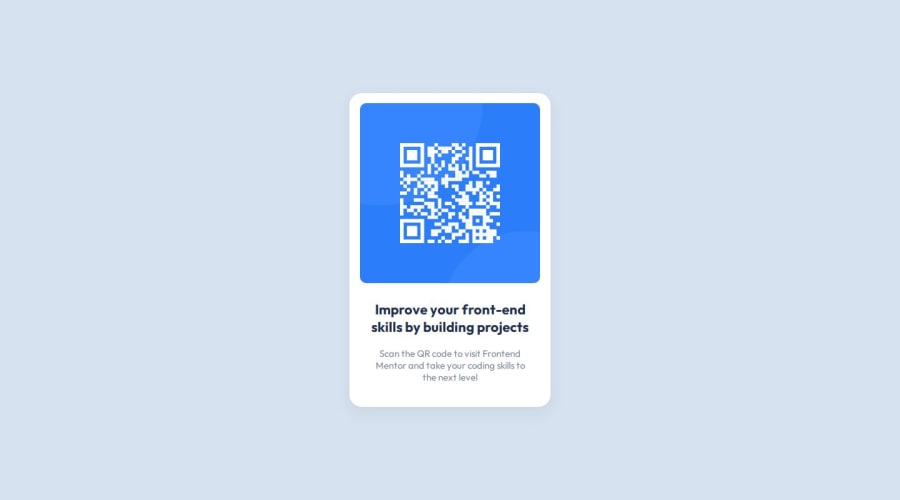
Design comparison
Solution retrospective
I take pride in achieving a design that closely resembles the provided challenge. The attention to detail and fidelity to the original design are aspects Iβm pleased with.
For future projects, I would consider the following improvements:
Responsive Design: While the current solution works well, enhancing responsiveness for various screen sizes would be beneficial.
Code Organization: Structuring the CSS more efficiently and modularly could make maintenance easier.
Accessibility: Ensuring proper accessibility features (like alt text for images) would enhance usability.
What challenges did you encounter, and how did you overcome them?The primary challenge was centering the components and aligning items precisely according to the challenge image.
To overcome this, I experimented with different CSS techniques, such as flexbox and media queries. I iterated until achieving the desired layout.
What specific areas of your project would you like help with?Currently, I donβt need assistance with any specific areas. However, Iβm open to feedback on any aspect of the project.
Community feedback
- @danielmrz-devPosted 7 months ago
Hey @rohanvron!
Your solution is really impressive!
I've got a couple of ideas (about how to use HTML better) that could make it even stronger:
π First: Think about using
<main>
to wrap your main content instead of<div>
.Imagine
<div>
and<span>
in HTML as basic containers. They're good for holding stuff, but they don't tell us much about what's inside or its purpose on the webpage.π Second: Consider using
<h1>
for your main title instead of<h2>
.It's more than just text size β it's about structuring your content effectively:
- The
<h1>
to<h6>
tags are used to define HTML headings. <h1>
is for the most important heading.<h6>
is for the least important heading.- Stick to just one
<h1>
per page β it should be the main title for the whole page. - And don't skip heading levels β start with
<h1>
, then use<h2>
, and so on.
These tweaks might not change how your page looks, but they'll make your HTML code clearer and help with SEO and accessibility.
Hope that's helpful!
Keep up the great work!
Marked as helpful1@rohanvronPosted 7 months ago@danielmrz-dev
Hi Daniel,
Thanks a bunch for your thoughtful feedback! I appreciate your insights on using
<main>
and<h1>
tags effectively. Iβll definitely make those adjustments to improve my code. π1 - The
- @jguleserianPosted 7 months ago
Greetings, Rohan,
Thank you for letting me take a look at your solution for the QR Code Component Solution. It looks like you did a great job mimicing the design and the overall look is as intended by the challenge. Well done!
Other positives:
- Your HTML and CSS is easy to read and follow.
- You solution is simple and effecient.
- Your solution is sound technically and incorporates at least a modicum of accessibility practices. Other practices you could consider as a next step are:
- A
<meta>
tag in the head that also has a description of the page, something like this: `<meta name="description" content="[description of page]"> This is also a good practice for search engine optimization (SEO) - Include an
<h1>
tag somewhere to assist screen readers in grasping the structure of the page. If you don't want to use an<h1>
tag, then consider making an element visible only to screen readers. Mark these section with a class like "sr-only" or something similar. Then "hide" the element from everyone else. A common CSS pattern for the "sr-only" is as follows:span[class~="sr-only"] { border: 0; clip: rect(1px, 1px, 1px, 1px); clip-path: inset(50%); height: 1px; width: 1px; overflow: hidden; white-space: nowrap; position: absolute; padding: 0; margin: -1px; }
- In all, there are copious methods for enhancing accessibility practices, but since these have to do with more complex HTML structures, such as forms, they are not yet relevant to this critique.
- A
Areas of attention Though your solution is really great, here are a couple of items that might also be helpful.
- Use the README.me file and fill in the sections. This process is very helpful in developing as a professional. It also gives your reviewers a better insight into your thought process and workflow. most importantly, it will help you focus on your goals and direction and facilitate you development.
- The design of the QR Code Component, although an applaudable copy of the original, is a bit smaller than the prototype. However, I believe that this is the fault of the FM, given that they do not give dimensions. I remember doing this challenge and having to compare the browser windows to get an "accurate" estimation of the width. Anyway, I believe the original width of the entire component is supposed to be 300px, but this is certainly nothing to fret over.
Areas of exploration You mentioned several areas that you would like to explore. Here I will try and give you some thought, resources, and further suggestions. Centering elements on the page This is acommon problem, especially for containers that don't seem act as we expect the to. Here are some thoughts that might help:
- Make sure the container/item you are trying to center has dimension to it, i.e., a height and width; otherwise, it may be centered, but you will not be able to see it.
- Make sure the parent container of the item you are trying to center has a position setting, either relative or absolute.
- Flexbox works great, as you mentioned in your comments, but if I am trying to center a single item, I use this technique:
-Make sure the container has dimensions as mentioned above.
-Make sure the parent container has a position setting.
-Set the position of the item I am trying to center to absolute and then set its position to
top: 50% left: 50%
. This puts the top left corner of your item in the exact center of the container. -Now usetransform: translate(-50%, -50%)
to move the item back and up 50%. The item will be in the exact center. Adjust thetranslate
property if you want it at the top or bottome, etc. -This trick works every time and is perfectly responsive.
Structuring/Organizing CSS
Believe it or not, this is a topic that leads to a great deal of vociferous debate. Although there are many systems, ultimately you will have to land on the one that is used by whatever team you are a part of. Meanwhile, I recommend you take a look at this article on MDN Organizing your CSS. In short, BEM is the most used style from what I understand. However, the system I believe is the best, and the one I try to use is GPS CSS Methodology. The latter one is, for me, easier to read, more efficient (DRY), and prevents scope leaks better.
Anyway, Rohan, I congradulate you on a job well done. I hope you find my comments helpful. I also wish you well as you continue your journey (don't foget to document it through the README.md files :))
Happy coding!
Jeff Guleserian
Marked as helpful1@rohanvronPosted 7 months ago@jguleserian
Hello Jeff,
Thank you for taking the time to review my QR Code Component Solution. I appreciate your positive feedback and constructive insights. Iβm committed to continuous improvement, and your insights will undoubtedly contribute to my growth as a developer. Happy coding!
0
Please log in to post a comment
Log in with GitHubJoin our Discord community
Join thousands of Frontend Mentor community members taking the challenges, sharing resources, helping each other, and chatting about all things front-end!
Join our Discord