
Bmi calculator - React & Styled Components


Design comparison
Solution retrospective
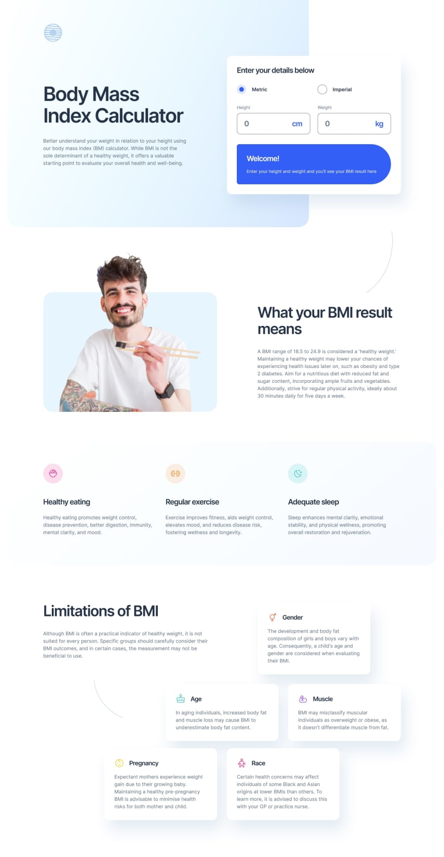
The calculator can convert all the units in real time.
What challenges did you encounter, and how did you overcome them?Two big challenges :
- How to manage correctly the conversion between one unit to all others.
- How to create the Limitations of BMI section correctly, with the grid tool?
- How to create the Limitations of BMI section correctly, with the grid tool?
Community feedback
- P@jguleserianPosted 10 months ago
Good morning, Aurélien! Thank you for letting me take a look at your solution of the BMI Calculator. I just turned in my own solution of the project as well, so it is still fresh on my mind. While I can't speak to your code directly, since I haven't used React, I might share my perspective on a couple of things you mentioned under "challenges" section.
First, concerning the conversions of one unit to another, I decided not to even try to do it. I took in the imperial units as they were and just sent them to a different function. To find BMI using the imperial measurements, I used the formula: (weight in lbs) * 703 / (height in inches) squared. Doing it this way save me from having to put in individual conversions prior to sending the data through the same metric formula. You are welcome to take a look at my solution and see how I did it, if you're interested: My repository.
Second, I also used CSS Grid to organize the "Limitations" section." At first I tried using Flexbox, but ran into problems. Once I converted to Grid, it became easier and the individual cards stopped moving around. To get them closest to their correct position, I made the Grid with 6 columns and 3 rows. Then I named all the locations (you can see the detail in my styles.css file). Once the items were close to their final positions, I used margins to adjust them; I used negative margins if I needed to move an item to the left of its division line. Of course, once I scaled down below the 768px tablet size, I converted everything back to Flexbox and let them all align themselves. The grid container ended up looking like this: `.grid-container { display: grid; grid-template-areas: 'limitations limitations limitations gender gender gender' 'graphic graphic age age muscle muscle' 'pregnancy pregnancy pregnancy race race race'; row-gap: 3.2rem; column-gap: 3.2rem; margin-top: 21rem;
@media (max-width:1230px) { grid-template-areas: 'limitations limitations' 'gender age' 'muscle pregnancy' 'race race'; margin-top: 9.6rem; }
@media (max-width: 768px) { margin-top: 15.6rem; row-gap: 2.4rem; column-gap: 1.4rem; padding: 0 5.2% 0 4.9%; }
@media (max-width: 700px) { display: flex; flex-direction: column; align-items: center; margin-bottom: 9.6rem; padding: 0; }
@media (max-width: 375px) { margin-top: 12.7rem; gap: 1.5rem; } }` I hope you find this at least a little helpful.
I did notice that your welcome message and the blue-colored results box wasn't showing up when the page loaded. That was probably just a simple oversight or possibly an issue with GitHub.
Anyway, I enjoyed taking a look at your project. Thanks for letting me examine your work. I always learn so much from doing this.
Happy coding! Jeff
0

Please log in to post a comment
Log in with GitHub
Join our Discord community
Join thousands of Frontend Mentor community members taking the challenges, sharing resources, helping each other, and chatting about all things front-end!
Join our Discord