Not Found
Not Found
Not Found
Not Found
Not Found
Not Found
Not Found
Not Found
Not Found
Not Found
Not Found
Not Found
Not Found
Not Found
Not Found
Not Found
Not Found
Not Found
Not Found
Not Found

Submitted

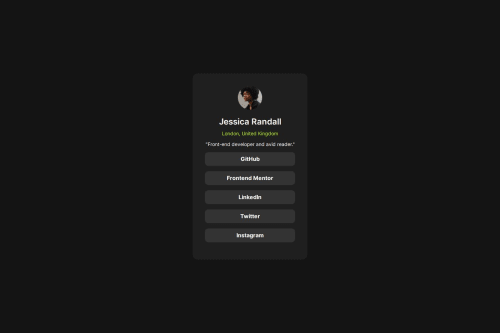
Social Links Profile HTML CSS

@Siyam1888

Desktop design screenshot for the Social links profile coding challenge

This is a solution for...

  • HTML
  • CSS
1newbie
View challenge

Design comparison


SolutionDesign

Solution retrospective


What are you most proud of, and what would you do differently next time?

I really feel amazed to see that I could successfully design it myself.

I would like to use more reusable CSS in the upcoming projects.

What challenges did you encounter, and how did you overcome them?

For this one I did not encounter any mentionable challenge.

What specific areas of your project would you like help with?

I am a beginner, and your feedback on any topic regarding semantic HTML and efficient CSS will be highly appreciated.

Thank you.

Community feedback

P

@jguleserian

Posted

Greetings, Siyam!

Thank you for sharing your solution to the Social Links Profile. You should be proud of yourself for completing this project with such a similitud to the original, especially if you are a beginner.

I did notice a couple of irregularities that you may, or may not, have already noticed. The overall length of the project is not the same as the model. This is due to incorrect margins between the heading elements and link elements. While it looks great the way you have it, the goal is to get it like the original. Moreover, concerning the size, the submission is not responsive, that is, it does not change as the screen size changes according to the provided models. You should also have an adaptation for screen sizes of 767px and 375px. This generally handled through "media queries." Take a look at W3Schools' for more information. This will be a good primer on the subject. I hope you find it helpful.

I also noticed that you used a <div> element to encapsulate your links. In the future you may try to use something less generic, for instance, <section> or <article>. While a lot of this is certainly personal choice, it can be helpful to mark out sections using semantically specific nomenclature. Here is a link to W3Schools' Layout elements and Techniques to see more of what I'm talking about. What I might suggest is something like:

<body>
  <main class="card">
     <header class="user-profile">
       <img src="./assets/images/avatar-jessica.jpeg" alt="Profile Picture" class="profile-picture">
       <h1 class="name">Jessica Randall</h1>
       <p class="location">London, United Kingdom</p>
       <p class="description">"Front-end developer and avid reader."</p>
    </header>
     <section class="links">
  <a href="#" class="social-link">GitHub</a>
    <a href="#" class="social-link">Frontend Mentor</a>
    <a href="#" class="social-link">LinkedIn</a>
    <a href="#" class="social-link">Twitter</a>
    <a href="#" class="social-link">Instagram</a>
    </section>
  </main>
</body>

Dividing it up into sections like this would also make spacing easier. You could turn the <section class="links"> into a flex container and handle all the spacing by just defining the flex's gap. The same goes for the <header> section (though you would have to put the "name" and "location" in their own <div> first. If you are curious, you are welcome to look at my personal solution of the project and how I solved it.

I noticed that you did a really great job in making the links, <a>, look like those in the model. I might just throw this out there that you may want to consider creating buttons instead, and then turning the buttons into links. The reason for this is that, in the future, you may be using JavaScript to do something with those links, in which case, the button would make more sense.

Finally, I noticed that your cursor changed, as it should, when it hovers over the links. This happens automatically with the <a> element. However, I noticed that the background and text of the link do not change like they should. The reason is that you used:

.social-link:active{
    background-color: var(--Green);
    color: var(--Grey-700);
}

which means that it will only turn while it is being clicked on. The fix is easy (just a difference in the pseudo-class used):

.social-link:hover{
    background-color: var(--Green);
    color: var(--Grey-700);
}

Anyway, kudos again for doing such a fine job. You have reason to be proud of yourself. Keep up the good work and keep marching forward. I hope my comments are helpful. I certainly appreciate you allowing me to take a look at your work!

Happy coding!

Jeff

0

Please log in to post a comment

Log in with GitHub
Discord logo

Join our Discord community

Join thousands of Frontend Mentor community members taking the challenges, sharing resources, helping each other, and chatting about all things front-end!

Join our Discord