Not Found
Not Found
Not Found
Not Found
Not Found
Not Found
Not Found
Not Found
Not Found
Not Found
Not Found
Not Found
Not Found
Not Found
Not Found
Not Found
Not Found
Not Found
Not Found
Your session has expired please log in again.

All comments

  • @ogb-daniel

    Submitted

    What are you most proud of, and what would you do differently next time?

    N/A

    What challenges did you encounter, and how did you overcome them?

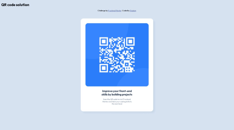
    Centering content in screen Overcome by setting default margin and padding of all elements to 0, used a flex container with 100vh to center vertically

    What specific areas of your project would you like help with?

    N/A

    @davidochoadev

    Posted

    Congrats for your solution!🥳

    The <div> element that contains the attributions, the one below the <main>, could have been used as a <footer> element.

    Explanation:

    In HTML, the <footer> element is specifically designed to represent the footer of a section or a document. It typically contains information such as copyright notices, contact information, links to related documents, and other metadata about the section.

    Using <footer> instead of a generic <div> has several benefits:

    • Semantics: It provides a clear semantic meaning to the content, making it easier for screen readers and other assistive technologies to understand the structure of the page.
    • SEO: Search engines may give more weight to content within a <footer> element, as it is considered to be important metadata about the page.
    • Accessibility: It helps users with disabilities to navigate the page more easily, as they can quickly identify the footer section.

    In your case, since the <div> element below the <main> seems to contain attributions, which is a typical type of content found in footers, it would be more appropriate to use the <footer> element instead.

    0
  • @HectorAgValenzuela

    Submitted

    I found it difficult to adjust the margin-top of the card, is there a way to do this adjustment effectively? I think i made it hardcoded

    @davidochoadev

    Posted

    Hi @HectorAgValenzuela,

    First of all congrats for your solution! 🎉 I've reviewed your source code, and after analyzing the structure, I have a few suggestions for future improvements. It's always a good practice to properly structure the code within the <body> element by using predefined semantic elements. I recommend checking out this link.

    This resource explains the concept of semantic HTML without going into too much detail and highlights its importance, particularly for SEO and accessibility purposes. One specific suggestion I have is to utilize the <main> and <footer> tags in your HTML code, as they provide several benefits:

    • Semantic structure: By incorporating the <main> and <footer> tags, you establish a semantic structure for your HTML document. These tags clearly indicate the main content and footer sections of your webpage, enhancing the accessibility and maintainability of your code. This approach reflects the logical organization of your content.

    • Accessibility: Semantically structuring your content using <main> and <footer> tags improves the accessibility of your website. Assistive technologies, including screen readers, can easily identify these sections, making it more convenient for users with disabilities to navigate through the main content and locate important information in the footer.

    • Search engine optimization (SEO): Search engines like Google rely on semantic HTML to understand the structure and meaning of webpages. Utilizing the <main> and <footer> tags provides clear indicators to search engines regarding the primary content and supplementary information on your page. This can positively impact your search engine rankings and improve the visibility of your website.

    • Code organization and readability: Incorporating dedicated tags like <main> and <footer> enhances the organization and readability of your HTML code. Other developers working on your codebase or maintaining your website will have a clearer understanding of the purpose and structure of different sections. This makes it easier to update or modify the code in the future.

    To address the issue at hand, I suggest removing the margins and ensuring that the card is placed inside a container that occupies the entire screen both in terms of height and width (you can use <main>😼). This way, you can utilize flexbox to center the card structure.

    • A guide to flexbox: Link

    • A game for learning CSS flexbox: Link

    By adopting semantic HTML and utilizing tags like <main> and <footer>, you not only enhance the accessibility and search engine visibility of your website but also improve the overall maintainability and understandability of your codebase. This best practice contributes to better user experiences and efficient web development workflows.

    Let me know if you have any questions or need further assistance.

    Best regards,

    David Ochoa. 🙏🏻

    Marked as helpful

    2
  • @Tarek-bari

    Submitted

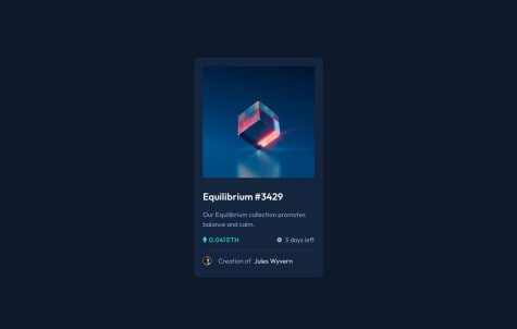
    i find difficult in this case: when the user hover on the svg shape (eye) i can not controle the opacity of the image for reduce and display the color of background (main color) . i need to know how can i solve this problem and what is the best practice. in the end , thank you so much for challenges.

    @davidochoadev

    Posted

    First of all Congrats for your solution. The issue with your CSS is that you applied the opacity rule to the img element within .card .image img:hover. This rule is only triggered when the mouse hovers over the image itself, not the SVG shape (eye). As a result, even though the SVG displays correctly when hovering over the .card .image element, the image's opacity does not change as desired.

    The issue:

    .card .image img:hover {
    opacity: .5;
    }
    

    A simple solution would be to move the hover effect to the container of the img element, which is the element with the class .image. By applying the hover effect to this container and targeting the img element inside it, you can achieve the desired opacity change.

    Here's the correct CSS code:

    .card .image:hover img {
    opacity: 0.5;
    }
    

    With this modification, when you hover over the .card .image element, the img element inside it will correctly change opacity as intended. I hope I've been helpful to you, and keep up the great work!

    Best regards,

    David Ochoa. 😼

    Marked as helpful

    1
  • HeroLeam 30

    @HeroLeam

    Submitted

    In my view it was a simple project to start my career, I had no difficulties, the project is visibly close to the challenge, I can't say if I did the development correctly and not to say the patterns in question of typing the codes.

    If you can evaluate and mention points that I can improve, thank you!

    @davidochoadev

    Posted

    Great job on the structure! Considering it's your first project, it's truly impressive. I wanted to commend you on your attention to detail and the overall quality of your work. I do have a few suggestions that you might find helpful.

    Firstly, regarding the structure of your code, you mentioned using the <main> tag to contain all the code. While the <main> tag is typically used to define the primary content of a webpage, it is not necessary to enclose all the code within it, as the <body> tag already fulfills that purpose. You can optimize your code by eliminating the redundant <main> tag.

    Additionally, I noticed that you used a div with a class .attribute for a certain section inside the <main> section. In terms of semantics and best practices, it might be more appropriate to use an <footer> element instead and place it outside the <main> section. The <footer> element is specifically designed to represent the footer section of a webpage, where you can include information such as author details, copyright information, contact information, or relevant links. This small adjustment will enhance the clarity and structure of your code.

    Furthermore, I suggest paying attention to the padding of the <h2> element. By refining the padding values for the left and right sides, you can fine-tune the spacing and alignment of your heading, ensuring it looks visually appealing and consistent across different devices. Consider experimenting with different padding values to achieve the desired visual effect.

    Lastly, I highly recommend leveraging the powerful inspector tool available in your browser. This tool allows you to examine your webpage's layout and design on various devices and screen sizes. By utilizing the inspector, you can identify any potential issues or areas for improvement, ensuring that your design is both responsive and visually appealing across different devices.

    I hope you find these suggestions helpful. Keep up the fantastic work!

    Best Regards,

    David Ochoa. 😼

    0
  • Karthik 220

    @Bi-Byee

    Submitted

    When I was trying to center h2 for some reason it didn't work on bottom or top tag and when I tried negative numbers it did and I don't know why? Any explanation and is it good practice to do this.

    Over and out, Karthik

    @davidochoadev

    Posted

    My friend, there are indeed many improvements you can make in your code. Firstly, I noticed that you haven't used either flexbox or grid extensively. It's essential to delve deeper into these technologies as they are crucial for creating responsive layouts across all devices. By utilizing flexbox and grid, you can achieve responsive designs without the need to manually position elements using 'top' or 'bottom'. I would strongly recommend familiarizing yourself with these tools as they provide more efficient ways to handle layout and alignment.

    By incorporating flexbox or grid into your CSS, you can take advantage of their powerful features to create flexible and adaptive designs. These technologies provide intuitive methods for positioning, spacing, and aligning elements, allowing your layout to automatically adjust based on the available space and screen size. This not only simplifies the code but also improves its maintainability and readability.

    In summary, I encourage you to explore flexbox and grid further to enhance your skills in creating responsive layouts. They will provide you with a solid foundation for designing websites that adapt seamlessly to different devices. I'll leave you with some very helpful and interesting links to learn more about these two things:

    Flexbox:

    Grid:

    These resources will provide you with a solid foundation and help you master flexbox and grid. Enjoy learning and applying these techniques to create responsive and well-structured layouts!"

    0
  • Honeypot 10

    @godwinjs

    Submitted

    I had issues with the responsive design of the card. the card breaks at 500px to 814px screen size, I had to use a font size compromise, not a great fix. had to add an extra breakpoint.

    I think it would be preferable to use css grind instead.

    what would be a better way to make the responsiveness of the card work well?

    @davidochoadev

    Posted

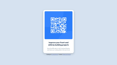
    Hi @godwinjs, congratulations on completing this challenge! To answer your question, you will need to use grid in your CSS or flexbox. The first thing to do could be to modify the main element with the following properties:

    • min-height: 100vh; sets the minimum height of the <main> element to occupy at least the full viewport height, ensuring that the content is visible even on smaller screens.
    • display: flex; enables flexbox layout for the <main> element.
    • justify-content: center; horizontally centers the content within the <main> element.
    • align-items: center; vertically centers the content within the <main> element.

    After that, you can make the following changes to improve the responsiveness of the card:

    • Remove unnecessary CSS: You can remove the position: absolute;, left: 50%;, and top: 50%; properties from the .qr_card class. These properties are not necessary for achieving responsiveness and centering the card.
    • Remove unnecessary media queries: You can remove the media queries targeting specific screen widths (e.g., @media only screen and (min-width: 376px)) and their corresponding CSS rules. This simplifies the code and avoids the need for compromises and extra breakpoints.
    • Adjust max-width for better responsiveness: Change the max-width or min-width value of the .qr_card class maybe to 350px. This allows the card to adapt its width based on the available space while maintaining a consistent layout.
    • Improve text alignment: Add text-align: center; to the .qr_card class. This will align the card's content (title and text) to the center, making it visually pleasing on different screen sizes.
    • Improve font size for title and text: Adjust the font sizes for the .qr_card_title and .qr_card_text classes. You can use font-size: 3em; for the title or maybe font-size: 1rem; for the text, making the font sizes more appropriate for different screen sizes.

    these could be your style.css

    body {
    background-color: hsl(212, 45%, 89%);
    font-family: 'Outfit', sans-serif;
    font-size: 10px;
    }
    
    header {
    display: flex;
    align-items: center;
    justify-content: space-around;
    width: 100%;
    }
    
    body {
    background-color: hsl(212, 45%, 89%);
    font-family: 'Outfit', sans-serif;
    font-size: 10px;
    }
    
    header {
    display: flex;
    align-items: center;
    justify-content: space-around;
    width: 100%;
    }
    
    .qr_card {
    margin: 0 10px;
    background-color: hsl(0, 0%, 100%);
    padding: 20px 20px 0 20px;
    max-width: 350px;
    border-radius: 1rem;
    box-shadow: 10px 10px 10px hsl(212, 39%, 85%);
    transition: width .5s;
    text-align: center;
    }
    
    .qr_card_title {
    font-weight: 700;
    color: hsl(218, 44%, 22%);
    text-align: center;
    font-size: 3em;
    }
    
    .qr_card_text {
    font-weight: 400;
    color: hsl(220, 15%, 55%);
    text-align: center;
    font-size: 2em;
    }
    
    .qr_card_img {
    border-radius: 1rem;
    max-width: 100%;
    }
    
    main {
    min-height: 100vh;
    display: flex;
    justify-content: center;
    align-items: center;
    }
    
    .qr_card {
    margin: 0 10px;
    background-color: hsl(0, 0%, 100%);
    padding: 20px 20px 0 20px;
    max-width: 350px;
    border-radius: 1rem;
    box-shadow: 10px 10px 10px hsl(212, 39%, 85%);
    transition: width .5s;
    text-align: center;
    }
    
    .qr_card_title {
    font-weight: 700;
    color: hsl(218, 44%, 22%);
    text-align: center;
    font-size: 3em;
    }
    
    .qr_card_text {
    font-weight: 400;
    color: hsl(220, 15%, 55%);
    text-align: center;
    font-size: 2em;
    }
    
    .qr_card_img {
    border-radius: 1rem;
    max-width: 100%;
    }
    

    These changes will help make the card more responsive and provide a better user experience across various screen sizes. Another suggestion would be to keep the directory organized by avoiding nested routes of elements. The simpler, the better. Anyway, this could be a possible solution. I hope I have been helpful.

    Regards,

    David Ochoa 😼

    Marked as helpful

    1
  • @RafaelRi23

    Submitted

    I don't know how to use media query, i'm not sure how to resize the layout on differents screen sizes.

    Is there any difference between id and class in CSS? I don't know who's the best to use.

    @davidochoadev

    Posted

    If you're unsure about using media queries and resizing layouts for different screen sizes, i can provide you with a brief overview to get you started.

    Media queries are a fundamental part of responsive web design. They allow you to apply specific CSS styles based on different screen sizes or device characteristics. This enables your website to adapt and provide an optimal viewing experience across various devices.

    Here's a basic example of how to use media queries:

    /* Default styles */
    .element {
    /* Default styles here */
    }
    
    /* Media query for screens smaller than 600px */
    @media (max-width: 600px) {
    .element {
    /* Styles for smaller screens here */
    }
    }
    
    /* Media query for screens between 600px and 900px */
    @media (min-width: 601px) and (max-width: 900px) {
    .element {
    /* Styles for medium-sized screens here */
    }
    }
    
    /* Media query for screens larger than 900px */
    @media (min-width: 901px) {
    .element {
    /* Styles for larger screens here */
    }
    }
    

    In the example above, we define different styles for the .element based on different screen sizes using media queries. The styles within each media query will only apply when the specified conditions are met.

    To get started with media queries, consider the following steps:

    • Identify the breakpoints: Determine the points at which you want your layout to change based on different screen sizes. Common breakpoints include small screens (e.g., mobile), medium-sized screens (e.g., tablets), and larger screens (e.g., desktops).

    • Write CSS within media queries: Within each media query, specify the desired CSS styles that should be applied when the screen size matches the defined conditions. You can adjust properties such as width, height, font sizes, margins, and more to achieve the desired layout adjustments.

    • Test and refine: Preview your website on different devices or use browser developer tools to simulate different screen sizes. This way, you can observe how your layout responds and make any necessary adjustments to ensure a visually appealing and user-friendly experience across devices.

    Remember to use relative units (such as percentages, em, or rem) instead of fixed pixel values to allow for fluid and flexible layouts.

    By understanding and utilizing media queries effectively, you can create responsive designs that adapt beautifully to various screen sizes and improve the overall user experience on different devices.

    Marked as helpful

    1
  • @RafaelRi23

    Submitted

    I'm struggling less with flexbox, but I can't make the footer to get fixed in the bottom, so I used padding to expand the box and throw it down. I guess there's another way to do this but I don't know how.

    @davidochoadev

    Posted

    If you want to fix the footer at the bottom of the page, you can consider using the following CSS code:

    .attribuition {
    position: fixed;
    bottom: 0;
    width: 100%;
    }
    

    This code targets the footer element with the class ".attribuition" and applies the following styles:

    • position: fixed;: This property sets the positioning of the element to "fixed." With a fixed position, the element is taken out of the normal document flow and remains fixed relative to the viewport, regardless of scrolling.

    • bottom: 0;: This property positions the element at the bottom of its containing element or the viewport if no containing element is specified. In this case, it sets the element to be positioned at the bottom of the viewport.

    • width: 100%;: This property sets the width of the element to 100% of its containing element. It ensures that the footer spans the entire width of the viewport.

    By applying these styles to the footer element, you can achieve the desired effect of fixing the footer at the bottom of the page. This is useful when you want the footer to remain visible at all times, even when scrolling through long content.

    Regards,

    David Ochoa😼

    Marked as helpful

    1
  • @armando1236

    Submitted

    Did I center the QR image correctly? I gave each side a different margin. I tried using auto for the left and right margin but it didn't work.

    Should I have given the bottom text a separate p tag instead of using span?

    How do you know when you should use rem, em, px, or % for sizing the width or anything else?

    @davidochoadev

    Posted

    I've reviewed your source code, and regarding the structure, there are some improvements you could consider in the future. It's good practice to properly structure the code within the <body> by using predefined semantic elements. I recommend checking out this link.

    It explains the concept of semantic HTML without going into too much detail and why it's important, especially for SEO and accessibility purposes. For example using the <main> and <footer> tags in HTML provides several benefits:

    • Semantic structure: The <main> and <footer> tags help establish a semantic structure for your HTML document. By using these tags, you clearly indicate the main content and footer sections of your webpage. This semantic structure improves the accessibility and maintainability of your code, as it reflects the logical organization of your content.

    • Accessibility: Semantically structuring your content using <main> and <footer> tags enhances the accessibility of your website. Screen readers and other assistive technologies can identify these sections, making it easier for users with disabilities to navigate through the main content and locate important information in the footer.

    • Search engine optimization (SEO): Search engines, like Google, rely on semantic HTML to understand the structure and meaning of webpages. By using the <main> and <footer> tags, you provide search engines with clear indicators of the primary content and supplementary information on your page. This can positively impact your search engine rankings and improve the visibility of your website.

    • Code organization and readability: Using dedicated tags like <main> and <footer> enhances the organization and readability of your HTML code. Other developers who work on your codebase or maintain your website will have a clearer understanding of the purpose and structure of different sections, making it easier to update or modify the code in the future.

    By adopting semantic HTML and using tags like <main> and <footer>, you not only enhance the accessibility and search engine visibility of your website but also improve the overall maintainability and understandability of your codebase. It's a best practice that contributes to better user experiences and efficient web development workflows.

    Marked as helpful

    1
  • @davidochoadev

    Posted

    The last <div> could also be a <footer>, or alternatively, you could add role="contentinfo" to your div. However, on MDN Web Docs, they always recommend using a <footer>. The use of <footer> is recommended for several reasons when structuring the content of a web page.

    Firstly, a <footer> element provides semantic meaning to the content it wraps. It clearly indicates that the enclosed content represents the footer section of the page, which typically contains information related to the document as a whole, such as copyright notices, contact details, and navigation links.

    By using a <footer>, you improve the accessibility and assistive technology support of your website. Screen readers and other assistive devices can recognize the <footer> element and convey its purpose to users, allowing them to easily navigate and understand the structure of the page.

    Moreover, <footer> helps with search engine optimization (SEO). Search engines analyze the structure and content of a webpage to determine its relevance and rank it in search results. By using semantic elements like <footer>, you provide additional context to search engines, enabling them to better understand and index your content.

    In addition, using a <footer> element makes your HTML code more readable and maintainable. It clearly delineates the footer section, separating it from the rest of the page's content. This separation enhances code organization and makes it easier to modify or update the footer content independently without affecting other sections of the page.

    Overall, incorporating a <footer> element in your webpage structure offers benefits in terms of semantics, accessibility, SEO, and code maintainability. It ensures clear and meaningful presentation of footer-related content while improving the overall user experience.
    1