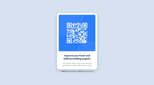
Design comparison
Solution retrospective
In my view it was a simple project to start my career, I had no difficulties, the project is visibly close to the challenge, I can't say if I did the development correctly and not to say the patterns in question of typing the codes.
If you can evaluate and mention points that I can improve, thank you!
Community feedback
- @0xabdulkhaliqPosted over 1 year ago
Hello there 👋. Congratulations on successfully completing the challenge! 🎉
- I have other recommendations regarding your code that I believe will be of great interest to you.
HEADINGS ⚠️:
- This solution consists incorrect usage of
<h2>
so it can cause severe accessibility errors due to incorrect usage of level-two headings<h2>
- Every site must want only one
h1
element identifying and describing the main content of the page.
- An
h1
heading provides an important navigation point for users of assistive technologies, allowing them to easily find the main content of the page.
- In this solution there's
<h2>
element which is this<h2>Improve your...</h2>
, you can preferably use<h1>
instead of<h2>
. Remember<h1>
provides an important navigation point for users of assistive technologies so we want to use it wisely
- So we want to add a level-one heading to improve accessibility
- Example:
<h1>Improve your front-end skills by building projects</h1>
- If you have any questions or need further clarification, and feel free to reach out to me.
- If you have any questions or need further clarification, you can always check out
my submission
and/or feel free to reach out to me.
.
I hope you find this helpful 😄 Above all, the solution you submitted is great !
Happy coding!
0 - @davidochoadevPosted over 1 year ago
Great job on the structure! Considering it's your first project, it's truly impressive. I wanted to commend you on your attention to detail and the overall quality of your work. I do have a few suggestions that you might find helpful.
Firstly, regarding the structure of your code, you mentioned using the
<main>
tag to contain all the code. While the<main>
tag is typically used to define the primary content of a webpage, it is not necessary to enclose all the code within it, as the<body>
tag already fulfills that purpose. You can optimize your code by eliminating the redundant<main>
tag.Additionally, I noticed that you used a div with a class
.attribute
for a certain section inside the<main>
section. In terms of semantics and best practices, it might be more appropriate to use an<footer>
element instead and place it outside the<main>
section. The<footer>
element is specifically designed to represent the footer section of a webpage, where you can include information such as author details, copyright information, contact information, or relevant links. This small adjustment will enhance the clarity and structure of your code.Furthermore, I suggest paying attention to the padding of the
<h2>
element. By refining the padding values for the left and right sides, you can fine-tune the spacing and alignment of your heading, ensuring it looks visually appealing and consistent across different devices. Consider experimenting with different padding values to achieve the desired visual effect.Lastly, I highly recommend leveraging the powerful inspector tool available in your browser. This tool allows you to examine your webpage's layout and design on various devices and screen sizes. By utilizing the inspector, you can identify any potential issues or areas for improvement, ensuring that your design is both responsive and visually appealing across different devices.
I hope you find these suggestions helpful. Keep up the fantastic work!
Best Regards,
David Ochoa. 😼
0
Please log in to post a comment
Log in with GitHubJoin our Discord community
Join thousands of Frontend Mentor community members taking the challenges, sharing resources, helping each other, and chatting about all things front-end!
Join our Discord