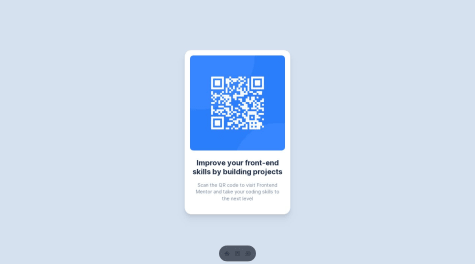
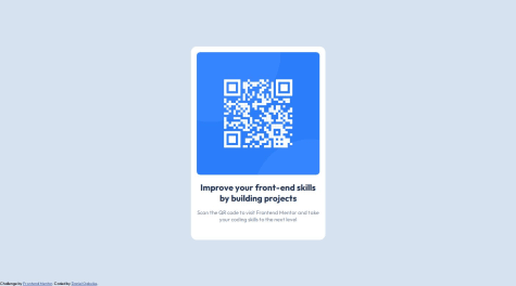
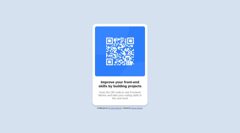
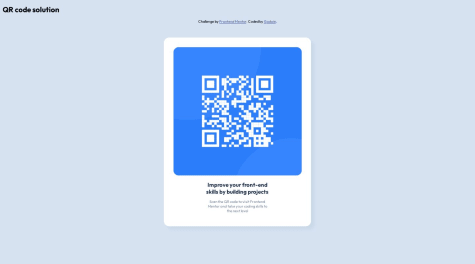
Hi @godwinjs, congratulations on completing this challenge! To answer your question, you will need to use grid in your CSS or flexbox. The first thing to do could be to modify the main element with the following properties:
min-height: 100vh; sets the minimum height of the <main> element to occupy at least the full viewport height, ensuring that the content is visible even on smaller screens.display: flex; enables flexbox layout for the <main> element.justify-content: center; horizontally centers the content within the <main> element.align-items: center; vertically centers the content within the <main> element.
After that, you can make the following changes to improve the responsiveness of the card:
- Remove unnecessary CSS: You can remove the
position: absolute;, left: 50%;, and top: 50%; properties from the .qr_card class. These properties are not necessary for achieving responsiveness and centering the card.
- Remove unnecessary media queries: You can remove the media queries targeting specific screen widths (e.g.,
@media only screen and (min-width: 376px)) and their corresponding CSS rules. This simplifies the code and avoids the need for compromises and extra breakpoints.
- Adjust max-width for better responsiveness: Change the
max-width or min-width value of the .qr_card class maybe to 350px. This allows the card to adapt its width based on the available space while maintaining a consistent layout.
- Improve text alignment: Add
text-align: center; to the .qr_card class. This will align the card's content (title and text) to the center, making it visually pleasing on different screen sizes.
- Improve font size for title and text: Adjust the font sizes for the
.qr_card_title and .qr_card_text classes. You can use font-size: 3em; for the title or maybe font-size: 1rem; for the text, making the font sizes more appropriate for different screen sizes.
these could be your style.css
body {
background-color: hsl(212, 45%, 89%);
font-family: 'Outfit', sans-serif;
font-size: 10px;
}

header {
display: flex;
align-items: center;
justify-content: space-around;
width: 100%;
}

body {
background-color: hsl(212, 45%, 89%);
font-family: 'Outfit', sans-serif;
font-size: 10px;
}

header {
display: flex;
align-items: center;
justify-content: space-around;
width: 100%;
}

.qr_card {
margin: 0 10px;
background-color: hsl(0, 0%, 100%);
padding: 20px 20px 0 20px;
max-width: 350px;
border-radius: 1rem;
box-shadow: 10px 10px 10px hsl(212, 39%, 85%);
transition: width .5s;
text-align: center;
}

.qr_card_title {
font-weight: 700;
color: hsl(218, 44%, 22%);
text-align: center;
font-size: 3em;
}

.qr_card_text {
font-weight: 400;
color: hsl(220, 15%, 55%);
text-align: center;
font-size: 2em;
}

.qr_card_img {
border-radius: 1rem;
max-width: 100%;
}

main {
min-height: 100vh;
display: flex;
justify-content: center;
align-items: center;
}

.qr_card {
margin: 0 10px;
background-color: hsl(0, 0%, 100%);
padding: 20px 20px 0 20px;
max-width: 350px;
border-radius: 1rem;
box-shadow: 10px 10px 10px hsl(212, 39%, 85%);
transition: width .5s;
text-align: center;
}

.qr_card_title {
font-weight: 700;
color: hsl(218, 44%, 22%);
text-align: center;
font-size: 3em;
}

.qr_card_text {
font-weight: 400;
color: hsl(220, 15%, 55%);
text-align: center;
font-size: 2em;
}

.qr_card_img {
border-radius: 1rem;
max-width: 100%;
}
These changes will help make the card more responsive and provide a better user experience across various screen sizes. Another suggestion would be to keep the directory organized by avoiding nested routes of elements. The simpler, the better. Anyway, this could be a possible solution. I hope I have been helpful.
Regards,
David Ochoa 😼