Submitted 11 months ago
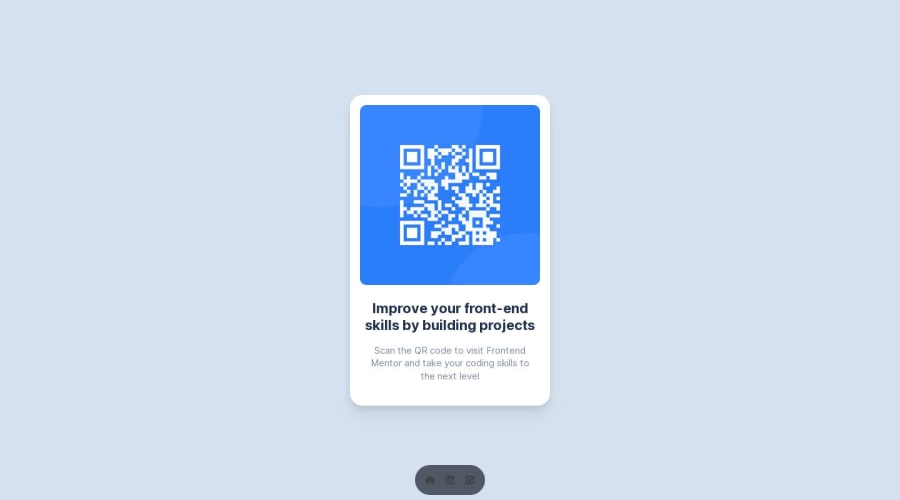
QR Code Component - Next.js
#next#react#tailwind-css
@davidochoadev
Design comparison
SolutionDesign
Solution retrospective
What are you most proud of, and what would you do differently next time?
my primary goal is to gain more experience with Next.js. So far, I'm proud to say that everything has been going smoothly without any major obstacles. I could definitely have paid more attention to best practices and syntax.
What challenges did you encounter, and how did you overcome them?I haven't encountered any technical difficulties.
What specific areas of your project would you like help with?I would love some advice on structure, SEO, and especially accessibility. I know I rushed through the task. It's basically all new to me and I don't really know what the right thing to do is. I'm relying on you for any technical advice 🙏🏻
Community feedback
Please log in to post a comment
Log in with GitHubJoin our Discord community
Join thousands of Frontend Mentor community members taking the challenges, sharing resources, helping each other, and chatting about all things front-end!
Join our Discord
