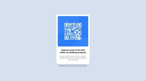
Design comparison
Solution retrospective
I found it difficult to adjust the margin-top of the card, is there a way to do this adjustment effectively? I think i made it hardcoded
Community feedback
- @davidochoadevPosted over 1 year ago
Hi @HectorAgValenzuela,
First of all congrats for your solution! ๐ I've reviewed your source code, and after analyzing the structure, I have a few suggestions for future improvements. It's always a good practice to properly structure the code within the
<body>
element by using predefined semantic elements. I recommend checking out this link.This resource explains the concept of semantic HTML without going into too much detail and highlights its importance, particularly for SEO and accessibility purposes. One specific suggestion I have is to utilize the
<main>
and<footer>
tags in your HTML code, as they provide several benefits:-
Semantic structure: By incorporating the
<main>
and<footer>
tags, you establish a semantic structure for your HTML document. These tags clearly indicate the main content and footer sections of your webpage, enhancing the accessibility and maintainability of your code. This approach reflects the logical organization of your content. -
Accessibility: Semantically structuring your content using
<main>
and<footer>
tags improves the accessibility of your website. Assistive technologies, including screen readers, can easily identify these sections, making it more convenient for users with disabilities to navigate through the main content and locate important information in the footer. -
Search engine optimization (SEO): Search engines like Google rely on semantic HTML to understand the structure and meaning of webpages. Utilizing the
<main>
and<footer>
tags provides clear indicators to search engines regarding the primary content and supplementary information on your page. This can positively impact your search engine rankings and improve the visibility of your website. -
Code organization and readability: Incorporating dedicated tags like
<main>
and<footer>
enhances the organization and readability of your HTML code. Other developers working on your codebase or maintaining your website will have a clearer understanding of the purpose and structure of different sections. This makes it easier to update or modify the code in the future.
To address the issue at hand, I suggest removing the margins and ensuring that the card is placed inside a container that occupies the entire screen both in terms of height and width (you can use
<main>
๐ผ). This way, you can utilize flexbox to center the card structure.By adopting semantic HTML and utilizing tags like <main> and <footer>, you not only enhance the accessibility and search engine visibility of your website but also improve the overall maintainability and understandability of your codebase. This best practice contributes to better user experiences and efficient web development workflows.
Let me know if you have any questions or need further assistance.
Best regards,
David Ochoa. ๐๐ป
Marked as helpful2 -
- @fernandolapazPosted over 1 year ago
Hi, regarding your question:
If you want to center the card, you could add
min-height: 100vh
to the body and remove themargin-top
.I hope itโs useful ๐
Saludos ๐
Marked as helpful2 - @Gabriel-AroucasPosted over 1 year ago
- Looks like do you forgot the text color of the h1.
- Think of 'alt' as an aid for the visually impaired, write what this image actually represents, like this: 'this image is a code to be scanned on a smartphone.
- You placed a div with a 'card' class. a semantic html best practice would be to put a section in place of the div to enclose your divs
i hope i was useful for you ! congratulations for your job and keep studying. ๐ค๐ค Hugs from brazil ๐ง๐ท
1
Please log in to post a comment
Log in with GitHubJoin our Discord community
Join thousands of Frontend Mentor community members taking the challenges, sharing resources, helping each other, and chatting about all things front-end!
Join our Discord