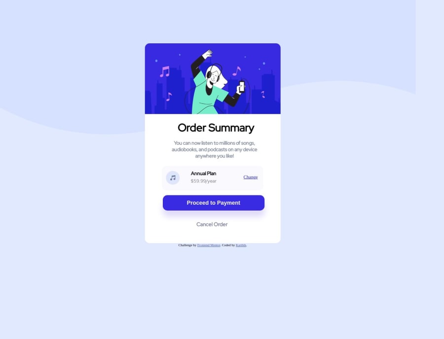
Not Found
Not Found
Not Found
Not Found
Not Found
Not Found
Not Found
Not Found
Not Found
Not Found
Not Found
Not Found
Not Found
Not Found
Not Found
Not Found
Not Found
Not Found
Not Found
Not Found

Submitted

Order summary component

Karthik 220

@Bi-Byee

Desktop design screenshot for the Order summary component coding challenge

This is a solution for...

  • HTML
  • CSS
1newbie
View challenge

Design comparison


SolutionDesign

Solution retrospective


When I was trying to center h2 for some reason it didn't work on bottom or top tag and when I tried negative numbers it did and I don't know why? Any explanation and is it good practice to do this.

Over and out, Karthik

Community feedback

@0xabdulkhalid

Posted

Hello there 👋. Congratulations on successfully completing the challenge! 🎉

  • I have other recommendations regarding your code that I believe will be of great interest to you.

BACKGROUND iMAGE 📸:

  • Looks like the background svg has not been properly set yet, the background svg has been set with img element actually it want to placed with background property using css.
  • So let me share my css snippet which helps you to easily apply the background color with the background svg they provided to place perfectly as same as design.
  • Add the following style rule to your css, and then experience the changes
body {
background: url(./images/pattern-background-desktop.svg) no-repeat, #E1E9Ff;
background-size: contain;
}
  • Now you can remove the img element from your source code.
<img src="./images/icon-ethereum.svg" alt="Ethereum Icon">
  • Tip, Don't forget to generate a new screenshot after editing the css file

.

I hope you find this helpful 😄 Above all, the solution you submitted is great !

Happy coding!

0

@davidochoadev

Posted

My friend, there are indeed many improvements you can make in your code. Firstly, I noticed that you haven't used either flexbox or grid extensively. It's essential to delve deeper into these technologies as they are crucial for creating responsive layouts across all devices. By utilizing flexbox and grid, you can achieve responsive designs without the need to manually position elements using 'top' or 'bottom'. I would strongly recommend familiarizing yourself with these tools as they provide more efficient ways to handle layout and alignment.

By incorporating flexbox or grid into your CSS, you can take advantage of their powerful features to create flexible and adaptive designs. These technologies provide intuitive methods for positioning, spacing, and aligning elements, allowing your layout to automatically adjust based on the available space and screen size. This not only simplifies the code but also improves its maintainability and readability.

In summary, I encourage you to explore flexbox and grid further to enhance your skills in creating responsive layouts. They will provide you with a solid foundation for designing websites that adapt seamlessly to different devices. I'll leave you with some very helpful and interesting links to learn more about these two things:

Flexbox:

Grid:

These resources will provide you with a solid foundation and help you master flexbox and grid. Enjoy learning and applying these techniques to create responsive and well-structured layouts!"

0

Please log in to post a comment

Log in with GitHub
Discord logo

Join our Discord community

Join thousands of Frontend Mentor community members taking the challenges, sharing resources, helping each other, and chatting about all things front-end!

Join our Discord