
David Ochoa
@davidochoadevAll solutions
- Submitted 6 months ago
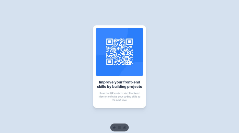
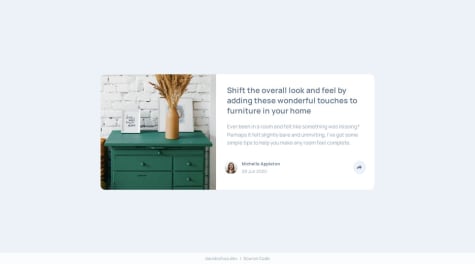
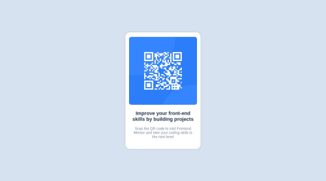
QR Code Component - Next.js
- HTML
- CSS
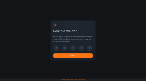
I would love some advice on structure, SEO, and especially accessibility. I know I rushed through the task. It's basically all new to me and I don't really know what the right thing to do is. I'm relying on you for any technical advice 🙏🏻
- Submitted over 1 year ago
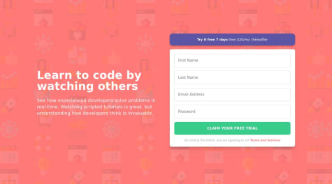
Component With Sign Up Form | Astro, React, TypeScript & TailwindCSS
- HTML
- CSS
- JS
- Submitted over 1 year ago
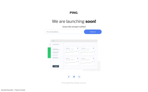
Base Apparel Coming Soon Page | HTML5, CSS3, JavaScript, Flexbox, Grid
- HTML
- CSS
- JS