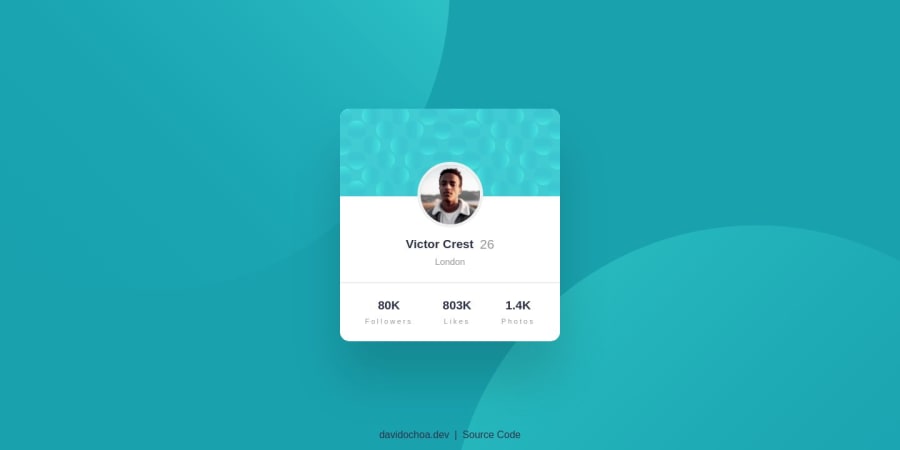
Profile Card Component | HTML5, CSS3, Grid & Flexbox


Design comparison

Solution retrospective
Hello everyone! 🙋🏻♂️
I would like to express my gratitude in advance for taking the time to review my project. I would appreciate some feedback on the structure, particularly regarding the elements that display numbers, such as follower counts. Currently, I have used a simple <span> for this purpose. As for the <h1> element, I have assigned it to the name of the user. Do you think there is a more appropriate way to assign the <h1> in this case? Your insights and suggestions would be greatly appreciated.
Best regards,
David Ochoa. 🙏🏻
Community feedback
- @KevhecPosted almost 2 years ago
Hi David 😁! what an amazing project you have here! Some highlights I want to share are the clean your code is and the good use of semantics and accessibility properties!
Now I will pass through your questions and add some extra tips I think you might find useful for your future projects 😉.
-
Regarding to the numbers inside
<span>tags. According to the documentation, these are inline-level tags that are mainly used for styling purposes or to group element who share attributes, and "should be used only when no other semantic element is appropriate". In your case I would recommend the use of<p>tags in order to follow good practices. -
The
<h1>tag describes the main subject of your page, in cases like this one where is not clear which element should be the main heading you can opt to have a visually hidden<h1>tag only for screen readers and use a<p>tag for the card's name. To do this I like to use this utility class:
.visually-hidden {
clip: rect(0 0 0 0);
clip-path: inset(50%);
height: 1px;
overflow: hidden;
position: absolute;
white-space: nowrap;
width: 1px;
}
--- EXTRA ---
- The usage you are giving to
<picture>is not what it is intended for. According to MDN, the<picture>tag is a container element that allows the site to offer a set of images according to certain conditions specified with<source>tags inside of it. For this case where you need to contain media with just one source you can use the semantic tag<figure>that represents "self-contained content" just like images, illustrations, diagrams, etc. - Related to what was covered before about the span tag, avoid using it as a container for text, use instead p tags, for example in the following code in line 34 of your HTML:
<span class="card__owner-location">
London
</span>
It should be a
<p>tag- Don't leave orphan text, always try to wrap it inside tags intended for typography, check the text "Followers" on line 41 on your HTML:
<div class="card__social-stat"> <span>80K</span> Followers </div>- A last tip that I could give is on your css. Try to avoid magic numbers, I'll illustrate this with a piece of your code:
.card__owner-avatar {
position: absolute;
top: -55px;
border: 5px solid #f0f0f0;
border-radius: 50%;
place-self: center;
transition: .7s ease;
width: 105px;
height: 105px;
}
Here is not clear what those -55px on the top property are for, try to assign them on a variable inside the block, also you can define a variable for the image size and if you want it to have the same width and height you can use the property "aspect-ratio", here is an updated version for your class:
.card__owner-avatar {
--imageOffset: -55px;
--imageSize: 105px;
position: absolute;
top: var(--imageOffset);
border: 5px solid #f0f0f0;
border-radius: 50%;
place-self: center;
transition: .7s ease;
width: var(--imageSize);
aspect-ratio: 1 / 1;
}
This way is more clear what it is for, also, what aspect ratio does is to assign 1 px to height for every pixel is in width, if you use a different ratio like 1 / 2, the height (wich is linked to the second number of the ratio) will recieve doubled the amount of pixels than width.
I hope you find this useful! Happy coding 😁
Marked as helpful2@davidochoadevPosted almost 2 years ago@Kevhec Thank you so much! I've improved all your suggestions. I had never considered using variables within classes before; I had always limited myself to using global variables to create variations of theming. Thank you for practically opening up a whole new world for me. Your explanations were very clear, and I truly appreciate it. 🙏🏻🙇🏻♂️
0@KevhecPosted almost 2 years ago@davidochoadev I'm glad you found it useful 😁
0 -
- @0xabdulkhaliqPosted almost 2 years ago
Hello there 👋. Congratulations on successfully completing the challenge! 🎉
- I have other recommendations regarding your code that I believe will be of great interest to you.
BACKGROUND iMAGE 📸:
- Looks like the background images has not been perfectly set yet, they both are slightly misplaced.
- So let me share my css snippet which helps you to easily apply the
background colorwith thebackground svgthey provided to place perfectly as same as design.
- Add the following style rule to your css, after completing these steps you can experience the changes.
body { background: url(./images/bg-pattern-top.svg), url(./images/bg-pattern-bottom.svg); background-position: right 52vw bottom 35vh, left 48vw top 52vh; background-repeat: no-repeat, no-repeat; background-color: hsl(185deg, 75%, 39%); }- Tip, Don't forget to generate a new screenshot after editing the
cssfile
.
I hope you find this helpful 😄 Above all, the solution you submitted is great !
Happy coding!
0


Please log in to post a comment
Log in with GitHub
Join our Discord community
Join thousands of Frontend Mentor community members taking the challenges, sharing resources, helping each other, and chatting about all things front-end!
Join our Discord