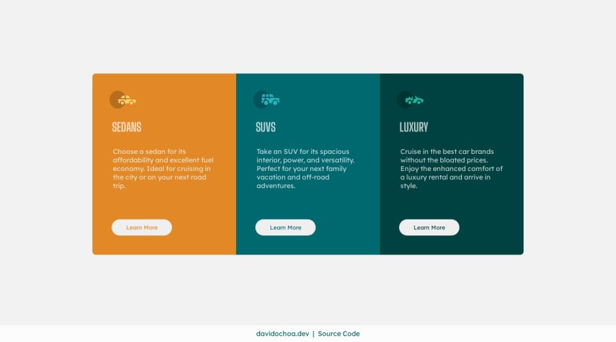
3-Column Preview Card Component | HTML5, CSS3, Grid & Flexbox
Design comparison
Solution retrospective
Hello Everyone 👋
I have successfully completed the challenge utilizing the following:
- Mobile-first approach
- HTML5
- CSS3
- Flexbox
- Grid
I do have a question regarding font importing using the link provided by Google Fonts. I attempted to paste the @import code below the :root selector, but the fonts didn't change. As a result, I had to import them within the HTML file. I would like to know the most efficient and performance-friendly method of importing fonts. Should I download and manually upload the font files to the repository? I appreciate your assistance in answering this question.
Thank you in advance for your response.
Best regards,
David Ochoa
Community feedback
- @VCaramesPosted over 1 year ago
Hey there! 👋 Here are some suggestions to help improve your code:
Regarding your question, it is best practice to
linkthefont-familyin the HTML due to performance (even if it is minimal).- The
sectionandfigureelements are being used incorrectly ❌.sectionare for sections of a page while thefigureis only used when there is afigcaption.
- Your "buttons" were created with the incorrect element ❌. When the user clicks on the button they should be directed to a different part of you site. The
anchor tagwill achieve this.
More Info:📚
- For "visually hidden" content use the following code:
.visually-hidden {
border: 0 !important;
clip: rect(1px, 1px, 1px, 1px) !important;
-webkit-clip-path: inset(50%) !important;
clip-path: inset(50%) !important;
height: 1px !important;
overflow: hidden !important;
margin: -1px !important;
padding: 0 !important;
position: absolute !important;
width: 1px !important;
white-space: nowrap !important;
}
If you have any questions or need further clarification, feel free to reach out to me.
Happy Coding! 👾
Marked as helpful1@davidochoadevPosted over 1 year ago@vcarames Thank you for your response,
and please forgive me for bombarding you with questions again. In this case, since we are dealing with icons, the
<picture>tag or even the<figure>tag would not be appropriate, correct? Should I settle for a<div>? Or is there a specific container element that is more suitable for wrapping these non-descriptive, purely decorative elements?1@VCaramesPosted over 1 year ago@davidochoadev
Ask as many question you have. That’s why I’m here for.
The icons don’t need to be wrapped by anything;
imgon its own is enough.The only time you’ll use the
pictureelement is when you re using different sized images during different breakpoints. As for thefigure, only if there is afigcaption.0 - The
Please log in to post a comment
Log in with GitHubJoin our Discord community
Join thousands of Frontend Mentor community members taking the challenges, sharing resources, helping each other, and chatting about all things front-end!
Join our Discord
