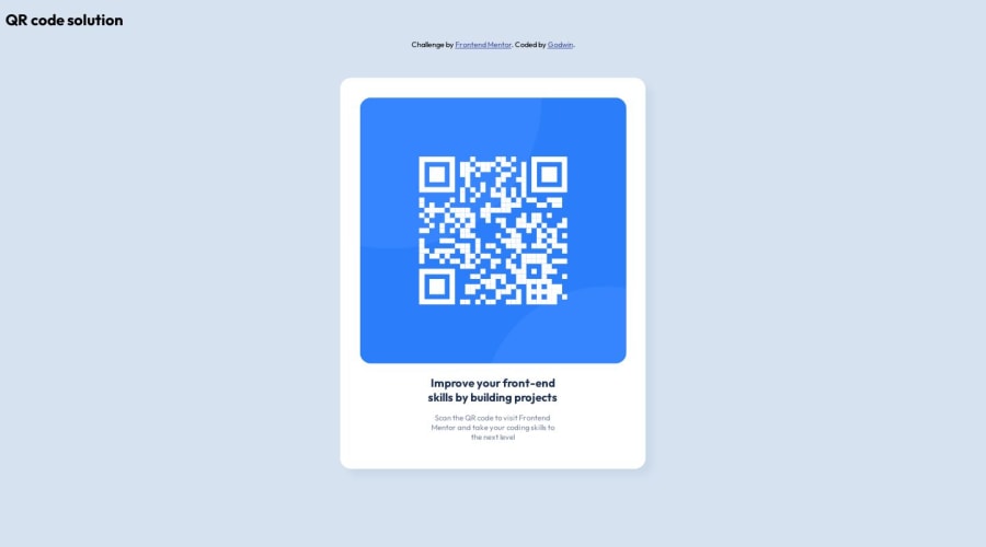


Design comparison

Solution retrospective
I had issues with the responsive design of the card. the card breaks at 500px to 814px screen size, I had to use a font size compromise, not a great fix. had to add an extra breakpoint.
I think it would be preferable to use css grind instead.
what would be a better way to make the responsiveness of the card work well?
Community feedback
- @vanzasetiaPosted over 1 year ago
Hi, Honeypot! 👋
For better responsiveness, you need to:
- Keep the design simple: Stick with the original design. You do not need to add additional content.
- Use modern CSS: Use flexbox or grid to place the card in the center of the page. These modern techniques are more robust than absolute positioning and have less code to write.
- Static maximum width: Use
remunit for themax-widthof the card. Do not use percentage unit. Percentage value will make the card keeps growing. - Use the same styling: Use the same font size for all breakpoints or screen sizes. Convert
15pxto theremvalue by dividing the pixel value by 16. - No width: You only need to specify the
max-widthof the card. You do not need to control the width of the card for other screen sizes. By specifying amax-width, the card will grow up to the specified value while allowing it to shrink if ever needed. In short, the card is responsive with onlymax-width.
I hope my feedback helps. Have fun coding! 😄
Marked as helpful2 - @0xabdulkhaliqPosted over 1 year ago
Hello there 👋. Congratulations on successfully completing the challenge! 🎉
- I have other recommendations regarding your code that I believe will be of great interest to you.
HEADINGS ⚠️:
- This solution consists incorrect usage of
<h2>so it can cause severe accessibility errors due to incorrect usage of level-two headings<h2>
- Every site must want only one
h1element identifying and describing the main content of the page.
- An
h1heading provides an important navigation point for users of assistive technologies, allowing them to easily find the main content of the page.
- In this solution there's
<h2>element which is this<h2>Improve your...</h2>, you can preferably use<h1>instead of<h2>. Remember<h1>provides an important navigation point for users of assistive technologies so we want to use it wisely
- So we want to add a level-one heading to improve accessibility
- Example:
<h1>Improve your front-end skills by building projects</h1>
- If you have any questions or need further clarification, and feel free to reach out to me.
- If you have any questions or need further clarification, you can always check out
my submissionand/or feel free to reach out to me.
.
I hope you find this helpful 😄 Above all, the solution you submitted is great !
Happy coding!
Marked as helpful1 - @davidochoadevPosted over 1 year ago
Hi @godwinjs, congratulations on completing this challenge! To answer your question, you will need to use grid in your CSS or flexbox. The first thing to do could be to modify the main element with the following properties:
min-height: 100vh;sets the minimum height of the<main>element to occupy at least the full viewport height, ensuring that the content is visible even on smaller screens.display: flex;enables flexbox layout for the<main>element.justify-content: center;horizontally centers the content within the<main>element.align-items: center;vertically centers the content within the<main>element.
After that, you can make the following changes to improve the responsiveness of the card:
- Remove unnecessary CSS: You can remove the
position: absolute;,left: 50%;, andtop: 50%;properties from the.qr_cardclass. These properties are not necessary for achieving responsiveness and centering the card. - Remove unnecessary media queries: You can remove the media queries targeting specific screen widths (e.g.,
@media only screen and (min-width: 376px)) and their corresponding CSS rules. This simplifies the code and avoids the need for compromises and extra breakpoints. - Adjust max-width for better responsiveness: Change the
max-widthormin-widthvalue of the.qr_cardclass maybe to350px. This allows the card to adapt its width based on the available space while maintaining a consistent layout. - Improve text alignment: Add
text-align: center;to the.qr_cardclass. This will align the card's content (title and text) to the center, making it visually pleasing on different screen sizes. - Improve font size for title and text: Adjust the font sizes for the
.qr_card_titleand.qr_card_textclasses. You can usefont-size: 3em;for the title or maybefont-size: 1rem;for the text, making the font sizes more appropriate for different screen sizes.
these could be your style.css
body {
background-color: hsl(212, 45%, 89%);
font-family: 'Outfit', sans-serif;
font-size: 10px;
}

header {
display: flex;
align-items: center;
justify-content: space-around;
width: 100%;
}

body {
background-color: hsl(212, 45%, 89%);
font-family: 'Outfit', sans-serif;
font-size: 10px;
}

header {
display: flex;
align-items: center;
justify-content: space-around;
width: 100%;
}

.qr_card {
margin: 0 10px;
background-color: hsl(0, 0%, 100%);
padding: 20px 20px 0 20px;
max-width: 350px;
border-radius: 1rem;
box-shadow: 10px 10px 10px hsl(212, 39%, 85%);
transition: width .5s;
text-align: center;
}

.qr_card_title {
font-weight: 700;
color: hsl(218, 44%, 22%);
text-align: center;
font-size: 3em;
}

.qr_card_text {
font-weight: 400;
color: hsl(220, 15%, 55%);
text-align: center;
font-size: 2em;
}

.qr_card_img {
border-radius: 1rem;
max-width: 100%;
}

main {
min-height: 100vh;
display: flex;
justify-content: center;
align-items: center;
}

.qr_card {
margin: 0 10px;
background-color: hsl(0, 0%, 100%);
padding: 20px 20px 0 20px;
max-width: 350px;
border-radius: 1rem;
box-shadow: 10px 10px 10px hsl(212, 39%, 85%);
transition: width .5s;
text-align: center;
}

.qr_card_title {
font-weight: 700;
color: hsl(218, 44%, 22%);
text-align: center;
font-size: 3em;
}

.qr_card_text {
font-weight: 400;
color: hsl(220, 15%, 55%);
text-align: center;
font-size: 2em;
}

.qr_card_img {
border-radius: 1rem;
max-width: 100%;
}
These changes will help make the card more responsive and provide a better user experience across various screen sizes. Another suggestion would be to keep the directory organized by avoiding nested routes of elements. The simpler, the better. Anyway, this could be a possible solution. I hope I have been helpful.
Regards,
David Ochoa 😼
Marked as helpful1


Please log in to post a comment
Log in with GitHub
Join our Discord community
Join thousands of Frontend Mentor community members taking the challenges, sharing resources, helping each other, and chatting about all things front-end!
Join our Discord