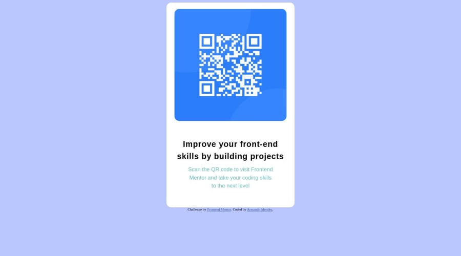
Design comparison
Solution retrospective
Did I center the QR image correctly? I gave each side a different margin. I tried using auto for the left and right margin but it didn't work.
Should I have given the bottom text a separate p tag instead of using span?
How do you know when you should use rem, em, px, or % for sizing the width or anything else?
Community feedback
- @davidochoadevPosted over 1 year ago
I've reviewed your source code, and regarding the structure, there are some improvements you could consider in the future. It's good practice to properly structure the code within the <body> by using predefined semantic elements. I recommend checking out this link.
It explains the concept of semantic HTML without going into too much detail and why it's important, especially for SEO and accessibility purposes. For example using the <main> and <footer> tags in HTML provides several benefits:
-
Semantic structure: The <main> and <footer> tags help establish a semantic structure for your HTML document. By using these tags, you clearly indicate the main content and footer sections of your webpage. This semantic structure improves the accessibility and maintainability of your code, as it reflects the logical organization of your content.
-
Accessibility: Semantically structuring your content using <main> and <footer> tags enhances the accessibility of your website. Screen readers and other assistive technologies can identify these sections, making it easier for users with disabilities to navigate through the main content and locate important information in the footer.
-
Search engine optimization (SEO): Search engines, like Google, rely on semantic HTML to understand the structure and meaning of webpages. By using the <main> and <footer> tags, you provide search engines with clear indicators of the primary content and supplementary information on your page. This can positively impact your search engine rankings and improve the visibility of your website.
-
Code organization and readability: Using dedicated tags like <main> and <footer> enhances the organization and readability of your HTML code. Other developers who work on your codebase or maintain your website will have a clearer understanding of the purpose and structure of different sections, making it easier to update or modify the code in the future.
By adopting semantic HTML and using tags like <main> and <footer>, you not only enhance the accessibility and search engine visibility of your website but also improve the overall maintainability and understandability of your codebase. It's a best practice that contributes to better user experiences and efficient web development workflows.
Marked as helpful1@armando1236Posted over 1 year agoYou're right....<main> and <footer> was something I completely forgot about. I'm doing a review course and starting from the beginning. I'll keep that in mind for the next project. Thanks! @davidochoadev
0 -
- @islamahmadayoubPosted over 1 year ago
You could also use on the body
{
display: grid;
grid-template-columns: 1fr;
place-items: center;
}
You will need all the content to be in one div and that div will be centered.
Consider learning Flexbox and CSS Grid, they make it so much easier to center pretty much anything
https://www.w3schools.com/cssref/css_pr_place-items.php
Marked as helpful0@armando1236Posted over 1 year agoThanks! Flexbox and CSS Grid are next on my list of things to learn. @islamahmadayoub
0 - @ioangheraszimPosted over 1 year ago
Hey Armando, good job on completing your challenge.
After reviewing your code, I would like to offer some suggestions for improvement: consider adding the following properties to the body element:
display: flex;
justify-content: center;
align-items: center;
flex-direction: column;
min-height: 100vh;
By applying these styles, you will achieve perfect vertical centering of your component. The min-height: 100vh property ensures that the component is positioned precisely in the middle of the page.
Hope this helps.
Best regards,
Ioan
2 - @0xabdulkhaliqPosted over 1 year ago
Hello there 👋. Congratulations on successfully completing the challenge! 🎉
- I have other recommendations regarding your code that I believe will be of great interest to you.
CSS 🎨:
- Looks like the component has not been centered properly. So let me explain, How you can easily center the component without using
marginorpadding.
- We don't need to use
marginandpaddingto center the component both horizontally & vertically. Because usingmarginorpaddingwill not dynamical centers our component at all states
- To properly center the component in the page, you should use
FlexboxorGridlayout. You can read more about centering in CSS here 📚.
- For this demonstration we use css
Gridto center the component.
body { min-height: 100vh; display: grid; place-items: center; }- Now remove these styles, after removing you can able to see the changes
.top-container {
margin: auto;
}
- Now your component has been properly centered
.
I hope you find this helpful 😄 Above all, the solution you submitted is great !
Happy coding!
0
Please log in to post a comment
Log in with GitHubJoin our Discord community
Join thousands of Frontend Mentor community members taking the challenges, sharing resources, helping each other, and chatting about all things front-end!
Join our Discord
