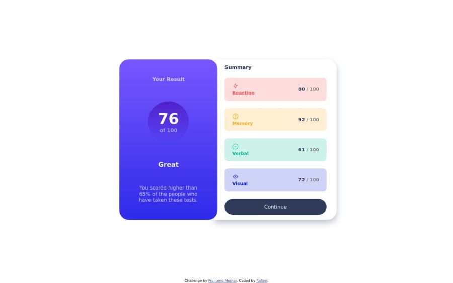
Not Found
Not Found
Not Found
Not Found
Not Found
Not Found
Not Found
Not Found
Not Found
Not Found
Not Found
Not Found
Not Found
Not Found
Not Found
Not Found
Not Found
Not Found
Not Found
Not Found

Submitted

Results summary component with CSS flexbox

@RafaelRi23

Desktop design screenshot for the Results summary component coding challenge

This is a solution for...

  • HTML
  • CSS
1newbie
View challenge

Design comparison


SolutionDesign

Solution retrospective


I don't know how to use media query, i'm not sure how to resize the layout on differents screen sizes.

Is there any difference between id and class in CSS? I don't know who's the best to use.

Community feedback

@Kamlesh0007

Posted

Is there any difference between id and class in CSS? I don't know who's the best to use.

Hey bro! I wanted to explain the difference between id and class in CSS:

• An id is used for unique elements, while class is used for groups of similar elements.An id must be unique and can only be used for one element, while a class can be applied to multiple elements.

• When it comes to specificity, id has a higher priority than class. This means that styles applied using an id will override styles applied using a class.

• In JavaScript or when manipulating the DOM, id is commonly used to target specific elements. To summarize, use id when you need to uniquely identify an element or perform specific targeting, and use class when you want to apply styles to multiple elements that share a common characteristic or purpose.

I hope this explanation helps! Feel free to reach out if you have any further questions.

and I have a few suggestions to improve your code further. Add this styling to header div

.header
{
display: flex;
gap: 0.5rem;
}

Marked as helpful

2

@davidochoadev

Posted

If you're unsure about using media queries and resizing layouts for different screen sizes, i can provide you with a brief overview to get you started.

Media queries are a fundamental part of responsive web design. They allow you to apply specific CSS styles based on different screen sizes or device characteristics. This enables your website to adapt and provide an optimal viewing experience across various devices.

Here's a basic example of how to use media queries:

/* Default styles */
.element {
/* Default styles here */
}

/* Media query for screens smaller than 600px */
@media (max-width: 600px) {
.element {
/* Styles for smaller screens here */
}
}

/* Media query for screens between 600px and 900px */
@media (min-width: 601px) and (max-width: 900px) {
.element {
/* Styles for medium-sized screens here */
}
}

/* Media query for screens larger than 900px */
@media (min-width: 901px) {
.element {
/* Styles for larger screens here */
}
}

In the example above, we define different styles for the .element based on different screen sizes using media queries. The styles within each media query will only apply when the specified conditions are met.

To get started with media queries, consider the following steps:

  • Identify the breakpoints: Determine the points at which you want your layout to change based on different screen sizes. Common breakpoints include small screens (e.g., mobile), medium-sized screens (e.g., tablets), and larger screens (e.g., desktops).

  • Write CSS within media queries: Within each media query, specify the desired CSS styles that should be applied when the screen size matches the defined conditions. You can adjust properties such as width, height, font sizes, margins, and more to achieve the desired layout adjustments.

  • Test and refine: Preview your website on different devices or use browser developer tools to simulate different screen sizes. This way, you can observe how your layout responds and make any necessary adjustments to ensure a visually appealing and user-friendly experience across devices.

Remember to use relative units (such as percentages, em, or rem) instead of fixed pixel values to allow for fluid and flexible layouts.

By understanding and utilizing media queries effectively, you can create responsive designs that adapt beautifully to various screen sizes and improve the overall user experience on different devices.

Marked as helpful

1

@RafaelRi23

Posted

@davidochoadev thank you very much for the explanation

0

Please log in to post a comment

Log in with GitHub
Discord logo

Join our Discord community

Join thousands of Frontend Mentor community members taking the challenges, sharing resources, helping each other, and chatting about all things front-end!

Join our Discord