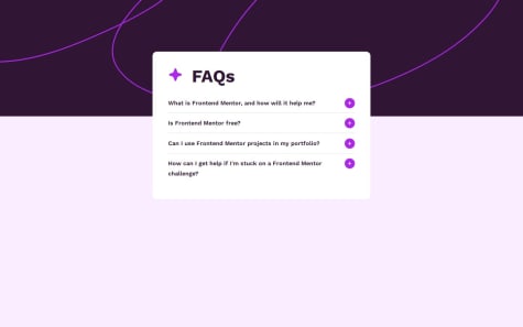
I just completed another JS beginner challenge from Frontendmentor. Please share your suggestions to improve. Thank you.
ezecoder
@3eze3All comments
- @nurlanova2012Submitted 9 months agoWhat are you most proud of, and what would you do differently next time?@3eze3Posted 9 months ago
Hi π, very good solution for this challenge, Aizirek.
I have some recommendations, which may help you in your next challenges:
HTML:
- Images that are decorative do not represent great significance in your component/page, then you can opt for:
<img class="item-heading-img" src="./assets/images/icon-star.svg" alt>
- You could use semantic tags such as <details> or <secitons> to make your page clearer to screen readers and improve SEO
- In the case of using fonts, you can download them and use them directly in css with the @font-face rule, it is much better than referencing them directly in html as they must resolve more domains when using the fonts, I leave you a resource -> Rule font-face
- You could use <button> for the tags that are interactive or that generate some function inside the page, instead of putting everything with a h2.
JS:
- You can implement that at the moment in which one is active the others are closed, since it breaks a little the design.
- You can also give a fixed height to your container, or have a little more separation for your elements.
I hope this recommendations have helped you, keep it up, and if at any time you have a doubt or you get stuck with something, write to linkedin.
Happy coding π§
Marked as helpful0 - @AngolapaSubmitted 9 months ago
Hello, I hope you are well here. I'm sharing the solution to this challenge, and I also took the liberty of adding some animations to provide a more satisfying experience. Any feedback is welcome; currently, I am studying and applying knowledge. You can find me on LinkedIn to stay in touch.
Hola buenas espero estΓ©n bien acΓ‘, dejo la soluciΓ³n a este desafΓo, ademΓ‘s me tome el atrevimiento de agregar algunas animaciones para darle una experiencia mas satisfactoria. Cualquier comentario es bienvenido, actualmente me encuentro estudiando y aplicando conocimientos me puedes encontrar en Linkedin y asΓ poder estar en contacto.
@3eze3Posted 9 months agoHey! π, very good solution for this challenge Jose Alfredo. π
I have a recommendation for you, I see how you don't use Js, and you handle it with Css, that's good but sometimes it's not so flexible.
-
For example when I leave one detail open and open another one the card expands and its size changes every time I open another detail, so that breaks the design a little bit.
-
You can use the @font-face-rule instead of importing fonts, I leave you a very interesting resource about this: @font-face-rule
-
Use relative measures such as <em>, <rm>,<ch>, for better flexibility.
I hope this recommendations have helped you, keep it up, and if at any time you have a doubt or you get stuck with something, write to linkedin.
Happy coding π§
Marked as helpful0 -
- @B4rkaSubmitted 9 months ago
It appears the avatar picture doesn't load while the favicon does. Does anyone have any idea why ?
Thanks a lot !
@3eze3Posted 9 months agoHi B4rkaπ‘, good solution for this challenge.
Answering your question and checking your <img> tag the src attribute of the tag you forgot to put "./" which means from the current directory to reference the img , because if you put "/" you would be referencing from the root.
<img src="./assets/images/avatar-jessica.jpeg" class="img" alt>
Some recommendations that I could give you in HTML:
-
When working with images try to put the alt attribute, it serves for accessibility and gives you a better semantic for your page.
-
As for the use of the <article> you could opt for another more generic tag, since <article> is a self-contained tag, and has its own value.
-
Also the use of semantic tags, such as <nav> for your links, use of a <section> for the letter container or an <article>, this so that you have more semantic value.
CSS
- You could opt to use the @font-face rule for your fonts instead of importing it directly. I was reading about that just now, I leave you the material here: @font-face rule
If you have a question, or have conflicts with a project you can write me on linkedin. π
Happy coding.π
Marked as helpful0 -
- @Benji963Submitted 9 months ago
Javascript is a lot harder than I expected. Any help is welcomed on how to improve, please help I don't know what I'm doing. I spent an hour trying to figure out why the Javascript wasn't working, only to realize I had my Javascript file as a link instead of a script in the HTML. My forehead is really, really, red right now.
@3eze3Posted 9 months agoHey!π Benji, good solution for this challenge.
First of all, these situations are normal in any learning environment. β¨
Some recommendations I could give you in JS:
-
Repetition of selections: In your code you select the inputs, this results in an unnecessary search every time the form is submitted, you could select the inputs outside the event.
-
Cascading classes: You are adding and removing the error class directly to the parent elements (input.parentElement), it works but it would be better if you use it directly in the input.
-
Redundant Mail Validation: You don't need to add and remove the error class twice for mail validation, you can remove the second case from the if handling.
I can think of something like this, more or less: const isValid = isEmailInput ? validateEmail(input.value) : input.value.trim() !== ""; if (!isValid) { input.classList.add("error"); } else { input.classList.remove("error"); }
- And the most important, create projects no matter if they are simple, or if it is to review a topic, just create using JS or another language you want to learn.β
If you have any questions, feel free to contact me. π¨π₯Ό
Happy coding.π
Marked as helpful0 -
- @G-DAMSSubmitted 9 months ago
first of all I had fun while building the project it was first experience for me to reproduce exact of the design.
The difficulty I had was targeting the Github option and give it a different color which is green.
please what is the best practice for html element, I often hear people talk about semantic element. What are the semantic element?
@3eze3Posted 9 months agoHey! π, very good solution for this challenge G-DAMS. π
Beyond simply defining its visual appearance, semantic tags provide meaning for search engines, screen readers. As the tags you used in this project are semantic and themselves mean and structure the most important parts of the web for better accessibility.
I can leave you some resources: Semantic HTML Accessibility
And a suggestion in your CSS styles:
-
You can directly use flex or grid to center your boxes, without needing to use absolute positions which can be a bit of a headache.
-
And in your links that had trouble with the GitHub link, you can use column classes and add a modification class. I base this on the BEM methodology, as you can reduce the call you make for each tag body #container ul .special-item{}, as it has a lot of specificity and is less flexible. With BEM, or another methodology, not necessarily BEM, you can better structure your classes and HTML files, avoid problems with specificity, and duplication of styles.
I hope these comments help you for your next challenges, keep it up, being constant is the key π₯.
Happy coding π.
0 -
- @luigi-peroneSubmitted 9 months ago
Some colors into the style-guide doesn't match with the design photo, there are things that i don't know or it work like this?
@3eze3Posted 9 months agoHey!π , very good solution for this challenge Luigi. π
I have some recommendations that may help you in future challenges.π§¨
HTML:
- The use of semantic tags, such as a <form> and <inputs> for user interaction.
- You can also remove the alt in decoration images like these:
<img src="icon-star.svg" alt aria-hidden=true>
- The use of the <h1> is exclusively one, you can take reference to the hierarchy of titles, I leave here a resource on this topic Hierarchy of titles
CSS:
-
As for the colors, you can really change them, or put your characteristic touch in the projects, as long as they are related to the page.
-
Also you have some problems when it comes to height and aesthetics with the buttons, you can try giving a "border-radius:50%" and "height:4rem" and play with this, so that it does not break and looks proporcinal.
-
Also the common styles can be grouped in classes, to avoid duplication of styles.
I hope these comments help you for your next challenges, keep it up, being constant is the key π₯.
Happy coding π
Marked as helpful1 - @josrubferSubmitted 9 months ago
Hi everyone, I am a new student diving into HTML and CSS, and as I don't have a formal instructor, I am reaching out to the community for feedback on my project. I am eager to learn and improve, and I believe your insights can help me adopt better practices.
I would greatly appreciate it if you could take a moment to review it and provide feedback. Specifically, I am interested in any recommendations for changes or alternative approaches that align with good general practices.
Your expertise and guidance would be immensely valuable to me as I continue to grow in my HTML and CSS skills. Thank you in advance for your time and input.
@3eze3Posted 9 months agoEy!π , very good solution for this challenge josrubfer. π
I have some recommendations that may help you in future challenges.π§¨
HTML:
-
In images you should always have the alt="" attribute, which is itself an alternative text, the alt attribute will make sure that the engines do not miss important sections of the pages.
-
There is no need for a tag <figure>, or <figcaption> you could include the tag for the name, but it would be a bit forced.
-
The use of <buttons> inside the <a> , is not correct, you could just use the a tags, since you are actually directing to another page, and a <button> fulfills a specific functionality within the page in most contexts.
-
You could choose to learn some Methodology of classes for your tags like BEM , I leave you the link if you are interested: Methodology BEM
CSS:
-
The pseudo-class of ":active" would be ":hover", not ":active", already with the passage of the cursor is more intuitive and we interpret faster that it is an interactive tag
-
Use of relative tags like em, rem , to handle padding, margin and fonts, there are more you can see it here: Relative Units
I hope these tips help you and keep going.
Happy coding π₯
Marked as helpful0 -
- @OliCBSubmitted 9 months ago@3eze3Posted 9 months ago
Hi OliCB , very good solution for this challenge. π
I have some recommendations that may help you in future challenges.
HTML:
-
Starting every project with an <h1>, although it makes use of a <header>, does not have the same meaning as an <h1>.
-
When we find ourselves with images that are only decorative, do not have a strong impact, then we can choose to use an aria-hidden. in the decorative images:
<img class="card__icon" src="assets/images/icon-star.svg" alt aria-hidden="True" />
-
Use of semantic tags, <article> to represent in itself a self-contained or complete element, for example it would be better to use the <article> to encompass an entire side of the letter or better a section, and you could separate it into two sections Front and back section.
-
The use of forms a direct interaction with the user and where they send some kind of data, it would be better that you replace the <div> by <form> and use <inputs> of type radio buttons, since you will receive data, and instead of <div> as button, replace it directly with the <button> tag so that the HTML code has a value by itself and is not something generic, but something semantic in which search engines and screen readers have references and know where they are.
Also, although it may seem more complicated to structure in this way, at the time of making interactions with Js, it is much easier and more flexible.
I hope these tips help you and keep going.
Happy coding π₯
Marked as helpful1 -
- @heisemmaco-devSubmitted 9 months ago
πRecipe pageπ
Hello, Iβm Emmanuel π and this is my solution for Recipe page.
βοΈ Built With:
- HTML
- CSS
I'm open to feedback and ideas for optimizing and streamlining the code. Your suggestions for improvement are highly appreciated! π
Thank you. π
@3eze3Posted 9 months agoHi Emmanuel Akpan very good solution for this challenge.π
I have some recommendations that I hope will help you.π¨
HTML:
- Classes with pronoun , "the main" > "main" , abtract the class names , "the main image" > "main image" , it would be good if you use a class Methodology to better modularize your html and css. , it would be good if you use a class Methodology to better modularize your html and css. π
CSS:
-
Regarding the hierarchy of headings, while going from a h1 > h4 , depends on the context and the importance of each section, it can be considered less semantic than following a sequence one by one (h1>h2>h3>...h6), Since search engines are based on a hierarchy of headings intended to structure the content in a logical and coherent way. π
-
Use of relative measures such as (em, rem, ch, &) for the boxes, as they help the flexibility of the project and adapt automatically in some cases.
-
Use of some methodology, as you can increase the specificity of the styles:
main .sectiona_third { display: flex; flex-direction: column; gap: 10px; } main .sectiona_third h2 { color: var(--Nutmeg); font-size: 28px; }
The second one has more specificity and more time to set styles, it would be better something like:
.main__seciton { display: flex; flex-direction: column; gap: 10px; } .section__h2 { color: var(--Nutmeg); font-size: 28px;
They have the same weight of specificity, and show what they refer to.
- We also found duplication of styles:
main .sectiona_second { display: flex; flex-direction: column; gap: 10px; } main .sectiona_third { display: flex; flex-direction: column; gap: 10px; } main .sectiona_second ul { display: flex; flex-direction: column; gap: 10px; /* margin-left: 20px; */ list-style-position: outside; padding-left: 25px; } main .sectiona_third ol { display: flex; flex-direction: column; gap: 10px; list-style-position: outside; padding-left: 25px; }
Css Methodology or a structure for the elements you could eliminate the duplicity of your styles:
.main__section { display: flex; flex-direction: column; gap: 10px; } .section__list { display: flex; flex-direction: column; gap: 10px; /* margin-left: 20px; */ list-style-position: outside; padding-left: 25px; }
I hope you will find these tips useful for next projects, overall very good code and project. π
Happy coding. π§¨
Marked as helpful1 - @danielkullSubmitted 9 months ago
π Hi Front-End Mentor Community. This is my Recipe Page solution.
π§±π¨ Build with:
- HTML
- CSS
- BEM Notation note
- Desktop first workflow approach π»
Feedback welcome, especially for BEM notation
@3eze3Posted 9 months agoHi Daniel Kull very nice project for this challenge.! π₯
I have some recommendations for it π , hope they will be useful for you for next ones:
Html:
- At the time of closing the first title of the section:
<h2 class="subtitle--prep-time">Preparation time</h3>.
CSS :
-
You could opt for some use of Class Methodology for your tags like BEM as there are some stylos that repeat, this ensures minimum specificity.π
-
Separate the reset css in other files and also the fonts, it would be something more modular for your project. π²
Overall a very good project, happy coding.π¨
Marked as helpful1 - @momorocks111Submitted about 1 year ago
This was brutal. Couldn't do it myself, followed like 5 tutorials to try and understand. Tried coding it for like over 15 hours. Couldn't understand how to manipulate the images on the desktop, having the box overlapping over the other image. Finally got it following one tutorial on youtube. Is it bad to do that though? Is it bad to follow tutorials? I couldn't do it myself so I don't know. I also wanted to add an animation to the image, but that only screwed things up even harder. So I left it out.
@3eze3Posted about 1 year agoHi momorocks111, first of all there is nothing wrong with watching tutorials and it is part of the process to feel uncertainty with some projects.
This is not technical but it is advice (it is my thought and may or may not help you):
Is it bad to do it, is it bad to follow tutorials? :
-
When you get stuck with a project (like this one) instead of watching tutorials on how to do the whole component it wouldn't be bad, but you wouldn't actively learn, and in programming it's active practice/theory.
-
It would be better to focus on the concrete problems and thus complement your learning and learn to search for information on the internet for the things/modules you need to review.
But well I have no context if you have enough time to learn comfortably or if your situation is good to just focus on this, but don't be discouraged enjoy this is the process and take it easy. π
Marked as helpful1 -
- @MuhammadjewelSubmitted about 1 year ago
17th challenge is completed π
Projects completed: 17/103
For this challenge I used Copilot, it helps a lot with hinting the code.
Any constructive feedback is welcome.
@3eze3Posted about 1 year agoHi Muhammadjavohir nice contribution to this project.
I have a small recommendation to make to you as I have not been able to see your code in depth.
I imagine that you use a set of classes to activate/deactivate the accordions, but I see that you allow us to open all the headers and this can break your design and make me have to close them all manually and it's a bit tedious :(
Then you could make clicking on one of the headers activate the class only on that one and on the others disable them, it's a nicer action and you avoid problems with your designπ₯
Happy coding π
0