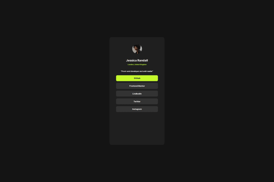
Design comparison
Solution retrospective
first of all I had fun while building the project it was first experience for me to reproduce exact of the design.
The difficulty I had was targeting the Github option and give it a different color which is green.
please what is the best practice for html element, I often hear people talk about semantic element. What are the semantic element?
Community feedback
- @3eze3Posted about 1 year ago
Hey! 👀, very good solution for this challenge G-DAMS. 🎃
Beyond simply defining its visual appearance, semantic tags provide meaning for search engines, screen readers. As the tags you used in this project are semantic and themselves mean and structure the most important parts of the web for better accessibility.
I can leave you some resources: Semantic HTML Accessibility
And a suggestion in your CSS styles:
-
You can directly use flex or grid to center your boxes, without needing to use absolute positions which can be a bit of a headache.
-
And in your links that had trouble with the GitHub link, you can use column classes and add a modification class. I base this on the BEM methodology, as you can reduce the call you make for each tag body #container ul .special-item{}, as it has a lot of specificity and is less flexible. With BEM, or another methodology, not necessarily BEM, you can better structure your classes and HTML files, avoid problems with specificity, and duplication of styles.
I hope these comments help you for your next challenges, keep it up, being constant is the key 🥇.
Happy coding 🎉.
0 -
Please log in to post a comment
Log in with GitHubJoin our Discord community
Join thousands of Frontend Mentor community members taking the challenges, sharing resources, helping each other, and chatting about all things front-end!
Join our Discord
