Design comparison
Solution retrospective
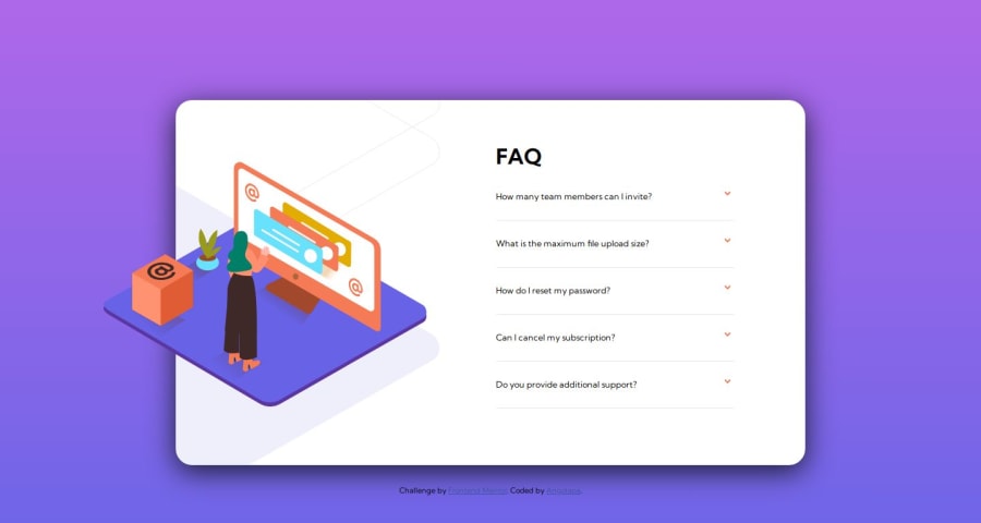
Hello, I hope you are well here. I'm sharing the solution to this challenge, and I also took the liberty of adding some animations to provide a more satisfying experience. Any feedback is welcome; currently, I am studying and applying knowledge. You can find me on LinkedIn to stay in touch.
Hola buenas espero estén bien acá, dejo la solución a este desafío, además me tome el atrevimiento de agregar algunas animaciones para darle una experiencia mas satisfactoria. Cualquier comentario es bienvenido, actualmente me encuentro estudiando y aplicando conocimientos me puedes encontrar en Linkedin y así poder estar en contacto.
Community feedback
- @3eze3Posted about 1 year ago
Hey! 👀, very good solution for this challenge Jose Alfredo. 🍕
I have a recommendation for you, I see how you don't use Js, and you handle it with Css, that's good but sometimes it's not so flexible.
-
For example when I leave one detail open and open another one the card expands and its size changes every time I open another detail, so that breaks the design a little bit.
-
You can use the @font-face-rule instead of importing fonts, I leave you a very interesting resource about this: @font-face-rule
-
Use relative measures such as <em>, <rm>,<ch>, for better flexibility.
I hope this recommendations have helped you, keep it up, and if at any time you have a doubt or you get stuck with something, write to linkedin.
Happy coding 🍧
Marked as helpful0 -
Please log in to post a comment
Log in with GitHubJoin our Discord community
Join thousands of Frontend Mentor community members taking the challenges, sharing resources, helping each other, and chatting about all things front-end!
Join our Discord
