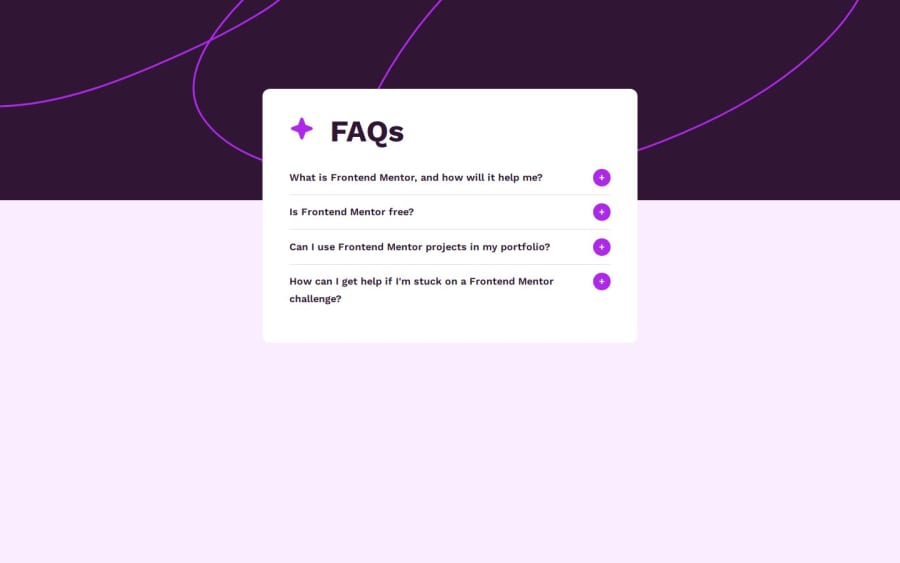
Design comparison
SolutionDesign
Solution retrospective
What are you most proud of, and what would you do differently next time?
I just completed another JS beginner challenge from Frontendmentor. Please share your suggestions to improve. Thank you.
Please log in to post a comment
Log in with GitHubCommunity feedback
- @3eze3
Hi 👀, very good solution for this challenge, Aizirek.
I have some recommendations, which may help you in your next challenges:
HTML:
- Images that are decorative do not represent great significance in your component/page, then you can opt for:
<img class="item-heading-img" src="./assets/images/icon-star.svg" alt>- You could use semantic tags such as <details> or <secitons> to make your page clearer to screen readers and improve SEO
- In the case of using fonts, you can download them and use them directly in css with the @font-face rule, it is much better than referencing them directly in html as they must resolve more domains when using the fonts, I leave you a resource -> Rule font-face
- You could use <button> for the tags that are interactive or that generate some function inside the page, instead of putting everything with a h2.
JS:
- You can implement that at the moment in which one is active the others are closed, since it breaks a little the design.
- You can also give a fixed height to your container, or have a little more separation for your elements.
I hope this recommendations have helped you, keep it up, and if at any time you have a doubt or you get stuck with something, write to linkedin.
Happy coding 🍧
Marked as helpful
Join our Discord community
Join thousands of Frontend Mentor community members taking the challenges, sharing resources, helping each other, and chatting about all things front-end!
Join our Discord
