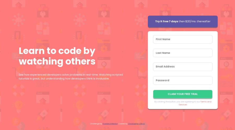
Design comparison
Solution retrospective
I struggled figuring out how to position the svg error icons correctly for a while before settling on using position: absolute within a container that was position: relative. I saw some articles mentioning pseudo-elements but from my understanding ::before and ::after do not work on <input> tags? Just curious if there was any easier way to position the error icons.
Community feedback
- @3eze3Posted over 1 year ago
Hi cmdarcy very nice project for this challenge.
Answering your question , as to whether there is an easier way to position the error icons in the input tags , with the use of ::before and ::affter you can also achieve this:
 .container {
  position: relative;
}

.container::after {
  content: url("icon-error.svg");
  position: absolute
  top: 0;
  right: 0;
}
Another valid option is to set the error icon as background.
But these options depend on the specific needs you have and how you want to structure the html and css.
Happy coding 🥨
0
Please log in to post a comment
Log in with GitHubJoin our Discord community
Join thousands of Frontend Mentor community members taking the challenges, sharing resources, helping each other, and chatting about all things front-end!
Join our Discord
