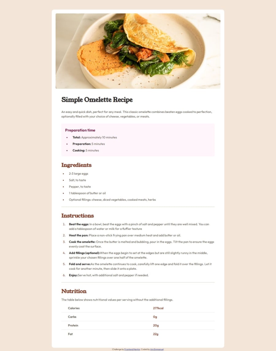
Recipe page using html and css
Design comparison
Solution retrospective
👉Recipe page👈
Hello, I’m Emmanuel 👋 and this is my solution for Recipe page.
⚒️ Built With:
- HTML
- CSS
I'm open to feedback and ideas for optimizing and streamlining the code. Your suggestions for improvement are highly appreciated! 🙏
Thank you. 😀
Community feedback
- @3eze3Posted about 1 year ago
Hi Emmanuel Akpan very good solution for this challenge.🎇
I have some recommendations that I hope will help you.🎨
HTML:
- Classes with pronoun , "the main" > "main" , abtract the class names , "the main image" > "main image" , it would be good if you use a class Methodology to better modularize your html and css. , it would be good if you use a class Methodology to better modularize your html and css. 🎃
CSS:
-
Regarding the hierarchy of headings, while going from a h1 > h4 , depends on the context and the importance of each section, it can be considered less semantic than following a sequence one by one (h1>h2>h3>...h6), Since search engines are based on a hierarchy of headings intended to structure the content in a logical and coherent way. 🎇
-
Use of relative measures such as (em, rem, ch, &) for the boxes, as they help the flexibility of the project and adapt automatically in some cases.
-
Use of some methodology, as you can increase the specificity of the styles:
main .sectiona_third {
 display: flex;
 flex-direction: column;
 gap: 10px;
}

main .sectiona_third h2 {
 color: var(--Nutmeg);
 font-size: 28px;
}
The second one has more specificity and more time to set styles, it would be better something like:
.main__seciton {
  display: flex;
  flex-direction: column;
  gap: 10px;
}

.section__h2 {
  color: var(--Nutmeg);
  font-size: 28px;
They have the same weight of specificity, and show what they refer to.
- We also found duplication of styles:
main .sectiona_second {
  display: flex;
  flex-direction: column;
  gap: 10px;
}
main .sectiona_third {
  display: flex;
  flex-direction: column;
  gap: 10px;
}

main .sectiona_second ul {
  display: flex;
  flex-direction: column;
  gap: 10px;
  /* margin-left: 20px; */
  list-style-position: outside;
  padding-left: 25px;
}

main .sectiona_third ol {
  display: flex;
  flex-direction: column;
  gap: 10px;

  list-style-position: outside;

  padding-left: 25px;
}
Css Methodology or a structure for the elements you could eliminate the duplicity of your styles:
 .main__section {
  display: flex;
  flex-direction: column;
  gap: 10px;
}

.section__list {
  display: flex;
  flex-direction: column;
  gap: 10px;
  /* margin-left: 20px; */
  list-style-position: outside;
  padding-left: 25px;
}
I hope you will find these tips useful for next projects, overall very good code and project. 🎑
Happy coding. 🧨
Marked as helpful1@heisemmaco-devPosted about 1 year ago@3eze3 thanks for your feedback back I really appreciate, I will look into it to implement those corrections, thanks.
0
Please log in to post a comment
Log in with GitHubJoin our Discord community
Join thousands of Frontend Mentor community members taking the challenges, sharing resources, helping each other, and chatting about all things front-end!
Join our Discord
