What specific areas of your project would you like help with?
I found this project pretty easy. In the last project I did someone had recommend me to us semantic HTML tags more, so I made sure to do that (though it's a small project so). I've also only been testing all of my projects down to 375px, Grace had told me to do it down to 320px which I did
My one question: The two images (the icon & the illustration), according to one article I read I should leave alt tags off of decorative images that are truly just decorative. I know I shouldn't put an alt tag on the icon, was I right in not putting one on the illustration too?
If anyone has any ideas on anything I can do better (especially relating to accessibility), let me know, thank you!
To answer your question... Yes, the alt text is not a required thing if it is only a decorative image. But you still have to specify the alt attribute and leave it empty (alt="") so screen readers know that the absence of alt text is intentional.
All in all, your solution is very great!
Keep up the good work!
What are you most proud of, and what would you do differently next time?
I'm pleased with the outcome, this, in my opinion, is my best project so far as I've been improving my approach to building HTML in an organized way, as well as working more efficiently with vanilla JavaScript before advancing to React.
What challenges did you encounter, and how did you overcome them?
Challenges included considering keyboard usability and card rotation.
Congratulations on completing this FrontendMentor challenge! Well done!
Only one teeny tiny observation: You can apply a justify-content: space-between property on the .card__buttons class as it already has a display: flex; property applied, so the rating buttons will not be alligned to the left. It would be a better user experience.
You can add a small padding-inline css property to the body tag (2-5vw) so the conent does not stick to the side of the viewport on medium screensizes (such as 800px).
What are you most proud of, and what would you do differently next time?
I'm most proud of how I integrated various CSS techniques to create a visually appealing and responsive blog card design. Using flexbox layout, custom fonts, hover effects, and media queries allowed me to craft a polished and user-friendly interface.
What challenges did you encounter, and how did you overcome them?
One challenge was maintaining consistent styling across various screen sizes, which I addressed through extensive use of media queries. Integrating custom fonts with @font-face posed initial hurdles, but I optimized font loading and cross-browser compatibility to overcome this challenge.
What specific areas of your project would you like help with?
I'd appreciate assistance with optimizing my CSS code for improved performance and maintainability, as well as exploring advanced CSS techniques to enhance the user experience further.
Your solution is very similar to the original design! Nice work!
As I see, you mainly use px units to font-sizes and other layout related properties. I recommend you to check out rem and em units. It is better for accessibility. Watch this video on how to choose your unit on each property.
Congratulations on finishing this FrontendMentor challenge! Well done!
The glitch you mentioned is caused by a list-style-position: inside; property on your <li> element. That makes the list marker part of the li element and moves with it when you apply a margin or padding property on the <li> element. Also you set a margin-left: 10px only on the <strong> element in the list item so only the <strong> element is pushed to the right. Use the margin-left on the <li> element (delete the strong word from the css selector) and delete the list-style-position: inside; property.
Also I recommend you not to use px unit on font related propertie as it is not accessible. Visually impaired people use their browser with large font settings, and px units do not adjust to this browser setting. Have a look at rem and em units. Use px units only on border-radius, box-shadow and such properties as their visual do not effect readability.
Congratulations on completing this frontendmentor challenge! Well done!
As the attribution section is not a vital part of the challenge, you can move it to the bottom of the screen with a position: fixed; bottom: 0; combo. However, the best workaround for these fits-in-screen-without-scrolling challenges, in my opinion is to set the component's container to min-height: 100vw; instead of setting it to the body element, so it will push down the attribution section to the bottom of the page by default.
Also I recommend to you to use semantic markup elements for better accessibility, such as <main> <section> <article> and for social links <ul> and <li> <a> elements and also you can wrap the .attribution section into a <footer> element. Newby challenges do not require semantic markup, but it is best to use any possibility to practice them and their use. Semantic markup elements have the same functionality as divs but they have a structural and grammatical meaning for screen-reader programs.
For social links I would use the above mentioned <ul><li><a> combo, as they are links. I only use buttons for form submitting or for actions that do change(s) to the current page's state and not redirect you to another page (such as "mark all as read" if we are speaking of notifications or messages).
You have set the img width and height to px units. It is better to change them to their rem equivalents, so they grow with the font-size, when the user changes the browser's font size (CTRL+num.plus). This video helped me a lot to decide when to use which unit: video
What are you most proud of, and what would you do differently next time?
Its was quite an intriguing project, it sharpened my knowledge on how to use the :focus pseudo selector and the transition property. I'd like to learn how to start my projects with mobile first as I am still learning the process of responsive web design
What specific areas of your project would you like help with?
If it would be possible I'd like to get a positive feedback on how to use the new units such as the dvh unit its still unclear to me.
Congratulations on completing this challenge! Nice job!
Firstly, let me advise you to put an inline margin on your <main> element, so it does not touch the side of the screen on smaller screen sizes.
Secondly, the dvh, as I could understand, is a dynamic viewport unit. Its most useful area is on mobile devices, where the upper section of the browser is being hided when scrolling down the page, and showed again when you scroll up or reach the page's top. The dvh detects the when the browser's upper section is being hided/showed. Technically when the upper section is showed, 1dvh = 1svh, and when it is hided, the 1dvh = 1vh.
Congratulations on nailing this challenge. The mobile size is almost the copy of the design.
Let me write here my observations:
You can improve the semantic markup. Usually the header, main and footer tags are separate from each other. You should not wrap them into one div.
The header element in general holds the logo and the navigation bar and other elements that are always on top of every page of the site.
For components like this whole challenge's card can be a whole section because it's content are semantically meant to be together.
You used max-width: 29% on the .container class. It makes the page fall apart on smaller screen width above 375px. You can improve it if you wrap this 29% in a max function like: max-width: max([x]rem, 29%); But it is better to define a min-width: [x]rem, and define a width: 29%.
Above 1500px screen width, the hero section picture get narrower then the whole component. You capped the img element to max-width: 100%, which is good in general, but you can define a .header-img {width: 100%} to eliminate this artifact.
I like your solution and thanks again for checking out mine!
One minor observation of mine:
On smaller screensizes, the illustration image should be cropped when the card is not wide enough to contain it.
As you mentioned: "I wasn't sure how to make the project to fit a smaller screen (375px) and I opted to start from the desktop version."
You can do it by not using media queries as the layout does not change on different screensizes, only font-sizes get smaller on smaller screens, but it does not mean that your approach is not good. I am a big fan of intrinsic design and love to use the clamp, min and max functions especially the clamp function, where you define an absolute minimum, an absolute maximum with a fix unit and an ideal in-between value with a dynamic unit such as: clamp(1rem, 5vw, 2rem);
Check out this workflow if you like the idea :)
Congratulations, on completing a new FrontendMentor challenge!
My observations:
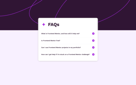
This is a perfect challenge to practice the usage of <details> and <summary> tags. They bring the hide/show answer capability by default. Give them a try. In addition the summary tags are focusable by pressing the tab key and show/hide the ansers when pressing the enter or space keys.
If I hover/click the question they don't act like it is written in the brief of the challenge, you can use the :hover, :active and :focus pseudo classes to reach this goal.
Also I love those animations, they bring life to your work.
Awesome job!