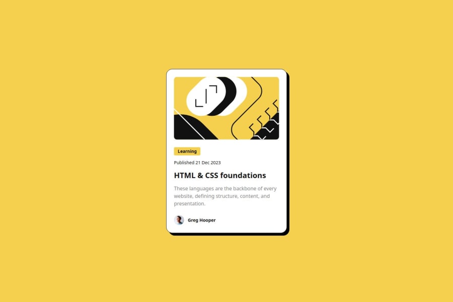
responsive visit card using CSS Flexbox, Hover Effects, and Object Fit
Design comparison
Solution retrospective
I'm most proud of how I integrated various CSS techniques to create a visually appealing and responsive blog card design. Using flexbox layout, custom fonts, hover effects, and media queries allowed me to craft a polished and user-friendly interface.
What challenges did you encounter, and how did you overcome them?One challenge was maintaining consistent styling across various screen sizes, which I addressed through extensive use of media queries. Integrating custom fonts with @font-face posed initial hurdles, but I optimized font loading and cross-browser compatibility to overcome this challenge.
What specific areas of your project would you like help with?I'd appreciate assistance with optimizing my CSS code for improved performance and maintainability, as well as exploring advanced CSS techniques to enhance the user experience further.
Community feedback
- @kemenyfa-szuPosted 11 months ago
Hello @mmandziuk!
Your solution is very similar to the original design! Nice work!
- As I see, you mainly use
pxunits to font-sizes and other layout related properties. I recommend you to check outremandemunits. It is better for accessibility. Watch this video on how to choose your unit on each property.
Marked as helpful0 - As I see, you mainly use
- @Gaffen87Posted 11 months ago
TIP: You can use em units instead of px for font-size so it automatically adjusts when adjusting container size for smaller screens.
Marked as helpful0
Please log in to post a comment
Log in with GitHubJoin our Discord community
Join thousands of Frontend Mentor community members taking the challenges, sharing resources, helping each other, and chatting about all things front-end!
Join our Discord
