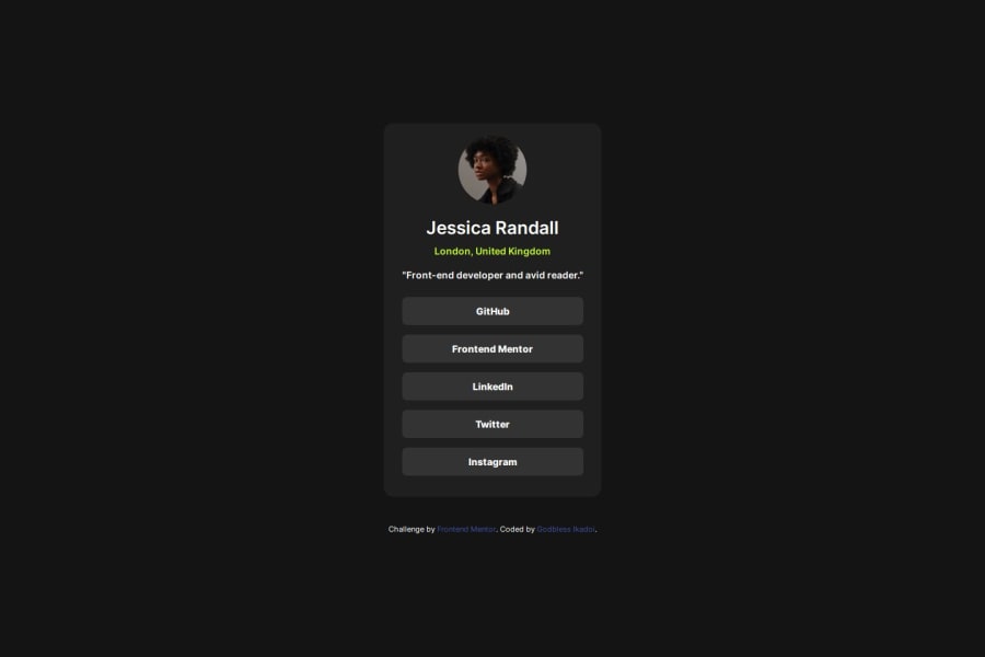
Responsive social link card using css flex
Design comparison
Solution retrospective
Its was quite an intriguing project, it sharpened my knowledge on how to use the :focus pseudo selector and the transition property. I'd like to learn how to start my projects with mobile first as I am still learning the process of responsive web design
What specific areas of your project would you like help with?If it would be possible I'd like to get a positive feedback on how to use the new units such as the dvh unit its still unclear to me.
Community feedback
- @kemenyfa-szuPosted about 1 year ago
Hello @TariCodes!
Congratulations on completing this challenge! Nice job!
- Firstly, let me advise you to put an inline margin on your <main> element, so it does not touch the side of the screen on smaller screen sizes.
- Secondly, the dvh, as I could understand, is a dynamic viewport unit. Its most useful area is on mobile devices, where the upper section of the browser is being hided when scrolling down the page, and showed again when you scroll up or reach the page's top. The dvh detects the when the browser's upper section is being hided/showed. Technically when the upper section is showed, 1dvh = 1svh, and when it is hided, the 1dvh = 1vh.
Best wishes!
Marked as helpful1
Please log in to post a comment
Log in with GitHubJoin our Discord community
Join thousands of Frontend Mentor community members taking the challenges, sharing resources, helping each other, and chatting about all things front-end!
Join our Discord
