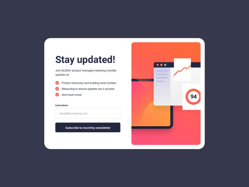
Submitted over 1 year agoA solution to the Newsletter sign-up form with success message challenge
Newsletter sign-up form with success message solution HTML, CSS, JS
accessibility
P
@AydanKara

Solution retrospective
What are you most proud of, and what would you do differently next time?
- I pride myself on getting as close to the design as possible.
- Next time I'll try to use as few div tags as possible.
-
Validating the email entered was a challenge.
-
The "JavaScriptAcademy" Youtube channel helped me a lot --> Form validation using Javascript on the client side for beginners
I think I did pretty well with the challenge. But of course I would appreciate feedback of any kind.
Code
Loading...
Please log in to post a comment
Log in with GitHubCommunity feedback
No feedback yet. Be the first to give feedback on Aydan's solution.
Join our Discord community
Join thousands of Frontend Mentor community members taking the challenges, sharing resources, helping each other, and chatting about all things front-end!
Join our Discord