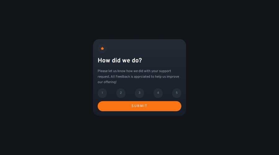
Design comparison
Solution retrospective
I found this project pretty easy. In the last project I did someone had recommend me to us semantic HTML tags more, so I made sure to do that (though it's a small project so). I've also only been testing all of my projects down to 375px, Grace had told me to do it down to 320px which I did
My one question: The two images (the icon & the illustration), according to one article I read I should leave alt tags off of decorative images that are truly just decorative. I know I shouldn't put an alt tag on the icon, was I right in not putting one on the illustration too?
If anyone has any ideas on anything I can do better (especially relating to accessibility), let me know, thank you!
Community feedback
- @kemenyfa-szuPosted 11 months ago
Hello @Mlchaell!
Nice solution!
- To answer your question... Yes, the alt text is not a required thing if it is only a decorative image. But you still have to specify the
altattribute and leave it empty (alt="") so screen readers know that the absence of alt text is intentional.
All in all, your solution is very great! Keep up the good work!
Marked as helpful1 - To answer your question... Yes, the alt text is not a required thing if it is only a decorative image. But you still have to specify the
Please log in to post a comment
Log in with GitHubJoin our Discord community
Join thousands of Frontend Mentor community members taking the challenges, sharing resources, helping each other, and chatting about all things front-end!
Join our Discord
