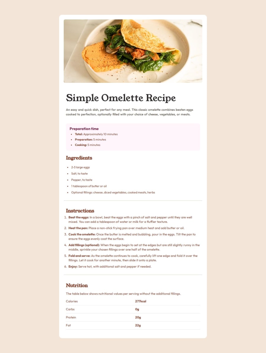
Design comparison
Solution retrospective
I structured the divs much more clearly this time ig.
What challenges did you encounter, and how did you overcome them?NA
What specific areas of your project would you like help with?If anyone can explain to me in short how does the length of the webpage works and how i can customize it, on which elements it depends. please help.
Community feedback
- @kemenyfa-szuPosted 12 months ago
Hello @hannibal1631!
Congratulations on finishing this FrontendMentor challenge! Well done!
- The glitch you mentioned is caused by a
list-style-position: inside;property on your <li> element. That makes the list marker part of the li element and moves with it when you apply a margin or padding property on the <li> element. Also you set amargin-left: 10pxonly on the <strong> element in the list item so only the <strong> element is pushed to the right. Use themargin-lefton the <li> element (delete the strong word from the css selector) and delete thelist-style-position: inside;property. - Also I recommend you not to use px unit on font related propertie as it is not accessible. Visually impaired people use their browser with large font settings, and px units do not adjust to this browser setting. Have a look at rem and em units. Use px units only on
border-radius,box-shadowand such properties as their visual do not effect readability.
Keep up the good work!
Marked as helpful0 - The glitch you mentioned is caused by a
- P@tdimnetPosted 12 months ago
Hi Hannibal,
Great work with your recipe project. Your project seems to meet the requirements. However, I have a weird issue with my computer: it seems that the website is really tinny.
For example, some of the font size you used are:
font-size: 9px;I think it's a little bit too small and it should be a bit bigger. On my challenge, mine is 16 pixels. You can have a look here: https://tdimnet.github.io/Recipe-page/ I don't say that my solution is better than yours, I just think your project could be a bit bigger.
Let me know, Tom.
0@hannibal1631Posted 12 months ago@tdimnet I'm facing that exact problem. The webpage seems too small compared to the actual solution. I increased the font sizes of all heading and other contents. But still the height of the container remains same. It's not long like the actual page. Can you suggest anything on that? Should I change anything on body and container?
0P@tdimnetPosted 12 months ago@hannibal1631 : hi, it seems you updated your project. I am not facing issues.
What did you do?
Have a nice day, Tom.
0@hannibal1631Posted 12 months ago@tdimnet : hello there. all i did was opened the preview image on my chrome and then i realized my font sizes were small as well as the margins. so i increased them by 20% ig, and it worked. Still i have a blank space at the bottom. As i'm still like 1 month into html and css, i'll figure it out in near future.thanks for checking on me though, i appreciate it mate.
0
Please log in to post a comment
Log in with GitHubJoin our Discord community
Join thousands of Frontend Mentor community members taking the challenges, sharing resources, helping each other, and chatting about all things front-end!
Join our Discord
