It looks good. But, there's quite some oddities in your code.
In your header you have to h1-titles. Even if it's possible to write that, it's very bad practice. There can only be 1 h1 on your html-page and it has to be the main title of your page. It's tough to know which one it'd be here. You can style any text-element to look like an h1 without it being it.
You've put a display: flex on your section. But it only has one child, a div so it is of no use here. Why did you use a flex? What did you want to achieve?
As for the grid on your main, consider using template-columns: repeat(4, 1fr) instead of 33.33% 33.33% 33.33%. It's actually the same, but it will save you some math and increase readability.
Why did you set width on your text-elements? Why is there a overflow-x: hidden in your css-reset?
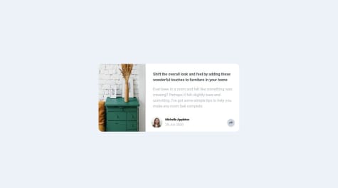
I think, eventhough it actually looks like it should, you might want to go over your code again. Move your image-div outside the div with all the text. What does section look like then, with and without display: flex. Remove the width: 100% on your .image. You want that to be on the actual img, not on its parent. Just rethink and shuffle the elements and see what happens.
I know. it's annoying because you finished this exercise and it looks good. But once you move on to tougher exercises, you'll be running in 'CSS is hard'-moments and the sooner you address these moments, the easier writing CSS becomes.
Don't let this discourage you. The code you've written is very structured and readable. You followed the design and created exactly what it should look like. Which is awesome. So, continue coding, you got this.