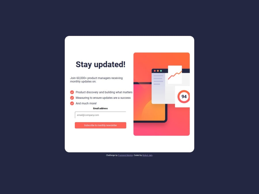
Design comparison
Solution retrospective
Need help please check while it swtched to media query the gap incrses what to doo Open for any feedback to improvise
Community feedback
- @katrien-sPosted 10 months ago
Desktop looks good. Mobile is where things really go wrong. I remember myself struggling quite some with this exercise, so don't feel down for not entirely achieving the result. It's part of the learning process.
It seems to me you got yourself in a lot of trouble with the extensive use of setting widths and heights using %. Are you familiar with working with flex or grid?
As for the image, you have been given 2 images: one for mobile, one for desktop. You need to use those. Have a look here to understand how te be using them: Responsive images
I don't understand why you set this width & height on your container. If you're going to use full-width, you don't need to specify it, as your webpage will always take up full-width. The height might be more usefull on your body or html-element, if you're using it to center your container.
.container { width: 100vw; height: 100vh; }
Also specifiying height on your main, seems overkill. A flex-element will always take up all the space it needs. And it's very rarely necessary to set a height.
Are You Making These CSS Height Mistakes?
One of the most common CSS issues people run into
Try again. Look into how using flex or grid. Whether it's necessary to set width and height. And have a little round of applause for yourself when things look good. Happy coding!
Marked as helpful1@Mukulvjain1Posted 10 months ago@graficdoctor thanks for the feedback definitely i will work on the design again and get it done correctly
1
Please log in to post a comment
Log in with GitHubJoin our Discord community
Join thousands of Frontend Mentor community members taking the challenges, sharing resources, helping each other, and chatting about all things front-end!
Join our Discord