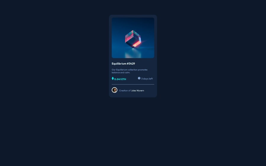
Frontend Mentor | NFT preview card
Design comparison
Solution retrospective
I'ts okey to use rem for everything?
Community feedback
- P@danielmrz-devPosted about 1 year ago
Hello @LexTarasov!
Your project looks great!
It's quite a challenge to add that hover effect with the overlay image properly. Here's how you can do it:
HTML
<img src="images/image-equilibrium.jpg" alt="Equilibrium" class="pic">
  <div class="icon">
    <img src="images/icon-view.svg" alt="icon-view" class="icon-view">
  </div>
CSS
.pic {
   width: 300px;
   background: url('images/icon-view.svg') center center no-repeat;
   background-color: $Cyan-hover;
   background-size: cover;
   margin: auto;
   border-radius: 10px;
}
.icon {
   display: grid;
   justify-content: center;
   align-items: center;
   position: absolute;
   opacity: 0;
   background-color: $Cyan-hover;
   width: 300px;
   height: 300px;
   border-radius: 10px;
}
icon:hover {
   opacity: .5;
   cursor: pointer;
}
Just don't forget to change the class names to match yours.
I hope it helps!
Other than that, you did an excelent job!
Marked as helpful1 - P@katrien-sPosted about 1 year ago
Check this Kevin Powell video: Are you using the right css unit and have a browse through his more recent vids.
1
Please log in to post a comment
Log in with GitHubJoin our Discord community
Join thousands of Frontend Mentor community members taking the challenges, sharing resources, helping each other, and chatting about all things front-end!
Join our Discord
