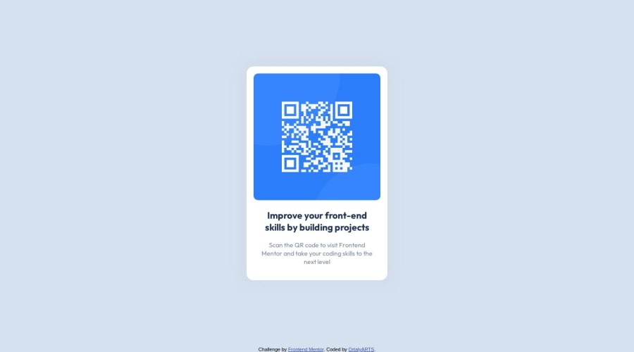
Design comparison
Solution retrospective
I am not sure if the usage of display:block was the right option or I should better use the css grid.
Community feedback
- P@katrien-sPosted over 1 year ago
Hi, this actually looks good. I've been going through your code and will point out some peculiarities I found.
On
bodyyou set afont-family: Inter, but declare later on a different font for yourh1andp. Since they are the only text-elements, why wouldn't you declarefont-family: 'Outfit', sans-serif;on your body?Also, why did you set
font-size:90%;? But onh1you set font-size inpx. As for font-sizes, most commonly people use rem-values. This is a responsive unit, that allows the user who's adapted its displat size, still see the font-size as intended. This 90% kind off does that, but it's not the correct unit to use here. Kevin Powell - Are you using the right CSS units?Try to be consistent. Your
mainhas apadding:16px;while on yourh1you writepadding:1.1rem;Just write it as rem/em everywhere.I don't see an issue with you having used
display: block. The item sits fine in the middle of the page.I'd see, all good besides a few minor issues.. But this looks promising. Keep coding and enjoying.
Marked as helpful0
Please log in to post a comment
Log in with GitHubJoin our Discord community
Join thousands of Frontend Mentor community members taking the challenges, sharing resources, helping each other, and chatting about all things front-end!
Join our Discord
