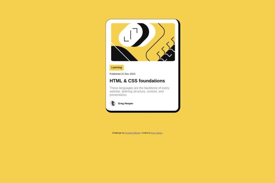
Design comparison
Solution retrospective
Responsive web design.
Not knowing the right questions to ask when solving problems.
Making the border for the main content look exactly like in the design.
Community feedback
- P@danielmrz-devPosted about 1 year ago
Hello @Ezra003!
Your project looks great!
I noticed that you used
marginto place the card in the middle of the page. Here's a very efficient way to center the card:- Apply this to the body (in order to work properly, don't use position or margins):
body {
    min-height: 100vh;
    display: flex;
    justify-content: center;
    align-items: center;
}
I hope it helps!
Other than that, great job!
0 - P@katrien-sPosted about 1 year ago
Hey, what you did looks good. Though when you finish an exercise, fill out the readme-file as instructed. It's important to create a habit from the beginning, as readme-files are vital later on in your career.
- One thing that I immediately noticed, is the use of nothing but
<div>s in your html, beside the<Main>(which has no need to be capitalized). If working with text, use the correct html-tags. As it's important to write your html readable for screenreaders. It's vital to use semantic html correctly. (HTML tags for text)[https://flaviocopes.com/html-text-tags/] - Why did you split up your css in 3 files? For a small project like this, there's no need.
- You declared a
cursor: pointeron the hover-state of.course. You can move that to.courseitself. - What is this url-reference doing here?
cursor: url(/assets/images/cursor.png), pointer;(The assets folder won't open on GitHub so I can't see what you're linking to) - The font you used, 'figtree', hasn't been installed?
- I suppose by using
margin: 100px 545px 100px 545px;on your<main>you were trying to center main in the middle of the page? (How to center a div horizontally)[https://www.youtube.com/watch?v=ULVu2VNM_54] - There's also no need to set a width on your body. Your body will always want to take up the full width of the browser window.
There's room for improvement, but this sure already looks good. It shows you have an eye for design vs. code. Have a look at what could be improved here and move on. There's lots more fun projects waiting for you. Happy coding!
0 - One thing that I immediately noticed, is the use of nothing but
Please log in to post a comment
Log in with GitHubJoin our Discord community
Join thousands of Frontend Mentor community members taking the challenges, sharing resources, helping each other, and chatting about all things front-end!
Join our Discord
