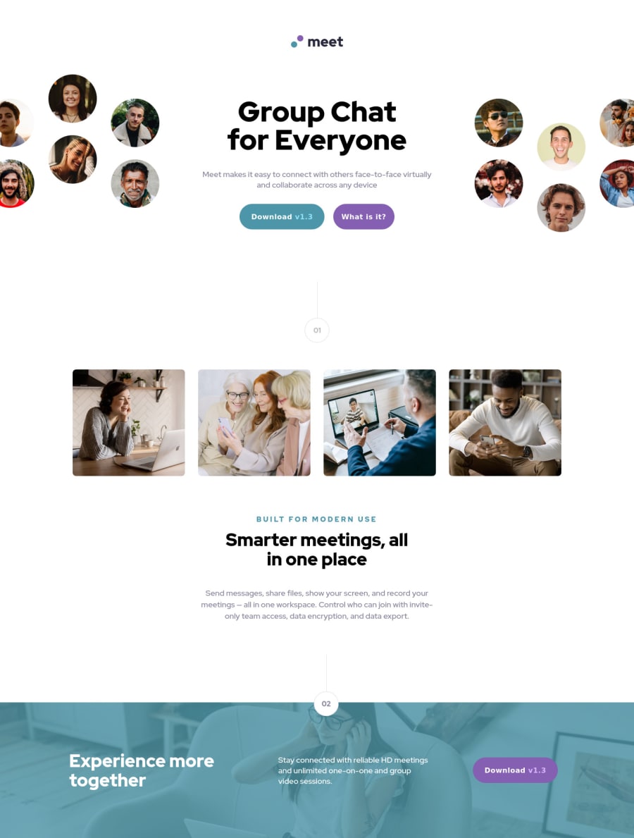
Design comparison
Solution retrospective
Direct me to be a better developer by giving some tips if I did something improperly, please :)
Community feedback
- P@katrien-sPosted about 2 years ago
Code looks decent and clean. Very well organised and easy to read. Your page however completely breaks up on tablet-size. Elements go of position, background-image overlaps the text,...
One advice to prevent this in the future: go for a mobile-first approach. It's a lot easier and it makes more sense when you're moving in your code from mobile to desktop, you always add stuff. You keep an overview. When you go from desktop to mobile, you don't only need to delete stuff, but also rearrange code. Giving yourself a lot more issues to solve.
Marked as helpful1
Please log in to post a comment
Log in with GitHubJoin our Discord community
Join thousands of Frontend Mentor community members taking the challenges, sharing resources, helping each other, and chatting about all things front-end!
Join our Discord
