Latest solutions
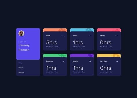
time-tracking-dashboard HTML CSS Javascript
PSubmitted about 2 months agoI want to improve naming classes in html. I think that a good markup helps a lot.
Article preview component HTML CSS Javascript
PSubmitted 2 months agoI would like suggestions on useful resources to learn better how to work with images in general
Article preview component HTML CSS Javascript
PSubmitted 2 months agoI would like some help with the images, how to make them responsive with all layout and fit where they have to fit...
Meet Landing Page pure CSS & HTML responsive layout
PSubmitted 5 months agoThe image in the footer, I was not able to made it look as the design where it looks zoom out, I tried everything...but did not work. Maybe something is not correct in the markup. I would love feedback on this and also...
overflow....even if there is no horizontal scrolling the number 02 is causing overflow...
..and the image on the left and right of the header in the desktop version also had overflow because I scaled them up to make it look like the design and then removed it because overflowing and cause horizontal scrolling.
This two things are what really slowed me down and could not fix.
Latest comments
- P@HelewudSubmitted about 2 months agoP@Kiara523Posted about 2 months ago
Hey I looked at your solution and I've found it too advanced for me, I can definitely learn something from it.... It made me realized that I'm missing a part of javascript, the "this" keyword, not very familiar with that...let know if you have any good resources to share...thanks bye😊
0 - @razanabbasSubmitted 2 months agoWhat are you most proud of, and what would you do differently next time?
I am proud that i successfully made my code functional
What challenges did you encounter, and how did you overcome them?This was my first time working with regex to make an email validator so it took me a while to work it out
What specific areas of your project would you like help with?Any general advice
P@Kiara523Posted 2 months agoHi! I had a look at your code and I it was very well organized easy to read. I liked the semantic and also that the form even if is not visible is still accessible to screen reader.
Just a small thing to improve the code could have been to show the actual email of the user in the success message page, utilizing the some span elemenr that you used for styling and handle the innerText with javascript.
I hope it was useful, have a good day!
0 - @DanieleErcoli243Submitted 2 months agoWhat are you most proud of, and what would you do differently next time?
I'm proud because I found all the solutions by myself when I had a problem of layout or so and I'm proud because I've been able to apply something I read on an article. Next time I would like to be faster at finding those solutions.
What challenges did you encounter, and how did you overcome them?I had troubles handling the dimensions of the cards in the different breakpoints. I overcame them using the inpsector of the browser and all my knowledge and experience.
What specific areas of your project would you like help with?I would really like to master Javascript, because on html and css I'm confident.
P@Kiara523Posted 2 months agoHey I took a look at your solution and all looks great, semantic HTML, well organized and structured.
The improvement on the HTML could be to use a <picture> tag which allows you to use the <source> tag to switch in between the two main images. It works a bit as a media query where you can set a break point <source media"(width: 650px)" srcset="...">
In the message page you could also show the actual email address of the user using a span in the HTML and then display it with javascript.
I hope this was useful.
Marked as helpful1 - P@JairRaidSubmitted 2 months agoWhat challenges did you encounter, and how did you overcome them?
The challenge for me is to create this little animation for the share links.
What specific areas of your project would you like help with?If someone has any suggestion to easily animate this "share links" please share the code.
P@Kiara523Posted 2 months agoHello there, I'd like to let you know that thanks to one of your comment on somebody else solution I was able to find the error in my code...
The problem I was having it was for the
overflow:hiddenthat wouldn't allow the popup to be on top.At the moment the GitHub server is having problems so I cannot look at you solution
I'm sorry...
0 - P@aysenurtatliSubmitted 5 months agoP@Kiara523Posted 5 months ago
Amazing job in my opinion, I had a look at your code and I find it very well organized.
I liked how you took advantage of flexbox and use it to center the main section all at once.
The webpage is very well done and on moblie looks good as well. A way to implement it would be to create variable for the font size using relatives units and clamp so that you do not need to rewrite the font size in the media queries.
Code is clean. Good breakpoint choise.
Great job!
Marked as helpful0 - @lordagSubmitted 5 months agoWhat specific areas of your project would you like help with?
I'm trying to get better with semantic HTML and aria attributes
P@Kiara523Posted 5 months agoGreat work! I found your CSS very organized and clean! More relatives units could have been applied though.
The HTML it's good, for Semantic you did very well using section and article where you could, it's important for browsers and screen readers to use headings starting from h1(only 1 per page) and then the others, as many as you need.
Happy coding 😎
0


