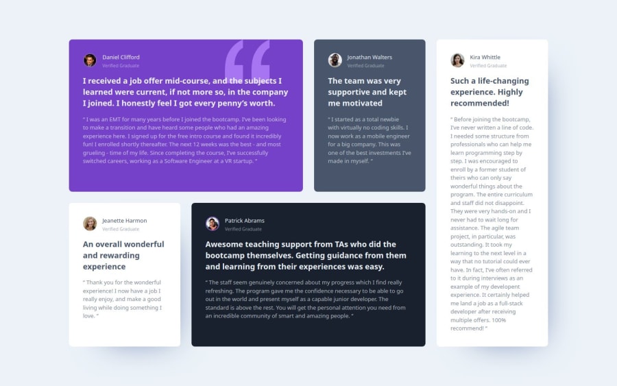
Design comparison
Solution retrospective
I'm trying to get better with semantic HTML and aria attributes
Community feedback
- P@Kiara523Posted 5 months ago
Great work! I found your CSS very organized and clean! More relatives units could have been applied though.
The HTML it's good, for Semantic you did very well using section and article where you could, it's important for browsers and screen readers to use headings starting from h1(only 1 per page) and then the others, as many as you need.
Happy coding 😎
0@lordagPosted 5 months ago@Kiara523 Thanks for the feedback, I really appreciate it.
How could I have applied more relative units?
For the use of h1, I didn't know where to use it in this layout.
0P@Kiara523Posted 5 months ago@lordag line 3
html{ font-size: 13px; }this unable the user to choose the preferred font size from the browser settings because the code it's setting it at 13px no metter what and has a waterfall effect on all the relatives units you have set for making it responsive. Try it, change the font size from in the browser settings and see that nothing changes, and it should instead.I hope this is helpful! Your code is great!!
0@lordagPosted 5 months ago@Kiara523 Thanks!!, I set the font to 13px as the root font so that 1 rem would be equivalent to 13px and not 16px. I did this to follow the instructions in the style-guide.md file that said the base font should be 13px. How would you have done it?
Thanks again for the feedback.
0P@Kiara523Posted 4 months ago@lordag Hey there... I would have set the 13px converted it in rem in the body (not on root element). That would set the paragraph text at 13px as required and also able to the user to choose his personal preference.
I hope this was helpful! 🌚
Marked as helpful0
Please log in to post a comment
Log in with GitHubJoin our Discord community
Join thousands of Frontend Mentor community members taking the challenges, sharing resources, helping each other, and chatting about all things front-end!
Join our Discord
