

Design comparison

Solution retrospective
There were a few things I had never encountered before...but I just kept looking for solution.
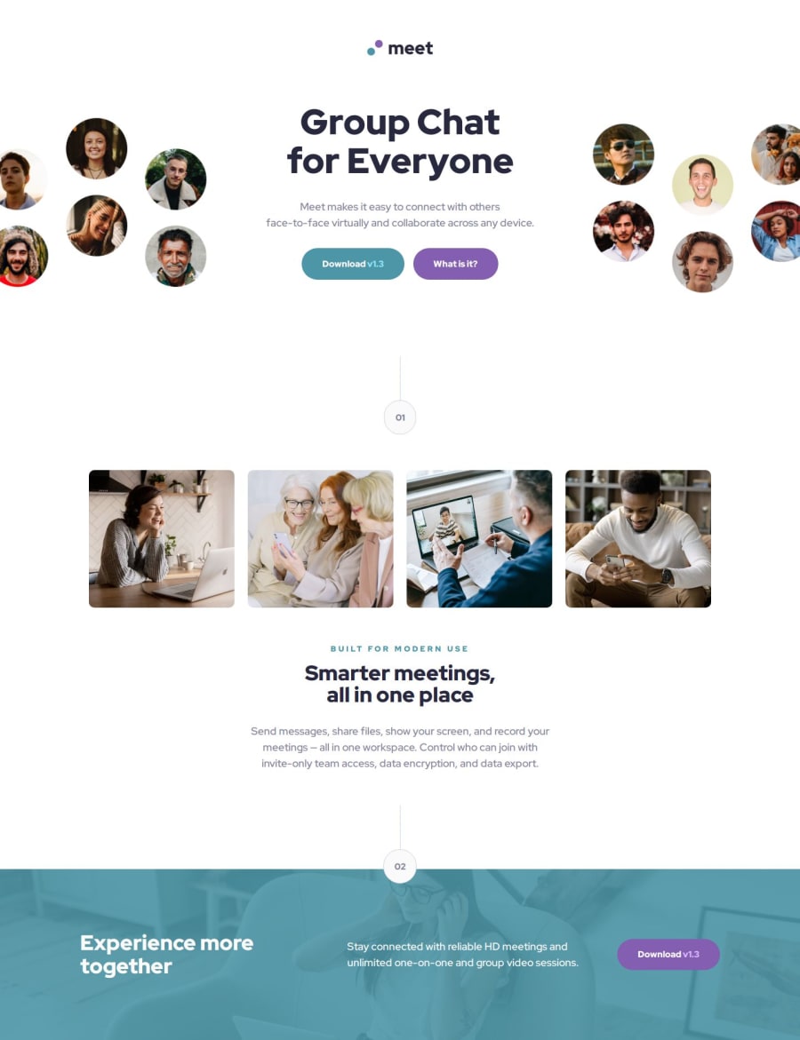
What challenges did you encounter, and how did you overcome them?The number in the middle of the page is the one that caused me more problem, but in the end I came out with my solution. Because of this I now have a better and stronger understanding of positioning, how they work and side effects that come with them like overflow...
What specific areas of your project would you like help with?The image in the footer, I was not able to made it look as the design where it looks zoom out, I tried everything...but did not work. Maybe something is not correct in the markup. I would love feedback on this and also...
overflow....even if there is no horizontal scrolling the number 02 is causing overflow...
..and the image on the left and right of the header in the desktop version also had overflow because I scaled them up to make it look like the design and then removed it because overflowing and cause horizontal scrolling.
This two things are what really slowed me down and could not fix.
Community feedback
- @lordagPosted 4 months ago
Great job! The code is clean and readable.
Some observations: I would balance the size and the use of space a bit, for example with the layout at a resolution of 1020px the title and the text should be adjusted by adjusting the padding-inline of the content (@media 62.5em).
Using the chrome tool you can select various devices to see how the layout adapts, try to see the one for iPad Pro for example.
I haven't done this challenge yet, it doesn't seem trivial, there are little things that can make you waste a lot of time. For the images above, perhaps I would have tried to use them as the background of the section element with class hero and I would have sized and positioned them with the css based on the various resolutions.
Something like this.
.element {
  background-image: url('left-image.png'), url('right-image.png');
  background-position: left center, right center;
  background-repeat: no-repeat, no-repeat;
  background-size: auto, auto;
}
Marked as helpful0P@Kiara523Posted 4 months ago@lordag thanks a lot! Yes I agree about the spacing, it is something that I straggled a bit with.
Hero as a background I didn't try, but seams like it could work well.
🌚
1 - P@ajibade-ibrahimPosted 4 months ago
Hi @Kiara523, great implementation. Nice attention to detail with the vertical alignment of the hero images.
0


Please log in to post a comment
Log in with GitHub
Join our Discord community
Join thousands of Frontend Mentor community members taking the challenges, sharing resources, helping each other, and chatting about all things front-end!
Join our Discord