Not Found
Not Found
Not Found
Not Found
Not Found
Not Found
Not Found
Not Found
Not Found
Not Found
Not Found
Not Found
Not Found
Not Found
Not Found
Not Found
Not Found
Not Found
Not Found
Not Found

All comments

  • vcalvo25 30

    @vcalvo25

    Submitted

    What are you most proud of, and what would you do differently next time?

    Might seem simple, but I'm mostly proud of just completing the project. I was a bit intimidated by Frontend Mentor, as my only experience with HTML/CSS was through the Responsive Web Design course by FreeCodeCamp. This was an excellent review after taking a break from HTML/CSS.

    What challenges did you encounter, and how did you overcome them?

    One challenge I encountered was to ensure that everything lined up correctly and was centered. I overcame it by editing the margins and padding quite a few times. I also watched a Youtube video to ensure I was on the right track for some parts of the project.

    What specific areas of your project would you like help with?

    I would mostly like help with margins and padding. More specifically, when is the appropriate time to use different units of measurement such as PX, EM, REM, %, and VW/VH? I waste time on projects by going back and forth between the different units of measurement to see the difference, so I'd like to know if some units of measurement are to be used in specific scenarios than others. Thank you for the feedback!

    Huy Phan 1,360

    @huyphan2210

    Posted

    Hi, @vcalvo25

    I saw your solution and I have some thoughts:

    • I noticed you've used Flexbox on the body and applied align-items: center, which is great! To fully center the card, you can simply add justify-content: center to the body and safely remove margin: 0 auto from the .container. This way, the card will still be centered, and you're making better use of Flexbox for positioning.
    • As for when to use different units like px, em, rem, %, and vw/vh: px is an absolute unit, so it doesn’t change based on the environment. em and rem are relative units, where em is based on the parent’s font size, and rem is based on the root html font size. If you don't change the font-size of the html, then rem can be considered as a fixed unit, with 1rem equal to 16px by default. % is relative to the size of the parent element, and vw/vh are based on the viewport width and height.

    Examples:

    • px: font-size: 14px; (fixed size, doesn’t adapt to screen size)
    • em: font-size: 2em; (twice the size of the parent’s font size)
    • rem: font-size: 1.5rem; (1.5 times the root font size, i.e., 24px if the root font size is 16px)
    • %: width: 50%; (half the width of the parent element)
    • vw/vh: width: 80vw; (80% of the viewport width)

    I'd personally use px or rem (if I don’t change the html font-size) for elements that rarely need to change size, and I’d use the other units for responsive purposes.

    Hope this helps!

    0
  • P

    @rkeppler42

    Submitted

    What are you most proud of, and what would you do differently next time?

    I am proud of being able to get close in the first iteration. Next time I will be more prepared because I will study more flexbox.

    What challenges did you encounter, and how did you overcome them?

    I am new in webdesign so flexbox is quite hard to me yet. I had to google somethings

    What specific areas of your project would you like help with?

    I would like to know if there is something or some technic I could have used to make my page more robust and complete.

    Huy Phan 1,360

    @huyphan2210

    Posted

    Hi @rkeppler42,

    It looks like this is your first challenge, and you got the QR card 99% accurate to the design—congratulations!

    I do have a few suggestions:

    • You don’t need to add width: 100vw to the body because the body is already a block-level element, which naturally takes up the full width. Also, instead of setting height: 100vh, it’s better to use min-height: 100vh to avoid layout issues on smaller viewports (e.g., mobile browsers with dynamic address bars).
    • Consider using more semantic HTML instead of relying heavily on div elements. Semantic elements like article, section, or main provide better context for the content, improving accessibility.
    • While I don’t have access to the design file, your card looks nearly perfect. Keep in mind that the design may be optimized for specific devices, so it’s often the developer's job to make elements responsive. Rather than hardcoding width and height values, try using min-width/min-height or max-width/max-height with specific values, while keeping width/height relative (e.g., using percentages or vw/vh units).

    Hardcoded Width/Height (Not Recommended)

    .card {
      width: 320px;
      height: 499px;
    }
    

    Responsive Example (Recommended)

    .card {
      max-width: 320px;
      width: 90%; /* Relative width, adjusts based on the screen size */
      
      min-height: 499px;
    }
    

    Hope this helps!

    Marked as helpful

    1
  • ayx 40

    @ayx234

    Submitted

    What challenges did you encounter, and how did you overcome them?

    The article's image stretches vertically on the mobile version of the design. I searched for a dynamic solution and was introduced to CSS aspect-ratio.

    Github didn't initially show the images or the correct font because I used src="/folder-name.../" Github needs a dot before the forward slash for relative paths src="./folder-name/..."

    What specific areas of your project would you like help with?

    • How do I make my HTML more semantic and accessible ?
    • How can I improve my CSS ?
    Huy Phan 1,360

    @huyphan2210

    Posted

    Hi, @ayx234

    I took a look at your solution and have some thoughts:

    • Semantic HTML: I think your .card could be an article element, or you could make the card itself the main element instead of using main as a wrapper. Also, the .attribute section might work better as a footer element below the main rather than a div inside it.
    • CSS: You've done a great job styling the card! My recommendation would be to reorganize your CSS file. Consider placing @font-face at the beginning and moving all @media queries to the end. I also noticed that you're styling the body in two places, so merging those would improve clarity.

    Hope this helps!

    0
  • @FxGanangGH

    Submitted

    What are you most proud of, and what would you do differently next time?

    Proud of identifying knowledge gaps. Need to improve on putting attention to details and work on problem-solving speed.

    What challenges did you encounter, and how did you overcome them?

    Adjusting layout from full-screen on mobile to a contained layout on desktop challenged me more than I thought. This helped me find knowledge gaps that I need to work on.

    What specific areas of your project would you like help with?

    Any feedback is appreciated.

    Huy Phan 1,360

    @huyphan2210

    Posted

    Hi, @FxGanangGH

    I saw your solution and had a suggestion:

    • It looks like you're using Tailwind, and on viewports smaller than 1440px, the result summary component expands to fill the entire width (which seems like it's only intended for mobile screens). I think you could add more Tailwind classes to the <div> that contains the desktop classes to make it more responsive. I'm not too familiar with Tailwind, so you'll have to experiment with that.

    Hope this helps!

    Marked as helpful

    1
  • @Kamelek1337

    Submitted

    What are you most proud of, and what would you do differently next time?

    I am proud that I was able to build the entire website on my own and it is fully functional. I think I will use Tailwind CSS next time in my project 💨

    What challenges did you encounter, and how did you overcome them?

    The hardest part of creating this site was saving the checkbox data to localStorage because I didn't want to create three states to manage this inputs, but I still haven't found a better solution

    What specific areas of your project would you like help with?

    Feedback welcome😃

    Huy Phan 1,360

    @huyphan2210

    Posted

    Hi, @Kamelek1337

    I took a look at your solution and I have some thoughts:

    • Your body covers the full viewport because of min-height: 100vh, but your #app and .container don’t. In situations like this, I usually apply Flexbox to the body and #app, with flex-direction set to column, and use flex: 1 on #app and .container to make them stretch properly.
    body {
      display: flex;
      flex-direction: column;
      min-height: 100vh;
    }
    
    #app {
      display: flex;
      flex-direction: column;
      flex: 1;
    }
    
    .container {
      flex: 1;
    /* Your styles here*/
    }
    

    This setup ensures both #app and .container expand to fill the available space of the body.

    • You're hardcoding the width and height of .container and <main>. It also looks like you're not using media queries to make the form responsive (it seems like you're using React state to change its class, which is another valid approach). However, on viewports between 601px and 1200px, the form isn't centered or responsive. I'd suggest removing the hardcoded width and height, and using media queries to handle responsiveness.

    Hope this helps!

    Marked as helpful

    0
  • P

    @danielbasilio

    Submitted

    What are you most proud of, and what would you do differently next time?

    In a refactoring in the future, I would focus more on the accessibility part and use some framework, probably react

    What challenges did you encounter, and how did you overcome them?

    Using the ITCSS methodology was the biggest challenge

    What specific areas of your project would you like help with?

    In terms of accessibility

    Huy Phan 1,360

    @huyphan2210

    Posted

    Hi, @danielbasilio

    I took a look at your solution and have a few suggestions:

    • For accessibility, I assume you're familiar with semantic HTML. I'd encourage you to think about what other elements you could use instead of <div>—there are plenty of block-level elements that could improve both structure and accessibility.
    • Your .container isn't centered on my 1920x1080 screen, and that's because of the max-width: 1440px you've applied. Simply removing this should fix the issue.
    • Also, you don't need height: 100vh on .container because it forces the container to always match the viewport height, which can cause overflow issues or create extra empty space. Instead, applying min-height: 100vh to the body ensures the page fills the screen without restricting the container's natural height, allowing it to grow as needed.

    Hope this helps!

    0
  • Josh Boys 70

    @jboys

    Submitted

    What are you most proud of, and what would you do differently next time?

    I tried a couple of new things: arbitrary values in Tailwind classes (e.g. rounded-[20px]) and auto class sorting using Prettier with the Tailwind plugin.

    What challenges did you encounter, and how did you overcome them?

    Matching the design in Figma. I got a 98% or so match, but an exact match was elusive. Despite matching the padding/margins, font sizes, weights, etc — there was still a slight discrepancy in the layout. Not a big deal, but I'm curious to know why.

    What specific areas of your project would you like help with?

    What caused my solution to be off by a few pixels from the design? I couldn't figure this out so I'd love some suggestions/feedback on this!

    Huy Phan 1,360

    @huyphan2210

    Posted

    Hi, @jboys

    I checked out your solution and had a few thoughts:

    • I noticed you don't have access to the design files, so I assume you used another tool to get as close as possible to the design.
    • As for why your solution is around 98% accurate but not a perfect match, it could be due to small differences in things like font-size, line-height, letter-spacing, font-weight, padding, margins, etc.

    Personally, I don’t think being pixel-perfect is something to worry about, and I believe you did a good job!

    Hope this helps!

    0
  • @niiquash

    Submitted

    What are you most proud of, and what would you do differently next time?

    I'm happy to be able to complete this task at all. My only problem is knowing how much value to assign font size and margin/padding to h2 and p elements.

    What challenges did you encounter, and how did you overcome them?

    As mentioned previously, I thought it was a bit confusing and almost go hacky figuring our a standard font size for the h2 and p elements underneath the qr code.

    What specific areas of your project would you like help with?

    I need help with knowing how to allocate margin and padding values appropriately without being hacky.

    Huy Phan 1,360

    @huyphan2210

    Posted

    Hi, @niiquash

    I took a look at your solution and had a few thoughts:

    • The card doesn't seem to be centered on my 1920x1080 screen. It looks like this is due to the margin: 12em auto on the <article>. There are other ways to center an element, which I'll explain below.
    • Ensure the body takes up at least the full height of the viewport by using min-height: 100vh (this ensures the body is always at least as tall as the visible screen). After that, you can remove the margin on the article and use Flexbox or CSS Grid to center the card effectively
    • As for the font sizes of h2 and p, there's no strict standard, as it really depends on the design. Since you don't have access to the design files, I recommend checking out some design systems (like Bootstrap, Material Design, etc.) and applying what feels right for your website.

    Hope this helps!

    0
  • HoaCTa 110

    @HoaCTa

    Submitted

    What are you most proud of, and what would you do differently next time?

    I am proud of being able to use Sass in this project. I will try to make my code neater next time.

    What challenges did you encounter, and how did you overcome them?

    I didn't make the page responsive. I have tried to use mobile first approach, but after that I don't know what I should do set rules for bigger screen. I notice that I should use calc() but I don't know if I should write it in mobile part only or for both part. Can those who have experience in implementing responsive pages give me some advice or feedback. Thank you!

    What specific areas of your project would you like help with?

    Calc(). After mobile screen css has defined, How to make use @media (min-width: 1024px) {}. Do we need to re-write most of parts? or is there better way to do it? Before we write css, do we need to reset the html tag every time? I usually have a main tag and a container div to wrap around all of the content. Is that a good practice or not ? Thanks

    Huy Phan 1,360

    @huyphan2210

    Posted

    Hi, @HoaCTa

    • Instead of applying styles directly to the html tag, I recommend applying them to the body tag. Styling the <body> is generally preferred because it directly impacts the visible content, whereas the <html> tag wraps both the <head> and <body>. Since the <body> manages layout and content, it's better suited for styles like padding, margins, and backgrounds. Additionally, many frameworks expect styles on the <body>, offering more flexibility when working with or switching between them.
    • After doing that, you can center your card by adding justify-content: center and align-items: center to the body.
    • Regarding your question about calc(): The decision to use calc() depends on your project requirements and personal experience. You can use it for mobile, desktop, or both. I'd suggest observing what others do and experimenting with it (as I have done and continue to do).
    • For media queries, here’s an example:
    /* Default styles - your mobile styles since you're using mobile first approach */
    body {
      background-color: white;
      color: black;
      font-size: 16px;
    }
    
    /* Media query for screens wider than 1024px */
    @media screen and (min-width: 1024px) {
      body {
        background-color: lightblue;
        font-size: 18px;
      }
    }
    

    When the viewport is 1024px or wider, the background-color changes from white to lightblue, and the font-size changes from 16px to 18px. Since the color: black isn't overridden in the media query, it remains the same. You don’t need to re-write everything nor reset the page or HTML tag to see the CSS changes—just resize your viewport/browser and observe the adjustments.

    Hope this helps!

    0
  • @StevenCodeson

    Submitted

    What are you most proud of, and what would you do differently next time?

    Learnt about bootstraps card class. Was able to visualise how the pieces went together before starting. It looks pretty close to the spec. Would like to have a better understanding about when to apply the grid system with bootstrap.

    What challenges did you encounter, and how did you overcome them?

    Struggled to get the card body layout looking spot on.

    What specific areas of your project would you like help with?

    More ergonomic use of layouts, rather than fudging margins until it looks right, I feel I'm missing a big picture concept.

    Huy Phan 1,360

    @huyphan2210

    Posted

    Hi, @StevenCodeson

    I checked out your solution and had a couple thoughts:

    • When you mentioned "More ergonomic use of layouts," I wasn’t entirely sure what you meant. If you're referring to positioning child elements within a parent container, I'd recommend diving into Flexbox and CSS Grid. They're great tools for layout design.
    • Bootstrap is definitely a handy framework, but if you're serious about mastering frontend development, I'd suggest focusing on crafting layouts with pure CSS. Once you get comfortable with CSS, you'll have a much deeper understanding of frameworks like Bootstrap, Tailwind, Bulma, and others, as they are essentially built on top of CSS. This will also give you more flexibility when choosing frameworks.

    Hope this helps!

    Marked as helpful

    0
  • @Ajaya-Rajbhandari

    Submitted

    What are you most proud of, and what would you do differently next time?

    • I'm most proud of the overall design and layout of the CSS code. The use of variables for colors and font weights makes the code more maintainable and scalable.

    • One thing I would do differently next time is to add more comments to the code to explain the purpose of each section and the reasoning behind certain design decisions. This would make the code more readable and easier to understand for others.

    What challenges did you encounter, and how did you overcome them?

    Responsive design: The code lacked a clear responsive design strategy, which made it challenging to adapt the layout to different screen sizes and devices. I had to add media queries and adjust the layout to ensure a smooth user experience across various devices. But i don't think that i succeed doing that.

    What specific areas of your project would you like help with?

    I would like to get help on following topics:

    • Consistency in naming conventions for classes and variables
    • Adding more comments to explain the purpose of each section and design decisions
    • Improving accessibility features, such as color contrast and ARIA attributes
    • Refining the responsive design for mobile devices
    • Optimizing the code for better performance and maintainability
    Huy Phan 1,360

    @huyphan2210

    Posted

    Hi, @Ajaya-Rajbhandari

    I reviewed your solution and wanted to share some feedback:

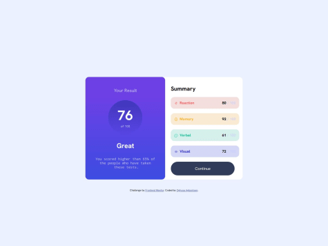
    • Your solution is missing key components from the design, such as the Reaction, Memory, Verbal, and Visual parts. Additionally, the font-family URL in your style.css is incorrect. It should be https://fonts.googleapis.com/css2?family=Hanken+Grotesk:[email protected]&display=swap instead of https://fonts.googleapis.com/css2?family=Hanken+Grotesk:wght@400;700&display=swap.
    • If you don't have a responsive design strategy in place, consider researching the mobile-first approach. Mobile-first is a responsive design strategy where you begin the design and development process with mobile devices in mind, ensuring that the website looks good on smaller screens first. Once that's done, you use media queries to progressively enhance the layout for larger screens like tablets and desktops. This strategy ensures a better experience on mobile devices, which are now more common.
    • For naming conventions, I suggest looking into the BEM methodology for CSS and using camelCase for JavaScript.
    • Regarding your point on adding comments: good class, variable, and function names should be self-explanatory. Focus on clear naming unless something is particularly complex and needs clarification.
    • For accessibility, I'd recommend researching semantic HTML. Don't stress about color contrast for now—those concerns are more design-related. As for ARIA attributes, I don't think they need to be a priority at this stage. Focus on nailing the design first.

    It seems like you have more questions, but from my perspective, your solution is currently incomplete. The goal of Frontend Mentor is learning, not just earning points. It feels like you're rushing through the process. Take your time to match the design as closely as possible, and we can dive into other topics later.

    Hope this helps!

    Marked as helpful

    0
  • Saya 90

    @SayaOvO

    Submitted

    What challenges did you encounter, and how did you overcome them?

    I think it's pretty hard for me to make my website look exactly like the design

    Can anyone give me some suggestions? Thank you

    What specific areas of your project would you like help with?

    I think it's pretty hard for me to make my website look exactly like the design

    Can anyone give me some suggestions? Thank you

    Huy Phan 1,360

    @huyphan2210

    Posted

    Hi, @SayaOvO

    I assume you're already aware that only Pro users have access to the design files.

    Personally, I don't focus on matching the design exactly, as there are many variables that can affect it, and I don't think it's something to obsess over.

    However, if you're aiming to match your website to the design as closely as possible, you can try using browser extensions like Page Ruler Redux, Measure-it, Dimensions, or PerfectPixel.

    Hope this helps!

    Marked as helpful

    0