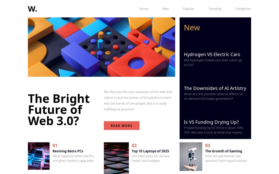


Design comparison

Solution retrospective
I'm most proud of how I utilized CSS Grid to create a responsive layout that adjusts seamlessly across devices. The decision to use grid-template-rows: auto; was particularly effective, allowing each row to size based on its content, preventing layout issues.
Next time, I would focus on better planning my HTML structure and CSS class naming conventions to ensure consistency. I found myself confused at times between using IDs and classes, which led to some debugging delays. Establishing a clearer naming strategy from the outset would help avoid this.
What challenges did you encounter, and how did you overcome them?One of the significant challenges was ensuring that the sidebar remained functional and visually appealing on different screen sizes. Initially, the sidebar was positioned absolutely and created issues with scrolling and visibility. I overcame this by adjusting its position to fixed when necessary, allowing it to stay visible during scrolling.
Another challenge was managing the responsiveness of images within containers. I learned that setting max-width: 100% and height: auto; ensures that images shrink properly without causing layout issues. I also discovered that using the clamp() function for setting widths could help maintain readability as screen sizes change.
What specific areas of your project would you like help with?I would appreciate feedback on optimizing the JavaScript functionality for my menu icons. Specifically, I’m looking for advice on how to efficiently toggle the sidebar visibility without causing layout shifts. Additionally, if there are best practices for managing media queries in CSS to ensure consistent responsiveness, I would love to hear about them.
Community feedback
- P@huyphan2210Posted about 1 month ago
Hi @Bunchydo,
I've reviewed your solution and would like to share my thoughts:
-
Background color reset
You forgot to reset thebackground-colorof#main-containerafter closing.main-sidebar-container. Consider updating this to ensure the correct styling. -
CSS structure and naming conventions
- Your
style.cssfile is quite long. Consider moving default styles to a separate file (e.g.,default.css). - If a style is completely unique, using an
idis fine, but for reusable styles, preferclassselectors. - Adopting a CSS naming convention, such as BEM (Block Element Modifier), can improve readability and maintainability. For example:
.news-article {
  grid-column: span 2;
}
.news-article--featured {
  grid-column: span 3;
}
- Your
-
Overuse of
idin HTML- Elements like
#number-one-container,#number-two-container, and#number-three-containershare similar styles except forgrid-column. - Instead of using multiple
ids, create a reusable class (e.g.,news-article) and separategrid-columnstyles into additional classes:<article class="news-article grid-1"></article> <article class="news-article grid-2"></article> <article class="news-article grid-3"></article> - This improves semantic HTML, CSS reusability, and maintainability.
- Elements like
-
JavaScript improvements
- Consider renaming
style.jsto something more descriptive. - If variables are not reassigned, use
constinstead oflet:const openMenuIcon = document.getElementById("menu-icon"); const closeMenuIcon = document.getElementById("close-icon"); const mainSidebarContainer = document.querySelector(".main-sidebar-container"); const mainContainer = document.getElementById("main-container");
- Consider renaming
If you have any questions, feel free to ask.
Hope this helps!
1 -

Please log in to post a comment
Log in with GitHub
Join our Discord community
Join thousands of Frontend Mentor community members taking the challenges, sharing resources, helping each other, and chatting about all things front-end!
Join our Discord