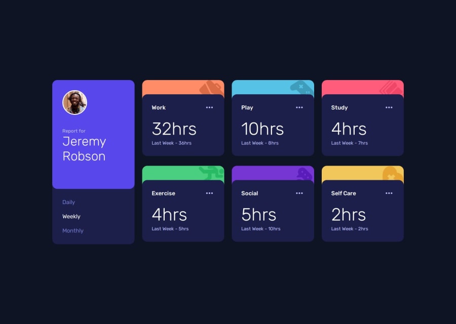
Time Tracking Dashboard Solution with async functions


Design comparison

Solution retrospective
I'm most proud of how I implemented the dynamic data fetching and rendering using JavaScript. Specifically, using async/await with the Fetch API to load the JSON data and update the UI based on the selected time period (daily, weekly, monthly) felt like a big accomplishment. I also really enjoyed using object destructuring and object lookup to make the code cleaner and more readable.
For example, this part of the code made me proud:
const createTimeCard = (item) => {
  const { title, timeframes } = item;
  const hours = timeframes[timePeriod];
  // Rest of the component logic...
};
A big challenge was dynamically updating the time cards when the user switched between daily, weekly, and monthly views. I solved this by creating a function to re-render the cards whenever the time period changed:
const updateTimePeriod = (id) => {
  timePeriod = id;
  fetchDataAndUpdate();
};
I would love feedback on the following areas:
- Error Handling in Fetch:
Currently, if the JSON file fails to load, the user doesn't get any feedback. How can I improve this? Should I add a loading spinner or a retry button? Here's the current fetch function:
const fetchDataAndUpdate = async () => {
  try {
    const response = await fetch("data.json");
    const data = await response.json();
    populateDOM(data);
  } catch (error) {
    console.error("Error fetching data:", error);
  }
};
- CSS Grid Layout:
I used CSS Grid for the main layout, but I'm not entirely sure if it's optimized. Specifically, I'd like feedback on this part of the CSS:
main {
  display: grid;
  gap: 1.5rem;
  grid-template-columns: repeat(auto-fit, minmax(300px, 1fr));
}
Is there a better way to handle the grid for different screen sizes?
- Accessibility:
I tried to make the dashboard accessible by using semantic HTML and ARIA labels, but I'm not sure if it's enough. For example, is this button accessible enough?
<button class="button-edit">
  <svg>...</svg>
  <span class="sr-only">Timer Settings</span>
</button>
Should I add more ARIA attributes or improve the focus states?
Community feedback
- P@huyphan2210Posted about 1 month ago
Hi @Crtykwod,
I've seen your solution and would like to share my thoughts:
If you want to notify users when the JSON file fails to load, you can add an alert inside the
catchblock:const fetchDataAndUpdate = async () => { try { // Load JSON } catch (error) { // console.error("Error fetching data:", error); alert(error.message); } };However, using
alertisn’t very user-friendly. A better approach would be to use a<dialog>element in your HTML. You can include two<button>elements—one to retry loading the data and another to cancel.Example: Using
<dialog>for Error HandlingHTML
<dialog id="errorDialog">
  <p id="errorMessage">An error occurred.</p>
  <button id="retryButton">Retry</button>
  <button id="closeButton">Close</button>
</dialog>
JavaScript
const fetchDataAndUpdate = async () => {
  try {
    // Simulate fetching JSON
    throw new Error("Failed to load data"); // Simulating an error
  } catch (error) {
    document.getElementById("errorMessage").textContent = error.message;
    document.getElementById("errorDialog").showModal();
  }
};

// Handle retry
document.getElementById("retryButton").addEventListener("click", () => {
  document.getElementById("errorDialog").close();
  fetchDataAndUpdate();
});

// Handle close
document.getElementById("closeButton").addEventListener("click", () => {
  document.getElementById("errorDialog").close();
});
This approach allows you to style the
<dialog>with CSS, which isn’t possible with a JavaScriptalert.Hope this helps!
Marked as helpful1P@CrtykwodPosted about 1 month agoHello, @huyphan2210,
I got some time and updated the code with the dialog error handling;
Also, I made the ellipsis button on each card functional. It was a headache to do, but i got it!!! :D
Could you please review again the project and share your thoughts?
0P@huyphan2210Posted about 1 month ago@Crtykwod
After reviewing your implementation again—especially since you've made the ellipsis button functional, which goes beyond the challenge's scope—I’d like to share my thoughts from my perspective:
- It would be helpful to break down your
script.jsinto smaller.jsfiles. When too much is packed into a single file, readability suffers. Just as you’ve separated functions, consider grouping related features into separate files to improve organization. - I noticed that you included "Olá, Mundo!", which stands out since the rest of the content is in English. This inconsistency might be confusing for users, especially since it doesn’t serve a functional purpose.
- In the popup, the "Delete Card" button is the only one that works, while "Olá, Mundo!" doesn’t do anything. From a UX perspective, this raises a question: why include two buttons if only one is functional? Removing the inactive button leads to another question—if there’s only one action, does the ellipsis button serve a meaningful purpose? Would it be more convenient to place the "Delete Card" button directly on the card instead? This would reduce both the development effort and the number of steps users need to take.
Let me know if you have any questions!
Marked as helpful1P@CrtykwodPosted about 1 month ago@huyphan2210, thank you so much for reviewing my code again! That really means a lot to me. ^-^
I’ve modularized the JavaScript, which took some effort since I had no prior experience with importing and exporting. However, I believe the code is now more readable and reusable. It would be incredibly helpful if you could assess whether I’ve done a good job with the refactoring.
Regarding “Olá Mundo”, it's an inside joke I have with a friend—we like sneaking “Hello World” into our code. “Olá Mundo” is just the Portuguese translation of “Hello World.”
As for the ellipsis button, I initially considered replacing it with a trash can icon, but I didn’t want to stray from Frontend Mentor’s original design. Since the button wasn’t meant to have any functionality within the project scope, I decided to add a small personal touch instead. While I understand that a trash can icon would be a better UX and development choice, I opted to stick closely to the provided design. :/
0P@huyphan2210Posted about 1 month ago@Crtykwod
Your file separation has improved—it’s definitely better than before. As you move on to other projects, I’d recommend refining your project structure further. If you collaborate with others, you’ll gain a better understanding of how to organize things so that your code is easier to work with.
As for the design issue, it really depends on user expectations. If you want to make deleting a card less accessible, hiding the delete button inside a popup is a solid choice—it’s a common practice in real-world applications. However, if you want to provide a smoother user experience, displaying the delete button directly on the card would be a better approach.
Marked as helpful1 - It would be helpful to break down your

Please log in to post a comment
Log in with GitHub
Join our Discord community
Join thousands of Frontend Mentor community members taking the challenges, sharing resources, helping each other, and chatting about all things front-end!
Join our Discord