

Design comparison

Solution retrospective
It took me a while to figure out how to center the whole thing. I thought it would be straight-forward jusing flex and justify-content and align-items but it wasn't working as expected until I did the min-height of 100vh.
What specific areas of your project would you like help with?I've only started to learn to code properly within the last month. Before that I've used tools like Wordpress and Webflow to create websites.
I'd like input on my code such as:
- Is my HTML semantically correct?
- Is there anything I could have done in this small project to make the HTML code cleaner?
- Is my CSS code okay or could I have used combinations of selectors or other things to make my CSS more lean?
- Is there anything in the CSS that I've written that doesn't need to be there?
- Is there anything I've missed in my CSS that I should have at the start of this and potentially all projects? For example font-size: 100%, or imgs to be displayed as block. Those are things that have been recommended to me since I started this project so I didn't add them, but would like to know recommendations for adding on all future projects.
Thanks in advance for any feedback😁
~ Carlton
Community feedback
- P@huyphan2210Posted 23 days ago
Hi @carltonjohnson1,
I’ve reviewed your solution and wanted to share some thoughts:
You’ve used too many
<div>elements and nested them unnecessarily. Here are my suggestions for improvement:Instead of this:
<main>
  <div class="code-wrapper">
    <div class="white-bg">

    </div>
  </div>
</main>
Do this:
<main class="code-wrapper white-bg">
  <!-- Content -->
</main>
Similarly, I noticed this pattern in your code:
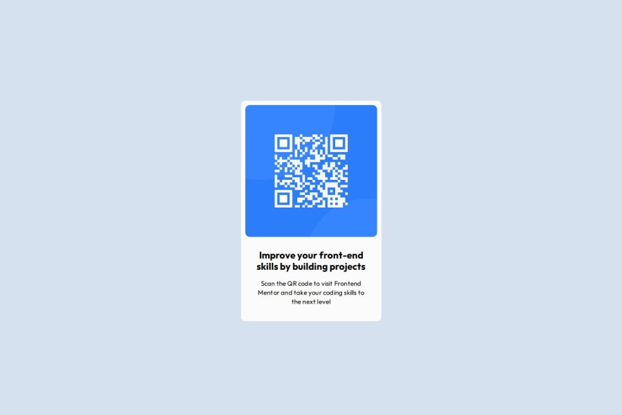
<div>
  <div class="txt-content">
    <h1>Improve your front-end skills by building projects</h1>
    <p>
      Scan the QR code to visit Frontend Mentor and take your
      coding skills to the next level.
    </p>
  </div>
</div>
Instead, simplify it like this:
<h1>Improve your front-end skills by building projects</h1>
<p>
  Scan the QR code to visit Frontend Mentor and take your
  coding skills to the next level.
</p>
Since
<h1>and<p>are block-level elements, they don’t need additional<div>wrappers. This approach improves readability, reduces unnecessary elements, and enhances semantic structure.Regarding your CSS, while there’s room for improvement, this challenge is quite simple and straightforward, so there’s not much to critique at this stage. We can dive deeper as you progress with other challenges.
Hope this helps! Let me know if you have any questions.
0 - @Rudy-275Posted 23 days ago
I have seen your code, and honestly it's really accurate to what was asked. I would suggest you regarding css that, ( it's something that I follow, my friend thought me this ) in the universal selector * we should also add margin =0; & padding = 0; cause some websites have predefined margin and padding which can affect your styling. In order to avoid that we mention it earlier to set margin and padding ( of the browser ) to zero. I guess it's a good practice.
0


Please log in to post a comment
Log in with GitHubJoin our Discord community
Join thousands of Frontend Mentor community members taking the challenges, sharing resources, helping each other, and chatting about all things front-end!
Join our Discord