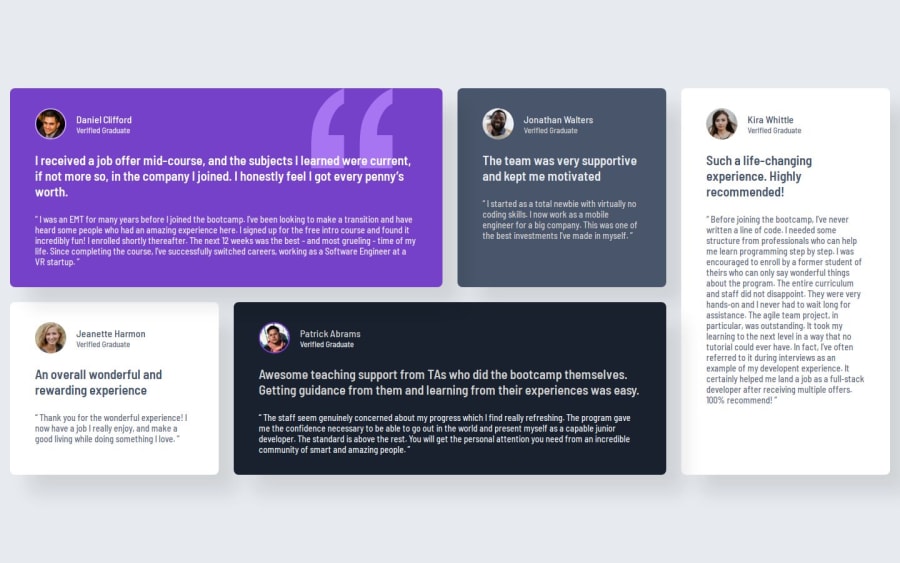
Responsive Testimonials Grid Section using CSS Grid


Design comparison

Solution retrospective
I'm most proud of how I implemented the responsive grid layout for the testimonials. The CSS Grid approach ensures that the testimonials are displayed in an organized and visually appealing way across different screen sizes.
What would you do differently next time? Instead of using nth-child selectors for styling each testimonial separately, I would use CSS classes to keep styles more modular.
What challenges did you encounter, and how did you overcome them?Challenge:
- Making the grid layout responsive across different screen sizes while maintaining the design aesthetics was tricky, especially with the placement of the quote icon in the first testimonial.
Solution:
-
I used CSS Grid with grid-template-areas for a structured layout and adjusted it using media queries.
-
For the quote icon, I repositioned it for smaller screens and completely hid it on mobile to maintain a clean layout.
-
Right now, I rely on nth-child selectors for styling each testimonial differently. Would it be better to use separate classes, or is there a more efficient way to handle this in CSS?
-
The grid-template-areas approach works well, but I’m wondering if there’s a more flexible or scalable way to handle the layout for different screen sizes.
Community feedback
- P@huyphan2210Posted about 1 month ago
Hi @rukhulkirom,
I've seen your solution and would like to share my thoughts:
Regarding your
nth-childselectors issue, I’d recommend creating separate classes based on the features of each.item.Why?
In real-world applications, data is typically fetched dynamically, so you wouldn't know in advance how many
.itemelements your application will have. Right now, your page has five.items, but what if there are 6, 7, or even 50? How would you arrange them in the layout? It’s important to think about scalability.If you want to organize
.itemsin groups of five, I'd suggest creating a class for each type of.item. For example,.item--purple-bgcould represent items with a purple background.How to Apply This
You can use JavaScript/TypeScript to add these classes dynamically based on their index. For example:
document.querySelectorAll('.item').forEach((item, index) => {
  if (index % 5 === 0) item.classList.add('item--purple-bg');
});
Alternative: Using SASS/SCSS
If you prefer not to use JavaScript/TypeScript, you can still use
nth-child, but instead of plain CSS, leverage SASS/SCSS. It supports loops and math calculations, allowing you to generate styles dynamically.For example, if you assume a maximum of 100
.items:@for $i from 1 through 100 { .item:nth-child(#{$i}) { background-color: if($i % 5 == 0, purple, inherit); } }This way, your styles scale better while keeping your CSS manageable.
Regarding your
grid-template-areasissue, you've already used media queries, which is a good approach to handling layouts for different screen sizes. However, I’d recommend using a mobile-first approach—styling for smaller screens first, then progressively enhancing for larger screens.Right now, you're using a desktop-first approach, which isn’t necessarily wrong, but it comes with limitations. For example:
- It often requires more overrides in CSS when adapting to smaller screens.
- Mobile-first styles generally lead to better performance since smaller devices load fewer unnecessary styles.
- It ensures better scalability as new devices with varying screen sizes emerge.
Additionally, I’d recommend defining the scope of the minimum and maximum widths your design should support. You can’t accommodate every device—especially newer ones with unique aspect ratios—so it’s best to focus on a realistic range that covers most users.
Hope this helps! 🚀
1

Please log in to post a comment
Log in with GitHub
Join our Discord community
Join thousands of Frontend Mentor community members taking the challenges, sharing resources, helping each other, and chatting about all things front-end!
Join our Discord