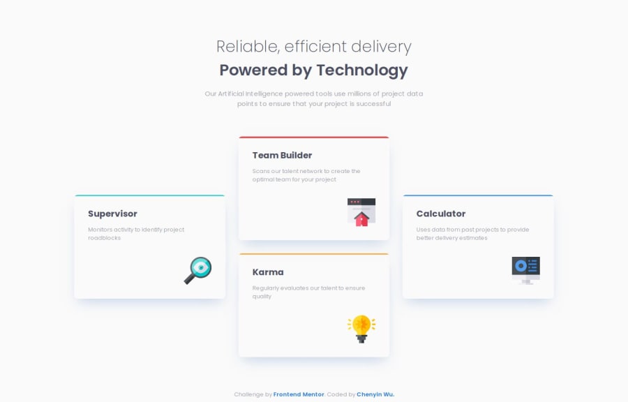
Four Card Feature with Grid and Animation


Design comparison

Solution retrospective
My second attempt with this challenge allowed me to refactor my code and implement new strategies such as:
-
css reset in same file as my stylesheet instead of another file to reduce load time
-
using list items for cards for screen readers
-
adding aria landmarks
-
make it more responsive by swapping out px with rem in media query, text, and width
-
adding animation upon hover: shine effect and shadow
Next time I would like to play around with tilt animation upon hover with JS.
What challenges did you encounter, and how did you overcome them?I struggled with using pseudo element to create the colored line on top of each card. The border-radius for them are still not accurate and differ a bit from the design given. If anyone has any tips on how to make the border radius accurate for the pseudo elements, or if you know of another way besides using pseudo elements, please let me know.
What specific areas of your project would you like help with?I would like advice on a few topics I feel iffy about, and would love guidance on:
- Did I use aria landmarks correctly? Are there other aria roles I should add, or any accessibility concerns I should change?
- I used rem for max-width for the card containers. Would ch be a better choice, and why or why not?
- The pseudo element ::after that I used to style the colored rectangles have inaccurate border-radius, as they differ from the design given. I am unable to get it to look like the design.
- Are there any foundations I need work on? Best practices that I'm not doing?
Community feedback
- P@huyphan2210Posted about 1 month ago
Hi @wcyin9,
I've seen your solution and I'd like to share my thoughts:
- I noticed that each card has
::beforepseudo-elements, but I don’t see any visible effect. Are they redundant, or was there an intended effect that I might be missing? - Your HTML is semantic, which is great! However, in each card, you’ve used
<div>elements while other parts of your structure utilize semantic elements. While this isn’t necessarily wrong, you could improve it further. Since.textelements are just wrappers with no styles, you could move your<h2>and<p>outside—they can stand on their own as block-level elements. The same applies to your<img>—you can make it standalone and usejustify-self: right(thanks to recent CSS updates) to align it to the right as per the design. - I see that you’ve named your classes using camelCase. While this isn’t incorrect, I’d recommend a more conventional naming strategy like BEM. camelCase isn’t commonly used for CSS class names.
- Using class names like
card1,card2, etc., isn’t ideal. Imagine styling 100 cards manually—it wouldn’t be practical. In real-world scenarios, data is often fetched dynamically, and you might not know the exact number of elements. Instead, consider class names based on features, such ascard--redfor a red background. Before jumping into styling, try to imagine how your layout should be structured first. Think about how the elements should be positioned and grouped, then apply styles that are scalable and reusable. This approach makes your styles more maintainable and reduces unnecessary complexity.
Hope this helps!
Marked as helpful0P@wcyin9Posted about 1 month ago@huyphan2210 Thanks for your advice! I will now adopt BEM, but I have a question regarding BEM naming convention.
If the name of the parent is more than one word, can I combine camelCase with BEM or is that frowned upon? For example, I find
componentName--modifierNameeasier to read thancomponent-name--modifier-name. What should I do in this situation?1P@huyphan2210Posted about 1 month ago@wcyin9
BEM is a naming convention, but it’s not something you must follow. Its purpose is to help you organize your CSS classes in a structured way, making your code easier to maintain. However, conventions should assist you in doing a better job — not become an obstacle.
Between your two examples, I would choose the second one. However, since this is your personal project and you find the first one easier to read, there’s nothing wrong with sticking to it.
If you’re collaborating with others (which is common in a professional environment), discuss and agree on a standard together. In the end, the people using your page likely don’t care how you name your classes. Focus on what works best for you in terms of maintainability and scalability.
Marked as helpful0 - I noticed that each card has
- @YacoubDweikPosted about 1 month ago
Wow! This is almost perfect, I loved the cool animation as well!
I loved how you did unify all heights of cards, using the semantic HTML was awesome!
Talking about ARIA, I just want to say most of the time using only semantic HTML elements leaves you with no need to ARIA at all, and as always, NO ARIA IS BETTER THAN BAD ARIA.
Here we don't have any pure content images, there's no dropdown menus or buttons that show and hide stuff, there's no updates for the the content, so I can't see any need for ARIA here, talking about the roles that you have used, role banner is the same as using the <header> element, now MDN says that the banner or the header is is for defining a global site header, which usually includes a logo, company name, search feature, and possibly the global navigation or a slogan. It is generally located at the top of the page.
So as you can see that section was not a banner it's just an intro section, and I'd suggest putting it inside the <main> as it's a basic part of the main content of the page.
I'd suggest using <main> without role="main", it's not necessary to add role="main" to a <main> element. The <main> element is already recognized by assistive technologies as the main content of the page, so explicitly adding role="main" is redundant. However, it won't cause any issues if you include it, but it's generally recommended to avoid unnecessary roles to keep your code clean and semantic.
It's ok to use max-width in rem, at the end of the day 20rem = fixed pixels, it's totally fine.
Keep it up I really liked how clean your CSS is!
Marked as helpful0P@wcyin9Posted about 1 month ago@YacoubDweik Thanks so much for your detailed feedback! It helped me understand aria roles a lot better and I learned a lot more about when to best use them. I have gone ahead and updated my code to reflect your advice.
Thanks so much for your time!
0


Please log in to post a comment
Log in with GitHubJoin our Discord community
Join thousands of Frontend Mentor community members taking the challenges, sharing resources, helping each other, and chatting about all things front-end!
Join our Discord