@zoubinnabaSubmitted almost 2 years ago
Hi, will like to have somme feeback about the best pratique.Thanks.

Hi, will like to have somme feeback about the best pratique.Thanks.
Hey Emmanual and congrats on completing this challenge
I saw that your component is not perfectly centered in the middle of the page. I also checked your code if there were some errors and found that you didn't try to center it. So, try centering it with flexbox or grid.
-Flexbox: try to write the following code in your body tag
Display: flex
Align-items: center;
Justify-content: center;
-Grid: try to write the following code in your body tag
Display: grid;
Place-items: center;
There are a lot of different ways to center your component in the middle but these two are the most popular and used ones.
I hope my feedback was helpful, if it's don't forget to marked as hepful 🙌🏻
I could't make it the letters to look like in the guide you sent me. How can i do it properly?
Hello @1991facundo, Congrats on completing this challenge
I've checked your solution and noticed some errors you made
shadow, don't use a dark shadow as it will make your user experience very bad.font-size this is also to create a great user experienceHope my feedback was helpful 🙌🏻
suggest some css website that include flex ,grid, animation...etc
Hello Logesh, Congrats on completing this challenge
I've checked your solution and your code, and noticed there are small errors I made
h1 for SEO optimizationvisual hierarchy and the user experience. Here in this component try reducing the white space between the title and paragraph to make them connected to each other.Hope my feedback was helpful 🙌🏻
Hello, Congrats on completing this challenge
I've checked your code, and noticed that you're using % unit a lot, and it will cause a lot of errors in your component style. So, to avoid these errors, you should instead use the rem, px, em ... etc units, and when your component style crushs, use media queries to fix it.
Hope my feedback is helpful 🙌🏻
Hello Carlos, Congrats on completing this challenge
I checked the html and css files and the code in both of them are great, just a small issue that I noticed
h1 for SEO optimizationHope my feedback is helpful 🙌🏻
Hi there, I’m Husam and this is my solution for my fourth challenge. 👋
Any feedback on how I can improve and reduce unnecessary code are welcome!
Thank you.
Hello Hussam, Congrats on completing this challenge
I will give you a very simple tip. When you are building a layout or component like this, always focus on the visual hierarchy and the user experience. Here in this component try reducing the white space between the title and paragraph to make them connected to each other.
I hope my feedback was helpful 🙌🏻
Hello Kolade 🙋🏻♂️, Congrats on completing this challenge
I checked your solutions and I found small mistakes:
body element should have the background color and not the container elementmin-height: 100vh must be added to the body element using align-items: centerjustify-content: center is specified there is no need to add margin-(right, left): autofont size in media queryI hope my feedback was helpful 🙌🏻
I am having some trouble with the positioning of the main box in smaller screens, it doesn't show everything until I have to put a drastic position using position:relative; but using that makes me have too much space on the top and too little space on the bottom. Any help will be well appreciated, thanks
Hello Nanle, Congrats on completing this challenge
I noticed from your solution that the buttons are not perfectly aligned at the end so try to fix it try making the parent container flexible
.container {
   display: flex;
   flex-direction: column;
}
Then add to buttons margin-top: auto and they will be perfectly aligned at the end.
I hope my feedback was helpful! 🙌🏻
Hello Stefan 🙋🏻♂️, Congrats on completing this challenge
I will give you a very simple tip. When you are building a layout or component like this, always focus on the visual hierarchy and the user experience. Here in this component, the whitespace is completely wrong, so it should be fixed and made perfect for users. Try to reduce the space between texts, prices, and button to make them related to each other.
I hope my feedback was helpful to you 🙌🏻
All feedback is welcome, thank you!
Hello Lisakhanya 🙋🏻♂️, Congrats on completing this challenge
Floats are a very old method of positioning items. Alternatively, you can use some modern methods like flexbox and grid. To get to know them, I suggest Jonas Schmedtmann's courses on Udemy
I hope my feedback was helpful 🙌🏻
Feeling good after completing this project, I completed this project pretty fast than my other older projects. And also felt really confident, maybe because of my other projects on frontend mentor. Guys, if you have any suggestions I can do to improve please elaborate. Thank you.
Hello Ajay 🙋🏻♂️, Congrats on completing this challenge
I checked your solution code, and I found small mistakes in your code
width component in the @media query, try specifying the width in the main tagpercentage to define width, we only use percentage to make responsive images. So you can use units like px, em, rem to define a fixed width for your component, and you can write @media query when your design crashesI hope my feedback was helpful 🙌🏻
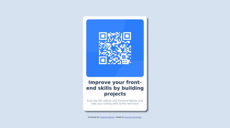
Here is my solution for the QR Code Scanner. Feel free to provide any feedback or improvements I can make.
Hello Matt 🙋🏻♂️, Congrats on completing this challenge
I checked your code solution for this challenge, and I found very small errors
@media query you wrote, it replaces the max-width of the wrapper class. So to fix your problem, try deleting it@media (min-width: 768px) {
.code-container {
max-width: 1440px;
}
}
I hope my feedback was helpful 🙌🏻