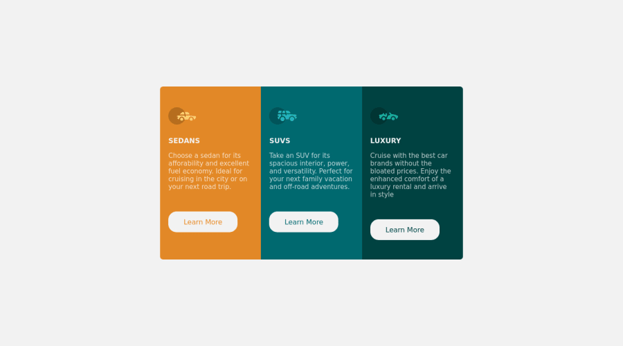


Design comparison

Solution retrospective
I am having some trouble with the positioning of the main box in smaller screens, it doesn't show everything until I have to put a drastic position using position:relative; but using that makes me have too much space on the top and too little space on the bottom. Any help will be well appreciated, thanks
Community feedback
- @correlucasPosted about 2 years ago
👾Hello @N-anle, Congratulations on completing this challenge!
Great code and great solution! I’ve few suggestions for you that you can consider adding to your code:
Use
max-width: 100%for the cards in the mobile version to allow the cards grow 100% of the width considering the paddings and avoid to have a lateral gap (limited by a fixed width).Your solution seems fine, you did a really good job wrapping the content for these 3 cards. Something you can improve here is to use a
single classto manage the content that is mostly the same for the 3 cards (paddings, colors, margins and etc) and another class to manage the characteristics that are different (colors and icon), this way you'll have more control over then and if you need to change something you modify only one class.✌️ I hope this helps you and happy coding!
Marked as helpful0@N-anlePosted about 2 years ago@correlucas alright, I would try all these. I appreciate you
0 - @akramAdjabPosted about 2 years ago
Hello Nanle, Congrats on completing this challenge
I noticed from your solution that the buttons are not perfectly aligned at the end so try to fix it try making the parent container
flexible.container { display: flex; flex-direction: column; }Then add to buttons
margin-top: autoand they will be perfectly aligned at the end.I hope my feedback was helpful! 🙌🏻
Marked as helpful0@N-anlePosted about 2 years ago@akramAdjab okay, thank you so much! I'd try implementing this
0 - @kalosFestusPosted about 2 years ago
Try height:unset
0


Please log in to post a comment
Log in with GitHub
Join our Discord community
Join thousands of Frontend Mentor community members taking the challenges, sharing resources, helping each other, and chatting about all things front-end!
Join our Discord