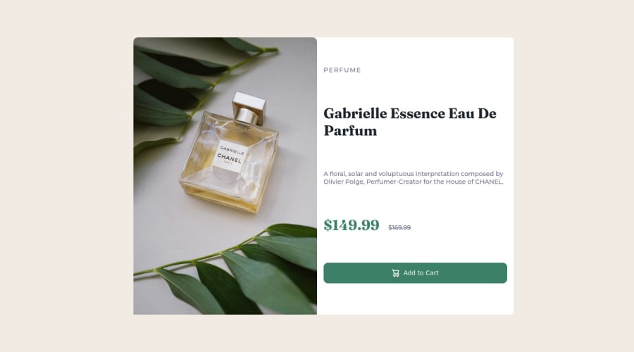


Design comparison

Solution retrospective
Feeling good after completing this project, I completed this project pretty fast than my other older projects. And also felt really confident, maybe because of my other projects on frontend mentor. Guys, if you have any suggestions I can do to improve please elaborate. Thank you.
Community feedback
- @hyrongennikePosted about 2 years ago
Hi @ajay117,
Nice job on your first attempt of the challenge
You can the change the
width: 60%tomax-width: 50%;that way it's more responsive. To center a card easily you can use flexbox replace your body rule with the below.body { margin: 0; background-color: var(--cream); font-family: "Montserrat", sans-serif; display: flex; justify-content: center; align-items: center; min-height: 100vh; }in order for this to work you need to remove the following properties every on the main tag rule.
main {
    border-radius: 10px;
    background-color: var(--white);
    margin: 0 15px;
    /* position: absolute; */ **remove**
    /* top: 50%; */ **remove**
   /* left: 50%; */ **remove**
    /* transform: translateY(-50%); */ **remove**
}
Hope this is helpful
Marked as helpful1@ajay117Posted about 2 years ago@hyrongennike thank you so much for your help, it worked and is more responsive. It helped a lot, really appreciate it.
0 - @akramAdjabPosted about 2 years ago
Hello Ajay 🙋🏻♂️, Congrats on completing this challenge
I checked your solution code, and I found small mistakes in your code
- Don't specify the
widthcomponent in the@media query, try specifying thewidthin themaintag - Don't use
percentageto definewidth, we only usepercentageto make responsive images. So you can useunits like px, em, remto define a fixedwidthfor your component, and you can write@media querywhen your design crashes
I hope my feedback was helpful 🙌🏻
Marked as helpful1@ajay117Posted about 2 years ago@akramAdjab thank you for your suggestion, really appreciate it...
0 - Don't specify the


Please log in to post a comment
Log in with GitHub
Join our Discord community
Join thousands of Frontend Mentor community members taking the challenges, sharing resources, helping each other, and chatting about all things front-end!
Join our Discord