

Design comparison
SolutionDesign

Community feedback
- @akramAdjabPosted about 2 years ago
Hello Stefan 🙋🏻♂️, Congrats on completing this challenge
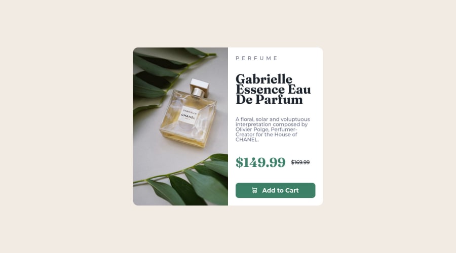
I will give you a very simple tip. When you are building a layout or component like this, always focus on the visual hierarchy and the user experience. Here in this component, the whitespace is completely wrong, so it should be fixed and made perfect for users. Try to reduce the space between texts, prices, and button to make them related to each other.
I hope my feedback was helpful to you 🙌🏻
0

Please log in to post a comment
Log in with GitHubJoin our Discord community
Join thousands of Frontend Mentor community members taking the challenges, sharing resources, helping each other, and chatting about all things front-end!
Join our Discord