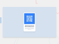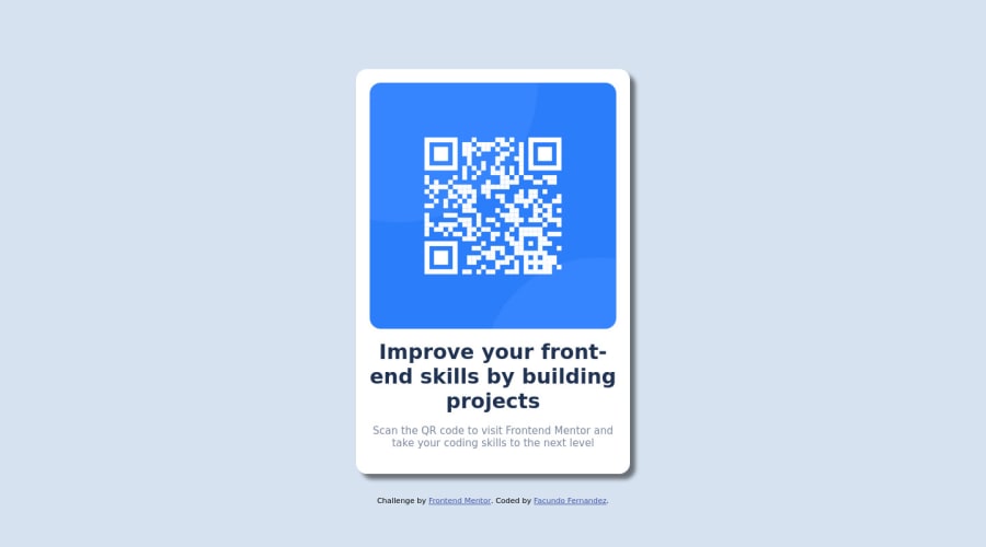
Design comparison
SolutionDesign
Solution retrospective
I could't make it the letters to look like in the guide you sent me. How can i do it properly?
Community feedback
- @RubylenshyPosted about 2 years ago
Hi @1991facundo 👋, a very nice job you've done here. However, here are some suggestions on how your build-up should look exactly like the design:
- I see that
@import url('https://fonts.googleapis.com/css2?family=Outfit:wght@400;700&display=swap');is not placed in the first line of your stylesheet code. Move that code up to the first line if you may. - Change
<div class="container"></div>to<main></main>tag as this will show that it is the main content of the webpage, do a similar thing to the<div class="attribution"></div>, change that to a<footer></footer>tag.
I hope this helps 👍
Keep Coding @1991facundo
Marked as helpful0@1991facundoPosted about 2 years ago@Rubylenshy Thank you very much for your help and advice!
0 - I see that
- @akramAdjabPosted about 2 years ago
Hello @1991facundo, Congrats on completing this challenge
I've checked your solution and noticed some errors you made
- Always use a very light
shadow, don't use a darkshadowas it will make youruser experiencevery bad. - Try to reduce the title's
font-sizethis is also to create a greatuser experience
Hope my feedback was helpful 🙌🏻
Marked as helpful0 - Always use a very light
- @EseAlliPosted about 2 years ago
Great job Facundo, you can change and make the text look like the guide by setting a font size the h1 tag.
.container h1{
 font-size: 1.5rem;
}
Marked as helpful0
Please log in to post a comment
Log in with GitHubJoin our Discord community
Join thousands of Frontend Mentor community members taking the challenges, sharing resources, helping each other, and chatting about all things front-end!
Join our Discord

